E-commerce Main Image - Rhode Lip Treatment Comparison Ad

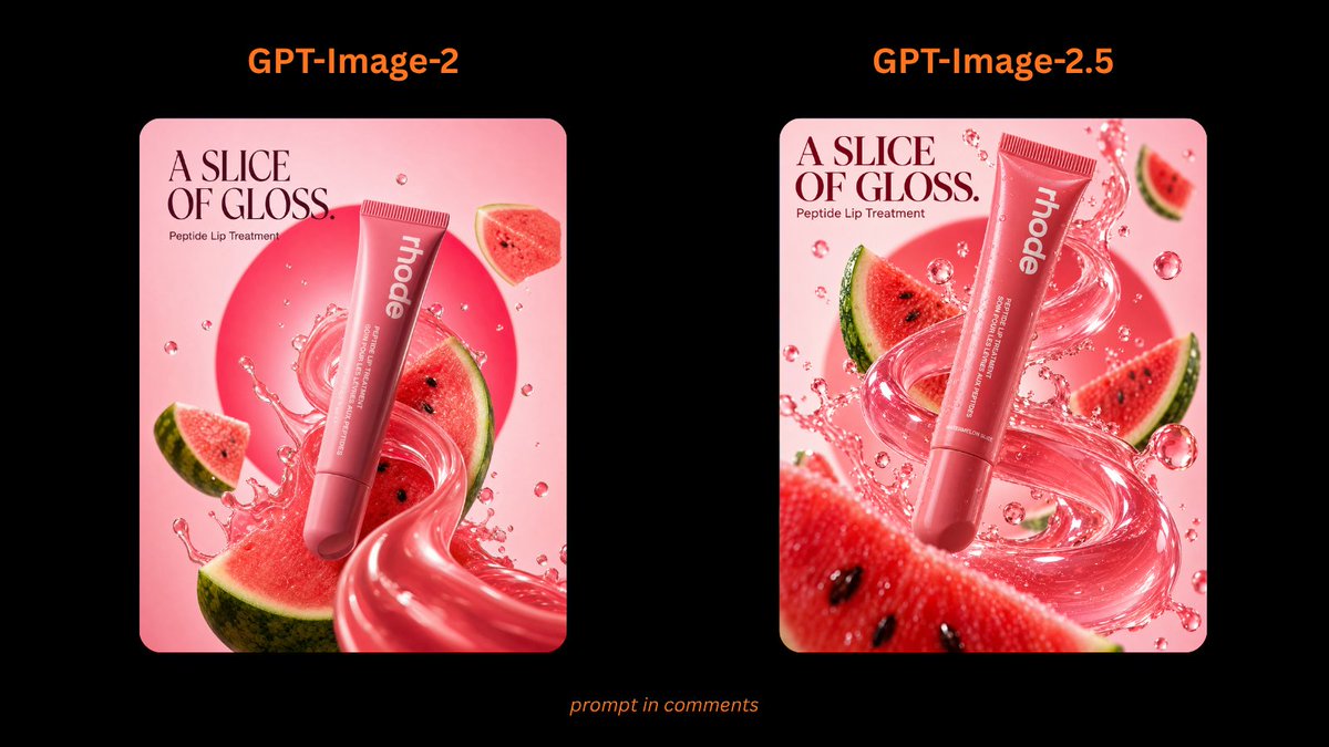
Creates a side-by-side black-background comparison graphic of two glossy watermelon-themed rhode beauty ad generations.

提示词

3,005 字符打开 Astorie 创作台 ↗
Goal: Create a wide comparison graphic showing two generated versions of a rhode beauty static ad for Peptide Lip Treatment in Watermelon Slice, with a black presentation background and two square ad mockups side by side.

Canvas: 16:9 horizontal frame, black background, high contrast, clean social-media comparison layout.

Layout: Place two rounded-corner square ad images centered horizontally with generous spacing. The left panel is labeled above in bright orange text: “GPT-Image-2”. The right panel is labeled above in the same bright orange text: “GPT-Image-2.5”. Add one small italic orange caption centered near the bottom reading “prompt in comments”.

Ad panels: Use exactly 2 square beauty advertisement panels.
1. Left panel: soft pink background, rounded corners, elegant editorial beauty-ad composition. At the upper left, large serif headline text reads “A SLICE OF GLOSS.” with smaller text below reading “Peptide Lip Treatment”. A pink rhode Peptide Lip Treatment tube floats diagonally from upper right toward lower center, with vertical white “rhode” branding. Surround it with a glossy pink gel swirl, transparent splash droplets, and watermelon slices. Include a large circular pink sunburst shape behind the product. Watermelon elements count: 3 visible slices or wedges — one large lower watermelon slice, one right-middle slice behind the tube, and one small upper-right wedge. Keep the product large and central.
2. Right panel: more dynamic, brighter, more detailed version of the same rhode ad. Pink background, rounded corners, upper-left serif headline “A SLICE OF GLOSS.” and smaller “Peptide Lip Treatment”. A larger pink rhode tube floats diagonally near the center, surrounded by a dramatic translucent glossy pink splash ribbon, many bubbles and droplets, and watermelon slices. Watermelon elements count: 5 visible pieces — one large foreground watermelon strip at the bottom, one left-middle wedge, one right-middle wedge, one small upper-right wedge, and one partial slice behind the splash near the center. The product should appear sharper, glossier, and more premium than the left panel.

Visual style: polished product advertising, vivid watermelon pinks and reds, glossy liquid textures, studio lighting, high-end cosmetics campaign, crisp typography, saturated color, realistic 3D product rendering mixed with surreal splash photography.

Text and customization: Use the top labels {argument name="left model label" default="GPT-Image-2"} and {argument name="right model label" default="GPT-Image-2.5"}. Use the ad headline {argument name="headline text" default="A SLICE OF GLOSS."}. Use the brand on the tube {argument name="brand name" default="rhode"}. Use the bottom caption {argument name="bottom caption" default="prompt in comments"}.

Constraints: Keep exactly 2 comparison panels, exactly 2 orange model labels, and exactly 1 bottom caption. Do not add extra logos, watermarks, UI chrome, or additional text outside the specified labels and ad copy.

来自原帖查看来源 ↗

更多灵感

YouTube Thumbnail - Cinematic Fried Chicken Food Advertisement
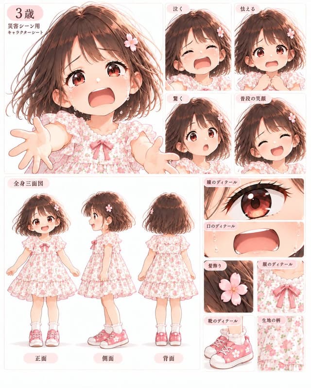
Infographic / Edu Visual - Anime Character Sheet: Crying Girl
Social Media Post - Healing Morning Poster with Dewy Leaves

Social Media Post - Healing Morning Poster with Dewy Leaves

小小东GPT Image 2
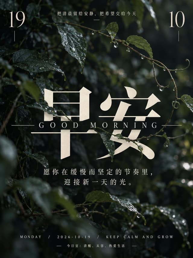
Create a vertical, high-resolution healing-style morning greeting poster. The background is a close-up photograph of dark green leaves and thin vines covered in clear water droplets, with soft natural light filtering through the foliage to create a moody, serene atmosphere.

In the top left corner, display the number "19" in a large, elegant serif font in cream color, with a short vertical line beneath it. In the top right corner, display the number "10" in the same style and color, also with a short vertical line beneath it. Centered at the very top, between the numbers, is a small horizontal line followed by the Chinese text: "把清晨留给安静,把希望交给今天" (Leave the morning for quietness, entrust hope to today) in a delicate white sans-serif font.

Dominating the center of the image are two massive Chinese characters "早安" (Good Morning) in a bold, stylized serif typeface. These characters are rendered in a textured cream/beige color that looks slightly translucent against the dark leaves behind them. Directly below these large characters is the English text "GOOD MORNING" in widely spaced, uppercase serif letters, flanked by long horizontal lines on either side.

Below the main title, centered in the lower-middle section, is an inspirational quote in white sans-serif text spanning two lines: "愿你在缓慢而坚定的节奏里,迎接新一天的光。" (May you welcome the light of a new day in a slow and steady rhythm.)

At the bottom of the poster, there is a footer section. The first line reads "MONDAY / 2026-10-19 / KEEP CALM AND GROW" in small, spaced-out white capital letters. Below this, centered between two short horizontal dashes, is the text "今日宜:清醒、从容、热爱生活" (Today's advice: Be awake, be calm, love life).
使用此提示词 ↗
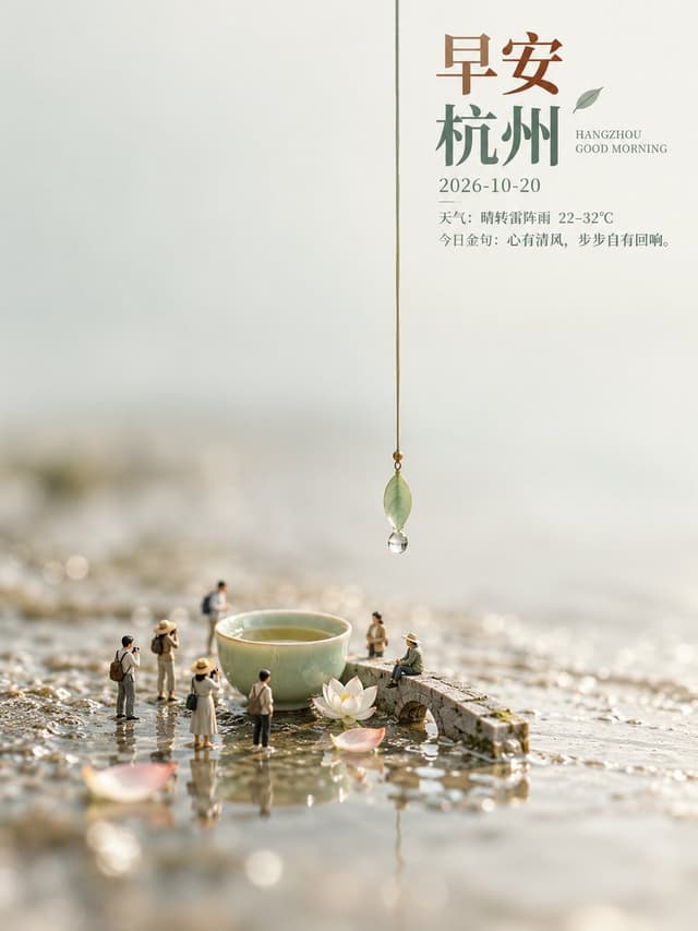
Social Media Post - Hangzhou Good Morning Miniature Tea Scene
Social Media Post - GPT Image 2 Prompt: Naïve Folk Art Transformation

Social Media Post - GPT Image 2 Prompt: Naïve Folk Art Transformation

SairahGPT Image 2
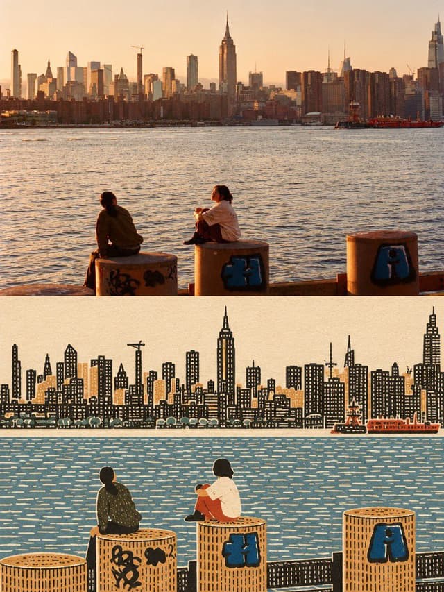
Create one vertically stacked before-and-after comparison using the supplied image as the only source.
LAYOUT:Exactly two equal-height panels: original image on top, transformed image on bottom. Both panels have the source image's aspect ratio and identical width. The complete canvas is twice the source image's height. Join the panels directly at a clean horizontal seam. No thick divider, extra panel, decorative frame, labels, or added text.
TOP PANEL — ORIGINAL:Place the supplied image unchanged in the upper half. Preserve its full composition, original colors, lighting, details, existing text, and crop. Do not redraw, retouch, stylize, or apply texture to this panel.
BOTTOM PANEL — OUTSIDER ART:Redraw the same scene as a flat, densely textured naïve folk-art print. Preserve the main subject, recognizable silhouettes, relative positions, important objects, and overall composition. Do not invent additional subjects or props.
Flatten the ground into map-like color zones, with people, trees, buildings, and objects shown in simple frontal or side elevation. Remove converging perspective, photographic depth, directional lighting, and cast shadows.Use warm paper white, warm ink black, and two to four subdued colors derived from the source. Choose one existing object or connected detail as the only saturated accent. Give each large zone one consistent handmade texture: stitch marks, irregular window grids, or dense foliage marks. Keep the texture dense, rhythmic, and slightly imperfect.
Where people appear, use small, solid, faceless figures with filled clothing and limbs of visible width. Render every surface as opaque printed ink on matte paper, with no photographic remnants.Keep all illustration, paper texture, and color changes strictly inside the lower panel. No gradients, glossy vector finish, watercolor, stick figures, cute cartoon proportions, invented lettering, or watermark.
使用此提示词 ↗
Social Media Post - Serene Good Morning Watercolor Poster

Social Media Post - Serene Good Morning Watercolor Poster

小小东GPT Image 2
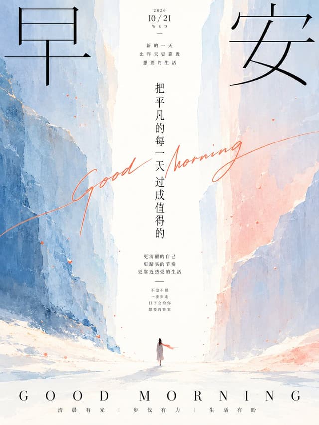
Create a vertical 3:4 poster in a serene, poetic Chinese minimalist style with watercolor textures and generous central whitespace. The background shows two towering cliffs on the left and right sides, painted in soft blue-gray tones with delicate pink and orange highlights, forming a narrow canyon that opens into a bright white misty center. At the bottom of the canyon stands a tiny solitary woman seen from behind, wearing a long light-colored coat and a flowing red scarf, walking toward the glowing opening.

Typography layout:
- Top-left corner: one large black serif Chinese character "早" (Morning).
- Top-right corner: one large black serif Chinese character "安" (Peace), together reading "早安" (Good Morning).
- Top-center small text block: "2026 / 10/21 / WED" followed by a short horizontal line, then three lines of spaced small Chinese text: "新的一天", "比昨天更靠近", "想要的生活".
- Center vertical column of medium-sized black Chinese characters reading top to bottom: "把平凡的每一天过成值得的".
- A handwritten cursive English phrase "Good Morning" in coral-orange ink sweeping diagonally across the middle of the image, overlapping the vertical text.
- Below the vertical text, a centered small paragraph of three lines: "更清醒的自己", "更踏实的节奏", "更靠近热爱的生活", followed by a short divider line and four more tiny lines: "不急不躁", "一步步走", "日子会给你", "想要的答案".
- Bottom edge: wide-tracked uppercase serif letters "G O O D   M O R N I N G" spanning the width, and beneath it a single line of small spaced Chinese text separated by thin vertical bars: "清晨有光 | 步伐有力 | 生活有盼".

Visual style: clean editorial typography, airy composition, muted pastel palette dominated by white, pale blue, and soft peach, subtle paper grain texture, faint scattered orange speckles like petals or dust, calm and inspirational mood.
使用此提示词 ↗

寻找下一个方向

ASTORIE CANVAS

让灵感,继续生长。

在同一个创作空间,连接提示词、参考素材和生成结果。

打开创作画布 ↗