

How to Use Nano Banana 2.1: From First Image to Finished Ad
Quick Answer
To use Nano Banana 2.1, start with a clear prompt and a reference image if your subject needs to stay consistent. Generate a draft, identify what needs improvement, and adjust the settings based on that problem. Once the composition works, choose the final resolution and check the output before exporting.
I used Nano Banana 2.1 Premium in Astorie to create a fragrance campaign for a fictional brand called VELA. The workflow covered product references, image generation, targeted editing, Thinking Levels, Web On/Off, and final resolution.
One finding stood out: higher settings did not always produce better results. High Thinking improved product details but weakened the layout. Web On added visual complexity without a clear accuracy benefit. And the final 2K image performed better than 4K in the areas that mattered for this campaign.
What You Need Before Using Nano Banana 2.1
For this project, I created a vertical luxury fragrance advertisement featuring a fictional perfume called VELA Nº7.
Element | Project specification |
Product | Clear rectangular perfume bottle with amber liquid |
Packaging | Matte black cap and cream label |
Exact product text | VELA / Nº7 / EAU DE PARFUM |
Campaign headline | STAY AFTER DARK |
Visual direction | Nighttime city, wet stone, warm reflections |
Final format | 4:5 advertising poster |
The workflow used Nano Banana 2.1 Premium on Astorie, with three resolution options (1K, 2K, and 4K), three Thinking Levels (Minimal, Medium, and High), and a Web On/Off setting.
I used connected image nodes to keep the product reference available throughout the project. Each comparison started from the same references, so I could evaluate a specific setting without rebuilding the campaign.
How to Use Nano Banana 2.1: Step-by-Step Workflow
Step 1. Create a Product Reference
I started by generating a clean product image rather than the finished advertisement.
The goal was to establish the bottle's shape, label, and materials before introducing a complex background.
Settings: 2K · 1:1 · Medium Thinking · Web Off
Here is a shortened version of the product prompt:
Create a photorealistic studio packshot of a fictional luxury perfume called VELA Nº7.
Show one rectangular transparent glass bottle with softly beveled edges, warm amber liquid, and a matte black cylindrical cap.
Add a cream front label with three centered lines:
VELA
Nº7
EAU DE PARFUM
Place the bottle upright against a warm light-gray studio background. Use soft directional lighting, natural glass reflections, and subtle contact shadows.
Keep the entire bottle visible. No props, extra text, or decorative objects.
After generating the image, I checked the label, bottle proportions, liquid color, and cap design.
I then approved it as the master product reference for the remaining workflow.
This step also established an important distinction: consistency is not the same as accuracy. A model can preserve an incorrect label across multiple images. The reference itself must be checked before reuse.
Step 2. Generate the First Campaign Draft
Next, I connected the product reference to a new image generation node.
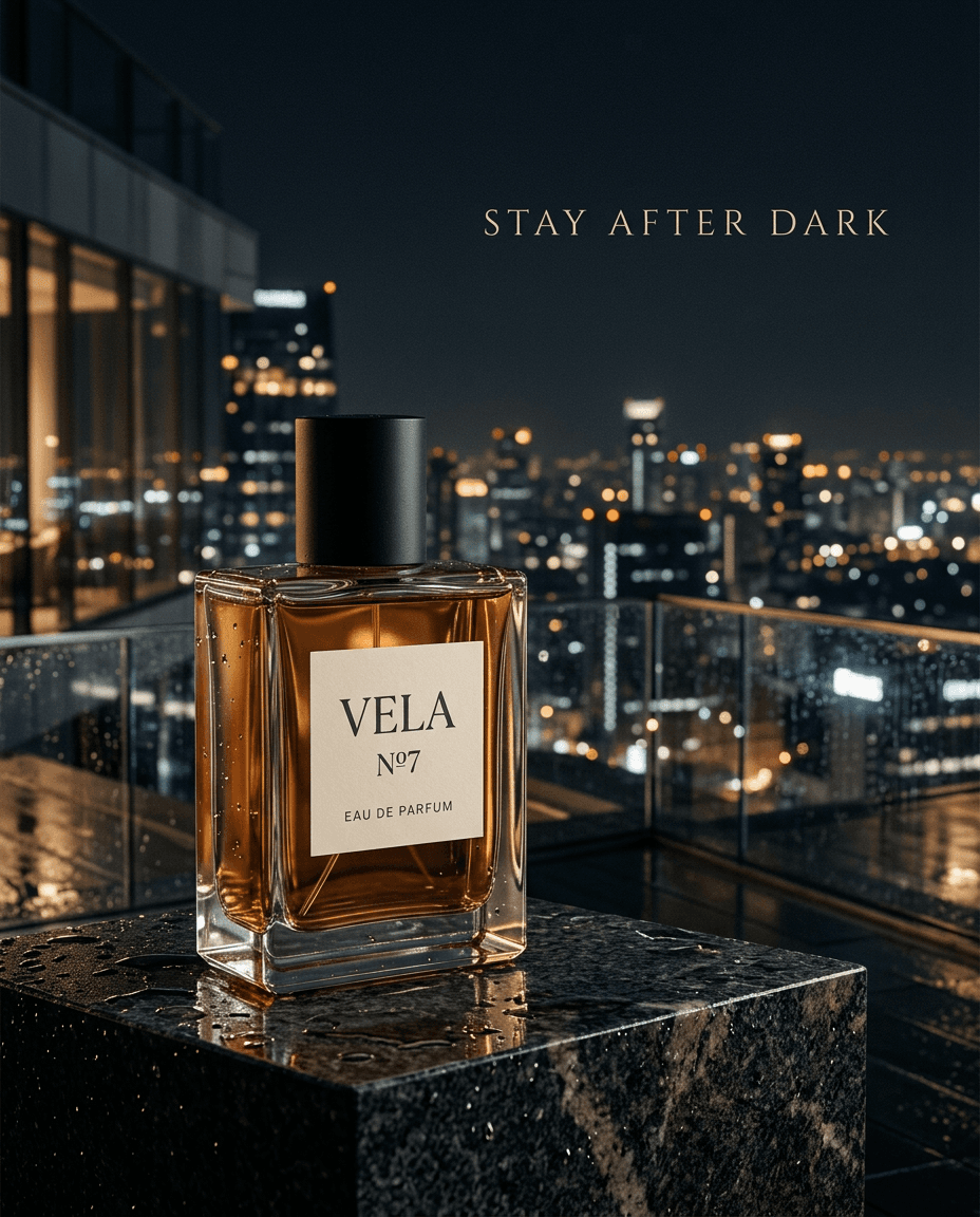
The campaign concept was a perfume bottle displayed on wet black stone, with a nighttime city skyline and the headline STAY AFTER DARK.
Settings: 1K · 4:5 · Minimal Thinking · Web Off
I used this campaign prompt:
Create a photorealistic luxury fragrance campaign poster using @Product_Reference.
Preserve the VELA Nº7 bottle, including its glass shape, amber liquid, black cap, cream label, and exact product text.
Place the bottle slightly left of center on a wet, polished stone pedestal overlooking a modern city at night.
Use dark charcoal tones, warm amber reflections, soft directional lighting, and realistic glass materials.
Add the exact headline "STAY AFTER DARK" in elegant uppercase typography in the upper-right area.
Keep the entire bottle visible and maintain clear visual hierarchy between the product, headline, and background.
Create a cohesive luxury advertisement, not a generic product render.
The first result was promising.
The bottle remained consistent with the reference, and the glass, rain, and reflections looked natural. However, the headline placement, composition, and overall advertising design had minor issues.
I kept this image as the baseline rather than immediately starting over.
The purpose of the first draft was to establish a workable creative direction, not to perfect every detail.
Step 3. Test Whether Higher Thinking Improves the Result
The first draft had acceptable product details but weaker layout control. I wanted to see whether increasing the Thinking Level would solve that problem.
I generated another version using the same prompt, reference, resolution, and Web Off setting. The only intended change was switching from Minimal to High Thinking.
The results were mixed.
Criterion | High Thinking compared with Minimal |
Headline and typography | Worse |
Composition adherence | Worse |
Overall advertising appearance | Similar |
Product consistency | Better |
Material realism | Better |
High Thinking improved the bottle and material details, but the headline and composition became less accurate.
Since the current problem was layout rather than product realism, I continued with the Minimal Thinking version.
This comparison showed why settings should be evaluated against the task. Higher Thinking did not improve the specific constraints I needed to fix.
minimal
high
Step 4. Try a Targeted Image Edit
Instead of generating a completely new campaign, I tried editing the Minimal version.
I used the existing advertisement as the main reference and the product packshot as an identity reference. The instructions asked for better headline placement, clearer negative space, and more balanced composition while preserving the bottle and background.
The edit did not produce the intended improvement.
When I compared the images, the headline font had changed, but the bottle position, background, and overall layout were almost identical.
The original composition was preserved, yet the layout problem remained.
I therefore rejected the edited version and returned to the original Minimal draft.
The lesson was not that image editing was ineffective. It was that preserving an image does not mean the requested correction was successful.
A targeted edit should solve a visible problem. If it does not, repeatedly applying similar instructions may add work without improving the result.
Step 5. Decide Whether to Turn Web On
The next step was to place the campaign in a recognizable real-world environment: Shibuya Scramble Crossing in Tokyo.
This gave me a reason to compare Web On and Web Off.
I created two branches from the same campaign and product references. Both used 1K, 4:5, and Minimal Thinking. The location prompt remained identical.
The prompt asked for recognizable pedestrian crossings, surrounding commercial buildings, illuminated signage, and a realistic nighttime atmosphere. The perfume bottle and headline had to remain the main visual elements.
The two outputs looked different.
Web On produced a busier background with denser commercial signage and more illuminated buildings. However, those details competed with the campaign headline.
Web Off created a more restrained scene. The perfume bottle remained prominent, and the headline was easier to read.
Neither image provided enough evidence to conclude that its geographical layout was more accurate. Confirming that would require comparison against reliable images of the actual location.
For this advertising project, I chose Web Off.
The decision was based on the purpose of the image: the campaign needed a recognizable setting, but the product and headline still had to lead.
Web grounding is useful when a task depends on real-world information. It should not be treated as a general image-quality upgrade.
Web Off
Web On
Step 6. Choose the Final Resolution
With the Shibuya composition selected, I compared 2K and 4K outputs.
Both versions used the same references, refinement prompt, Minimal Thinking, Web Off, and 4:5 aspect ratio. Only the selected output resolution changed.
The prompt focused on preserving the approved composition while maintaining natural glass reflections, readable typography, and realistic materials.
Here is what I observed:
Criterion | Result |
Glass, liquid, and stone details | No noticeable difference |
Product label and headline clarity | No noticeable difference |
Natural texture | 2K better |
Composition preservation | 2K better |
Overall advertising quality | Similar |
The 4K version did not provide a meaningful advantage in fine detail or text clarity.
Meanwhile, the 2K output preserved the established composition better and looked more natural.
I selected 2K as the final campaign image.
This comparison also highlighted a limitation of evaluating resolution through image generation. A higher-resolution output may differ from the approved image in ways beyond pixel count.
Before exporting, I checked the bottle shape, label text, campaign headline, reflections, and overall framing against the approved references.
The finished 2K poster met the project's visual requirements without needing another generation.
Common Nano Banana 2.1 Problems and Fixes
When a result looks wrong, identify the problem before changing the settings.
Problem | What to do |
Product details change | Return to the approved reference and specify what must remain unchanged. |
Headline is difficult to read | Reduce background competition or separate typography from image generation. |
Composition ignores instructions | Simplify competing layout requirements and prioritize the main visual elements. |
An edit barely changes the image | Make the requested correction more specific or try a different editing approach. |
A real-world location looks inaccurate | Compare it with reliable visual references rather than assuming Web On guarantees accuracy. |
Higher resolution changes the composition | Compare the new output with the approved image before replacing it. |
Materials look artificial | Reduce excessive sharpening and detail requests. Check lighting and surface textures. |
The most effective adjustment depends on whether the problem involves identity, layout, factual accuracy, or image quality.
FAQ
Can I use Nano Banana 2.1 without a reference image?
Yes. You can generate an image from a text prompt alone.
References become particularly useful when the same product, character, or visual identity needs to appear across multiple images.
For this campaign, the approved product packshot helped maintain the bottle's appearance while changing the scene.
What makes a good Nano Banana 2.1 prompt?
A useful prompt clearly defines the subject, visual references, environment, composition, text, and lighting.
A practical structure is:
Subject → Reference → Scene → Composition → Exact Text → Lighting → Constraints
Be specific about elements that must remain unchanged, especially packaging details and written text.
Can Nano Banana 2.1 edit an existing image?
You can use an existing image as a reference and request changes.
However, the result still needs to be checked against the editing goal. In my test, the model preserved most of the advertisement but did not meaningfully correct its layout.
Should I use 2K or 4K in Nano Banana 2.1?
Choose based on your intended output and the quality of the generated result.
In this project, 4K offered no noticeable advantage in material detail or typography. The 2K version also preserved the composition and natural texture better.
For a different project, 4K may be appropriate if the deliverable requires higher resolution and the output passes the same quality checks.
Ready to try it on the canvas?
Open Astorie and fan your prompt across every frontier model in one workflow.