

Cinematic Color Palettes: Examples and How to Create Your Own
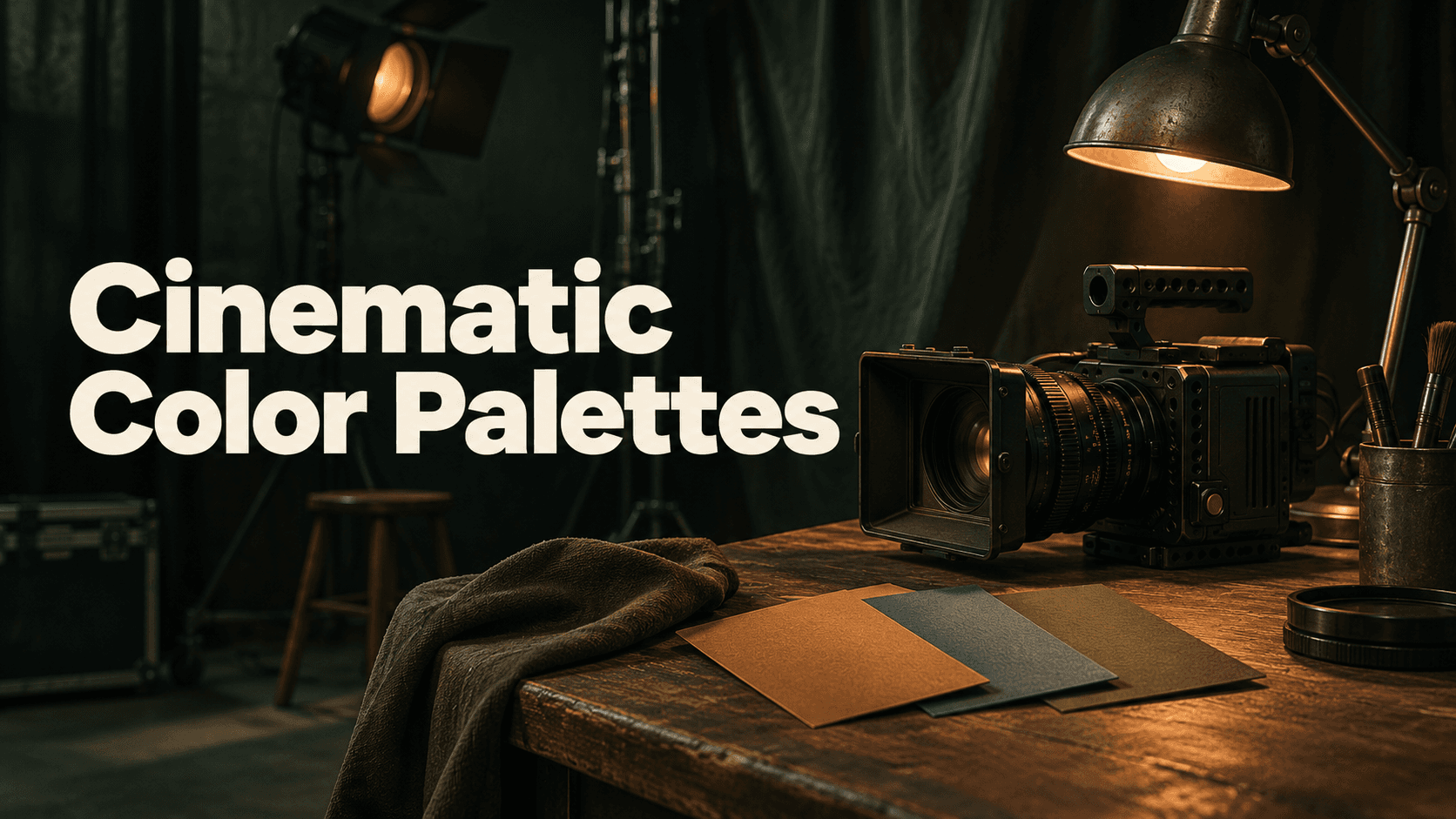
A cinematic color palette is a planned relationship between colors across a scene: which hue dominates, which supports it, where an accent attracts attention, and how light and dark areas stay readable. Choose those roles before chasing a preset name. A palette guides the look; lighting, material, exposure and composition still determine what the viewer sees.
This guide includes four original directions and a tested Astorie workflow for extracting and saving palettes before generating images and video. The results show useful differences and real deviations, rather than exact HEX matching or guaranteed cross-shot consistency.
Four palette directions and when to consider them
Direction | Color roles | Possible story use — an editorial choice | Watch for |
|---|---|---|---|
Warm amber | Brown shadows, amber midtones, golden highlights | A sheltered or intimate night atmosphere | An excessive orange cast or lost neutral detail |
Cool blue-gray | Deep blue shadows, slate midtones, pale blue highlights | Distance, stillness or a restrained exterior | Skin or pale surfaces becoming unnaturally blue |
Warm and cool | Cool environment with a limited warm practical accent | A contrast between shelter and the surrounding street | Both accents competing for attention |
Muted earth neutrals | Dark brown, khaki-gray and subdued warm lights | A grounded, restrained environment | Assuming a source labeled olive will produce a visibly green scene |
These are choices to audition, not universal psychological rules. A warm room can be threatening and a cool scene can feel peaceful; context, performance and contrast matter. A monochromatic direction varies value and saturation within a narrow hue family. Complementary directions place contrasting hues in distinct roles. Analogous directions keep neighboring hues together. None of those relationships requires every pixel to come from a short list of codes.
Build your own palette from a visual brief
Choose the scene and the attention target
Write what the scene must communicate, then name the important subject. For a rain-soaked bus stop, the practical shelter light can become an accent against the street. If every surface is equally bright and saturated, the palette cannot direct attention effectively.
Assign dominant, supporting and accent roles
Use a limited set of colors with enough value separation for the materials to read. Treat proportions as design choices, not fixed percentages that every film must follow. Decide what belongs in shadow, what occupies the midtones and what can catch a highlight.
Select references for color rather than copying their scene
A warm still life can guide a bus-stop look without supplying the bus stop’s geometry. Keep color extraction separate from scene-reference inputs. If you need a particular subject, connect the appropriate scene reference as well and record that extra influence.
Extract and save four workspace palettes in Astorie
In an Astorie Director Image node, open Color palette and choose New palette. Enter a name, upload the color-source images, wait for extraction, inspect the swatches and save. Reopen the Color palette menu and check that the named workspace palette is available and selected. An extraction preview alone does not establish a saved palette.
In the interface inspected for this test, New palette accepted 1–8 PNG, JPEG or WebP images, up to 10 MB each. The actual single-image cases produced six colors; the two-image case produced fifteen. These are observations from the tested interface and inputs, not a guarantee that every future version has the same controls.
Codex prepared three AI-generated still-life sources: a warm amber interior, a cool blue-gray arrangement and an olive/earth arrangement. The built-in image tool did not disclose its model version. They were uploaded only for color extraction, and were not the generated bus-stop scene or real production photographs.
Saved palette | Source images | Extracted colors | Actual source-derived HEX values |
|---|---|---|---|
CP-A-Warm-Amber | 1 | 6 | #2C0F01, #502202, #7F3C09, #AE5A18, #D9812B, #FCC261 |
CP-B-Cool-BlueGray | 1 | 6 | #030A12, #172A3C, #324961, #4D657F, #677E98, #8DABCF |
CP-C-Warm-Cool | 2 | 15 | #04080D, #2F1101, #152637, #532302, #2C4259, #7D3B09, #465E79, #A65414, #617791, #748CA9, #CA7124, #92B2D8, #EE9B39, #FDD073, #E8F4FB |
CP-D-Olive-Earth | 1 | 6 | #130F05, #28200F, #40341D, #584A31, #716247, #928169 |
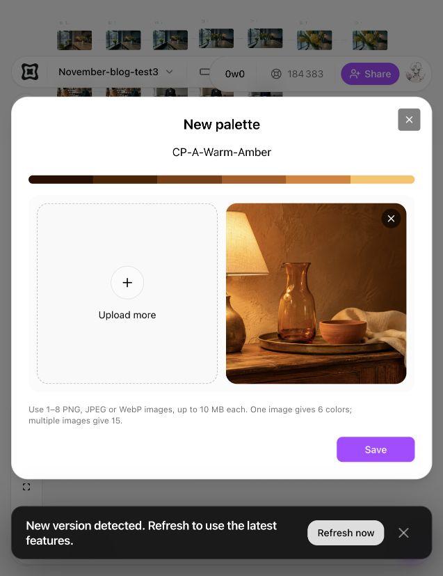
Figure 1. Warm-source extraction preview. This initial preview proves extraction, not persistence; after an unverified save, the source was extracted again and saving was checked in the workspace menu.
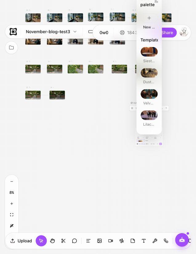
Figure 2. Reopen the Color palette menu after saving to check that your workspace palette is available.
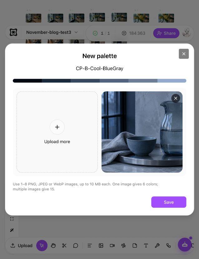
Figure 3. Single cool-source extraction produces six colors in this test.
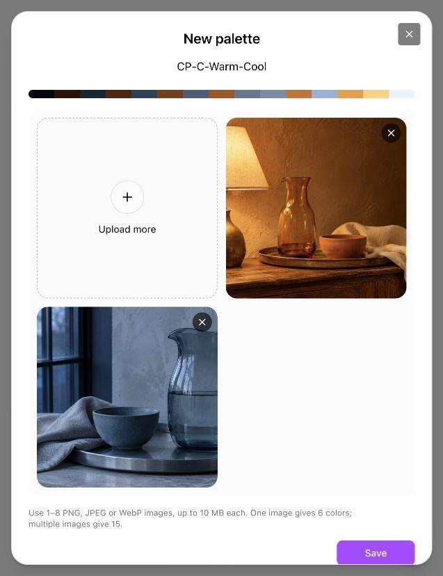
Figure 4. Uploading the warm and cool sources together produces fifteen colors before saving CP-C-Warm-Cool.
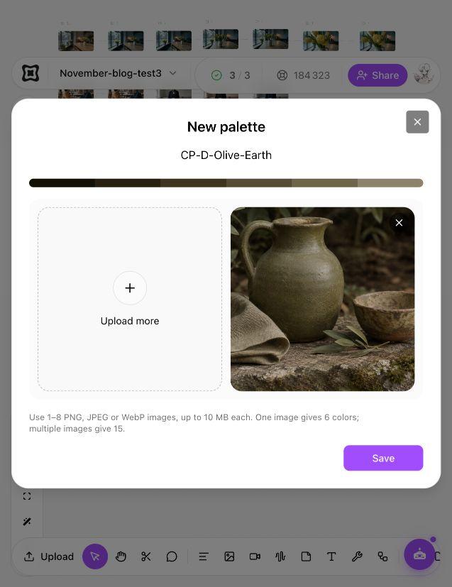
Figure 5. The olive/earth source produces predominantly brown and khaki-gray earth tones; the extracted values matter more than the source label.
Generate the same scene brief with each palette
Codex created one Director Image candidate per saved palette. All four used the same complete scene prompt, World Auto, Camera Auto, Lens Wide deep focus, 16:9 and 1K. The main scene-reference slots stayed empty. Only the selected palette changed in the planned image setup, but independent generation still changed composition and objects.
Original image prompt executed once per palette by Codex
Create one photorealistic cinematic wide still of an empty covered bus stop on a rainy city night.
Use an eye-level view from the nearby sidewalk. Place a simple glass-and-metal bus shelter in the middle-right of the composition, with one plain wooden bench inside. Show wet paving across the foreground, a few small puddles, and believable reflections from a modest practical light inside the shelter and subdued streetlights farther away. A closed plain black umbrella leans beside the right end of the bench. Keep the street and background architecture simple, with plausible straight lines, grounded objects and clear spatial relationships.
Use the selected Color palette as the overall color direction for highlights, midtones and shadows. Keep the lighting physically believable and the materials recognizable as glass, metal, wood and wet paving. Preserve readable shadow detail and controlled highlights rather than flattening the image into blocks of color or applying a posterized effect.
No people, vehicles, buses, advertisements, readable text, route numbers, letters, logos, watermarks, borders or interface graphics. Produce one coherent cinematic still, not a collage, storyboard or color chart.
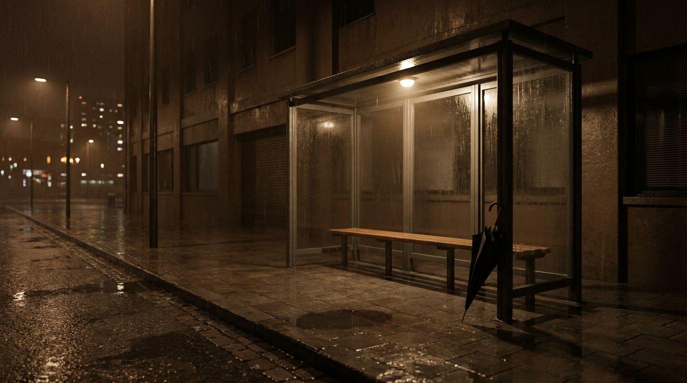
Figure 6. Warm amber candidate: a brown/amber rain-night scene with a readable shelter, bench and closed umbrella.
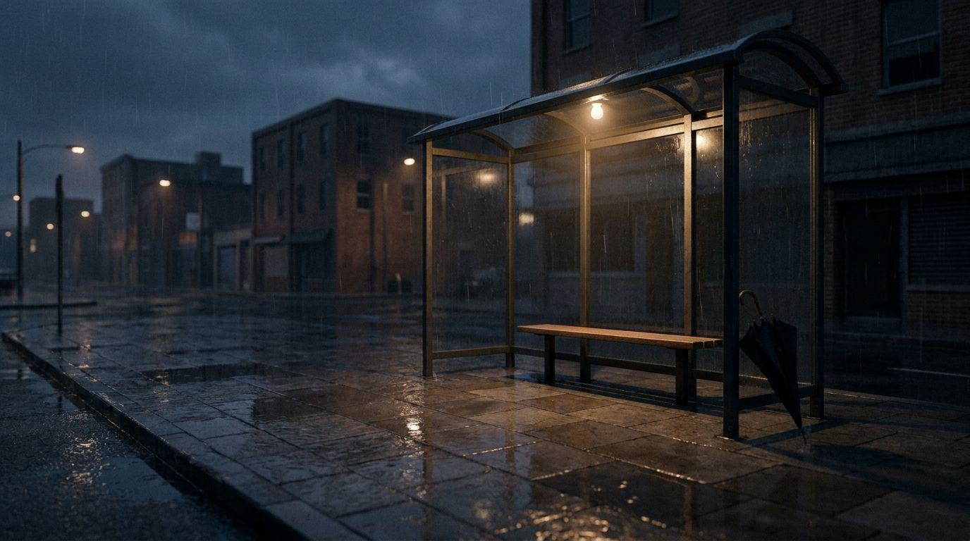
Figure 7. Cool blue-gray candidate, with a warm practical lamp retained inside the shelter. Its framing differs from the warm candidate.
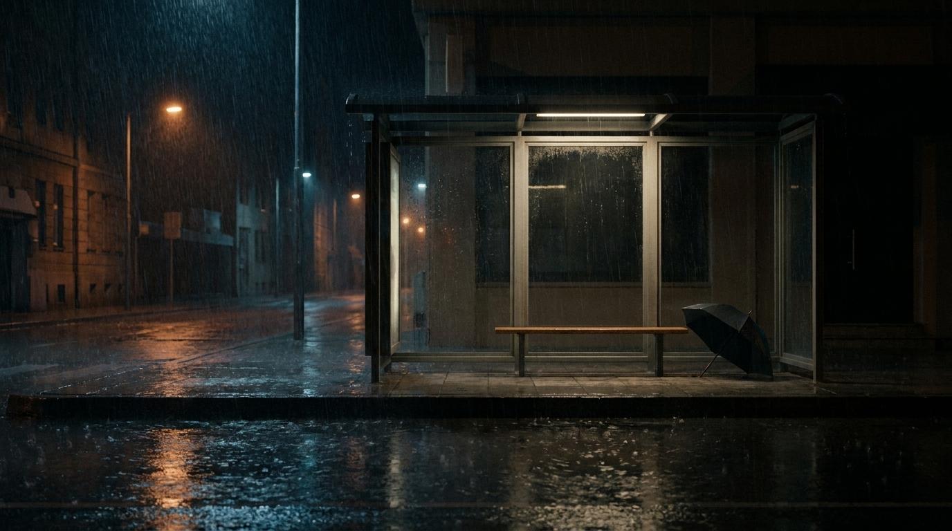
Figure 8. Warm/cool combined-palette candidate. The umbrella is open despite the prompt requesting it closed; this first-run deviation was retained.
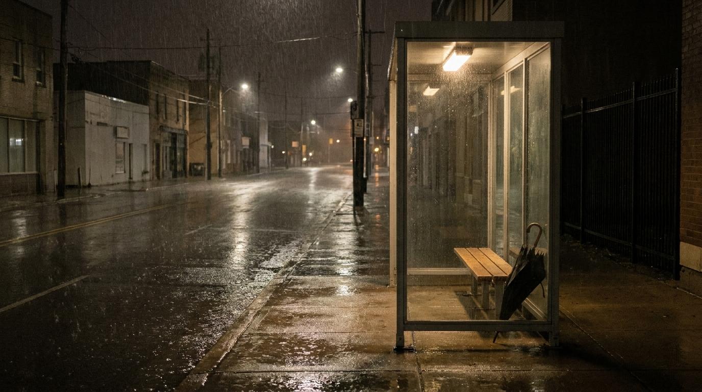
Figure 9. Earth-neutral candidate. The result is restrained brown/gray, rather than a strongly green look.
Use the candidates to choose an atmosphere and identify what to revise. The different shelter framing and umbrella state prevent a fixed-composition, color-only comparison. No color chart, calibrated measurement or pixel-level HEX compliance was tested.
Carry a selected direction into a video candidate
Codex connected the warm image to one Director Video node and the cool image to another, selecting the corresponding saved palette in each. Both used World Auto, Camera Auto, Movement Static, Lens Wide deep focus, 16:9, 720p, 5s and Real-time. The reference area showed 1/25; this was a scene reference, not a verified first-frame lock.
These Director runs were chosen to test the exposed Color palette control. They do not establish how an untested model would interpret the same swatches. Because the two videos use different scene images as well as different palettes, they are creative examples rather than an isolated test of the palette’s effect.
Original video prompt executed once for each warm and cool branch
Create one continuous 5-second photorealistic cinematic wide shot of the empty covered bus stop on a rainy city night, using the connected bus-stop image as the visual scene reference.
Use a locked-off static camera at eye level with a wide deep-focus composition. Keep the glass-and-metal shelter, wooden bench, closed black umbrella, background buildings and wet paving recognizable and spatially coherent. Show only subtle natural rain, small raindrops moving on the glass and restrained ripples in the puddles. Keep the bench, umbrella and architecture still.
Use the selected Color palette as the overall color direction across the whole shot. Preserve believable practical lighting, controlled highlights, readable shadows and recognizable glass, metal, wood and wet paving. Do not cycle between color looks.
No camera movement, cuts, transitions, focus pulls, flickering lights, new objects, people, vehicles, buses, advertisements, readable text, route numbers, letters, logos or watermarks. No voiceover or music. Produce one calm coherent shot, not a montage.
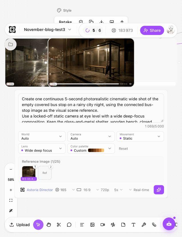
Figure 10. Completed warm Director Video node, corresponding image reference and warm Custom palette.
Warm bus-stop video generated by Codex with Astorie Director, the warm scene reference and CP-A-Warm-Amber; complete original output.
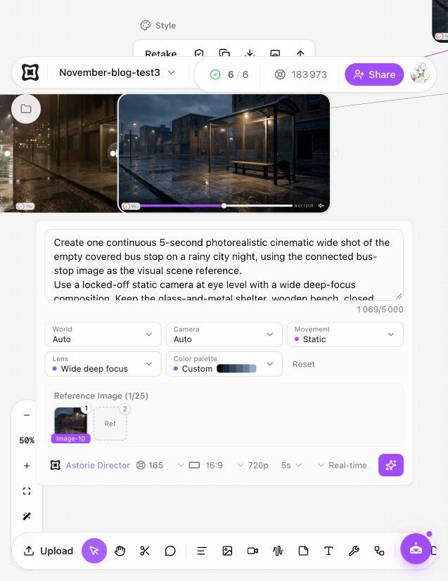
Figure 11. Completed cool Director Video node with the cool reference and palette, using the same other settings.
Cool bus-stop video generated by Codex with Astorie Director, the cool scene reference and CP-B-Cool-BlueGray; complete original output.
Inspect the result before adopting the palette
Wait for completion, preview the result and use Download on the node toolbar to retain the original image or MP4. Compare highlights, midtones, shadows and important materials. Then play the whole video to look for changing color, light flicker, new objects and unstable reflections. A warm first frame alone does not establish a consistent five-second look.
In eleven sampled frames per video, the shelter, bench and umbrella remain broadly recognizable. The warm scene stays visibly amber/brown, while the cool scene retains blue-gray surroundings and a warm practical light. These samples do not certify every frame, motion quality, exact geometry or audio.
When the reference is a moment from existing footage, the frame extraction guide explains how to keep that still with its source. For several related shots, use multi-shot reference planning and review the color relationship across the proposed cuts. A saved palette does not by itself lock a sequence.
What this changes in a production workflow
Instead of describing a look from memory for every candidate, this workflow saves named swatches, applies them before generation and keeps the related image and video branches on one canvas. It supports look development without turning the article into a traditional color-software tutorial.
The case does not prove that one prompt completes color design or finishing. It involved three prepared sources, four extractions, a warm-palette save retry, four image runs and two video runs. The image quotes were 20 credits each and video quotes 165 each: 4×20 + 2×165 = 410 quoted credits, excluding source preparation. Workspace balance observations were recorded, but itemized actual charges and a conventional time comparison were not verified.
Frequently asked questions
What makes a palette cinematic?
Its relationship to the scene, attention and story. A limited set of hues can help, but contrast, lighting, material and context matter more than copying famous colors.
Can I use HEX values to guarantee the generated colors?
Not from this test. The codes record extracted swatches. The outputs were not calibrated or verified to contain only those exact values.
Is a color palette the same as color grading?
A palette plans color relationships. Grading changes the look of footage. Here the saved palette guided new image and video generation before any tested finishing grade.
Why did the olive source look mostly brown?
The actual extraction returned dark earth and khaki-gray values. The selected source name is not a promise of a green result; inspect the extracted values and output.
How many references should I upload?
Choose enough to express the intended color relationships without mixing unrelated looks. This test used one source for each six-color palette and two together for the fifteen-color palette; it did not establish a universal optimal count.
Test method and sources
Codex performed the four palette saves, four Director Image runs and two Director Video runs in Clara’s specified Astorie project on November 17, 2026. Every planned paid generation ran once with the logged complete prompt. Director did not expose the underlying model version. The palette extraction retry did not regenerate an image or video.
Images downloaded as 1376×768 JPEG files. Both H.264 videos are 1280×720, 24 fps, approximately 5.042 seconds and 121 decoded frames, with one audio track. All video frames decoded without error; eleven stills per clip were inspected at half-second intervals. No complete normal-speed, audio listening or calibrated color review was performed. The extracted values, settings and results are original observations from these tests; general color-role suggestions are editorial recommendations.
Ready to try it on the canvas?
Open Astorie and fan your prompt across every frontier model in one workflow.