

How to Create an AI Mood Board [Prompts, Examples, and Models]
I created 48 brand mood boards to bring you the right AI mood board generation workflow, the exact prompt structure, 10 copy-ready prompts, and the 3 best AI image models for the task.
Key takeaways
A mood board holds your palette, typography, and photography direction on one page. It works as the visual reference for creative production.
Image-to-image workflows work better for mood boarding as compared to text-to-image and basic prompting.
GPT Image 2 is the best AI image generation model for mood boards because of prompt accuracy, text rendering, hex code intelligence and layout handling. Use Nano Banana Premium for editing and Seedream 5 Lite for initial concepts.
A mood board prompt should specify canvas color, aspect ratio, photo count, lighting and grade, hex codes, and typefaces.
Creating AI mood boards on creative workflow tools helps users establish complete creative production pipelines from approved visual references.
A mood board fixes your palette, typography, and photography direction in one frame so every team member who touches the brand works from the same reference.
Instead of a folder of loose screenshots, you get a single composed page: swatches with hex values printed underneath, type specimens showing the actual faces at display size, and a photo grid graded the way the campaign will be graded.
Building a mood board for a new brand in Figma or Canva used to mean an afternoon and 33 Pinterest tabs.
Now you can generate a finished board from a single prompt, run six directions in the time it took to assemble one, and hand your team or client something to react to on the same call.
What is a mood board?
A mood board is a single-page visual decision document. It carries three things:
- the color palette with exact values,
- the typeface pairing with names attached
- and a set of photographs that show 'lighting'
A brand mood board can also include marketing assets like logo, icons and patterns.
Why should you build a mood board?
- A mood board helps with team input and feedback, and explains creative tasks better than plain text briefs.
- Marketing collaterals for example, social media posts can follow a visual direction with mood boards for consistency.
- With a mood board as a creative reference, marketing teams can save on billable design hours.
- Mood boards work as a design input with AI image generators and ad makers.
- Professional users and marketers using node-based workflow tools for creative production can start one canvas with the mood board and use it as reference for images, videos, social media posts, advertisements, product packaging, and lifestyle shots.
Mood board vs concept board vs brand guidelines
| Mood board | Concept board | Brand guidelines | |
|---|---|---|---|
| Answers | What should this feel like | What are we making | How do we use this correctly |
| Format | One page | One deck or board per idea | Multi-page document or site |
| Color | Hex swatches for feel | Applied in sample layouts | Full values across print and screen |
| Typography | Faces shown at display size | Set in real headlines | Complete scale with usage rules |
| Scope | Brand level | Campaign level | Brand level |
| Lifespan | Years | One project | Until the next rebrand |
| Stage | Before approval | After direction, before production | After approval |
| Built for | Aligning taste | Selling an idea | Enforcing consistency |
3 best AI mood board generators
A mood board needs the right text, characters, photography, color palette and visual style. That's why only limited AI image models can generate mood boards. I can write a comprehensive prompt with vivid details, but if hex code intelligence, text rendering or art styles are not the strongest features of a specific AI image model, it will struggle and waste your time as well as credits.
So, after creating 48 AI mood boards on Astorie with prompts of varying lengths, each containing different text and image inputs, typography instructions, and hex code instructions, here are three tools I can confidently recommend:
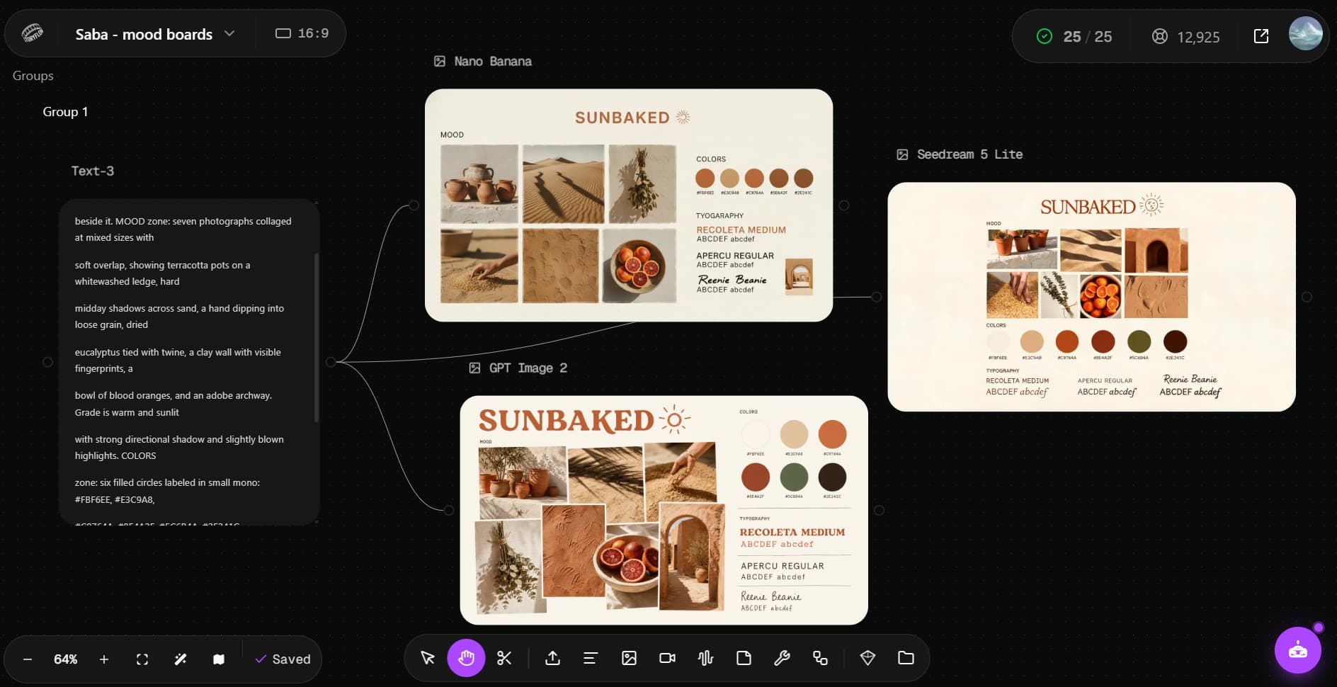
1. GPT Image 2
OpenAI's GPT Image 2 is easiest to prompt in text-to-image and image-to-image workflows. It understands prompts, hex codes, color clues, text instructions, layout directions and AI art styles. And mood boards live and die on these factors. This model that render the mood board correctly on the first attempt, at least 9 out of 10 times. That's 90% accuracy. For the remaining 10%, we have photo editing powered by Nano Banana Premium.
2. Nano Banana Premium
Nano Banana Premium (including others in the series) already boasts real-world intelligence and that's why it renders colors and visual aesthetics like no other AI image model, yet! But its best feature for mood boards is the prompt-based image editing. Once a board is close but one swatch is wrong or a single photograph in the grid misses, Nano Banana changes that element while leaving the rest of the composition untouched. Regenerating a whole board even on the cheapest models will be a hit or miss, while editing with Nano Banana Premium will preserve the version you liked or your team approved.
3. Seedream 5 Lite
Seedream 5 handles generation volume. If you are a power-user, for example in an agency, you breathe mood boards. And when you want six directions in front of a client rather than one, generate them here first, pick the two worth developing, then rebuild those in GPT Image 2 with clean type. Seedream 5's AI mood boards are also beautiful, but I prefer running the first renders via GPT Image 2 in my canvas.
Note: Redditors often compare Flux and Midjourney as mood boarding tools. My tests, however, revealed that both of these AI image tools failed at rendering mood boards the way they should be.
Midjourney v7 generated images with illegible text. It could not even place hex codes and swatches properly. Flux 2 Pro did create mood boards, but all of them had serious layout issues.
Recommended Read: AI image models for brand visuals
2 common AI mood board generation workflows
1. Text-to-image
Write the full board description and generate cold. This is the right approach when the direction lives in your head and you want to visualize the first reference.
The sequence: write the prompt with named zones, generate at 16:9 or 1:1. Check whether the type rendered legibly, and edit if the labels came out garbled. It's better to generate 2-3 variants in the first pass, so you can quickly pick one that matches your vision.
2. Image-to-image
Start from one photograph you already love. A campaign still, a piece of packaging, a room shot, a frame from a film. The model extracts the palette and extends the world around it, which gets you a board that's anchored to something real rather than to a description of something real.
You can try with a basic prompt, for example:
"Create a mood board inspired by this image."
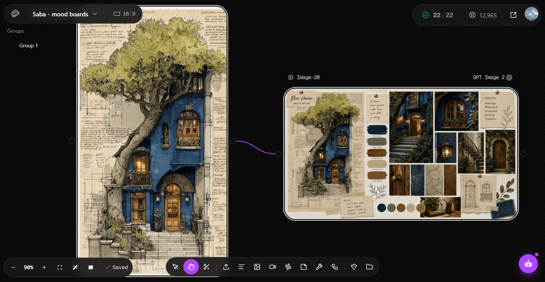
Or, you can write a comprehensive prompt if you want variations:
"Use the attached image as the visual reference. Build a brand moodboard on a warm cream canvas (#FBF3EA). Header reads "SUN-BLEACHED" in a soft rounded serif, warm coral, top left aligned. MOOD zone: a loose 3x2 grid of six photographs with thin white gutters, extending the world of the reference: backlit cumulus clouds at golden hour, a pale pink inflatable resting on wet sand, a close crop of teal ocean foam, two figures walking toward the water in silhouette, beaded bracelets on a sun-tanned wrist, and a striped towel folded on pale sand. All images share the reference grade: warm golden backlight, soft atmospheric haze, pastel saturation, gently blown highlights, fine film grain. COLORS zone: six filled circles in a row pulled from the reference, each labeled beneath in small monospace type: #F4BFCB, #FBF3EA, #F6C98D, #4E9E92, #E3D4BE, #5C6B7A. TYPOGRAPHY zone: three specimens stacked left aligned, reading "RECOLETA MEDIUM" in a warm rounded serif at large size, "APERCU REGULAR" in a friendly sans beneath it, and "Caveat" in a casual handwritten face, each followed by ABCDEF abcdef 0123. Small uppercase letter-spaced section labels reading MOOD, COLORS, TYPOGRAPHY. Flat graphic design, generous white space, balanced grid alignment"
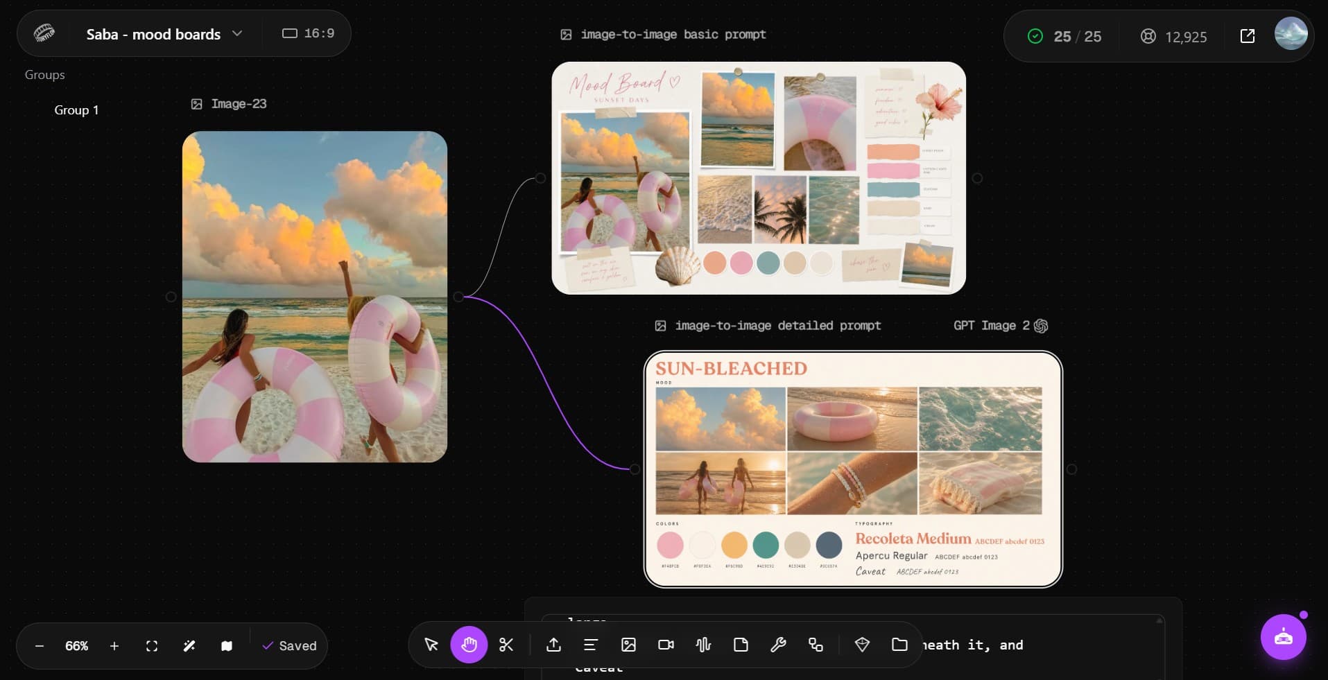
This workflow is the faster one when your manager or client has already sent you something they like. Take their reference, build the board around it, and you've turned a vague "something like this" into a specification within an hour.
The right mood board prompt structure
Based on visual quality, there can be two types of mood boards: one that resembles a collage with photos taken from here and there, and one that looks intentionally designed.
To create the latter, here are six elements you definitely need in the prompt:
- A canvas color and format
State the ground color explicitly and specify an aspect ratio: 1:1 or 16:9. I created all the mood board examples in this blog at 16:9 to balance against the blog interface.
- Elements
Write MOOD, COLORS, and TYPOGRAPHY into the prompt as literal section labels. This forces the layout into bands and stops the model from scattering elements.
- A photo count
"Six photographs showing X, Y, Z" will render a grid. "Some lifestyle images" will render a rough-looking collage.
- Lighting and grade
You can make the nine separate images read as one shoot with a single sentence describing lighting and color treatment.
- Exact hex codes
Write the values into the prompt and ask for them printed beneath each swatch. Even when the model renders the digits imperfectly, having them in the prompt pulls the swatch colors closer to what you specified. AI image tools like GPT Image, Nano Banana and Seedream 5 can understand hex codes.
- Typefaces
Name the faces and follow each with ABCDEF abcdef 0123 so the specimen has some material to display in typography.
- Negative prompt (optional)
Blocking watermarks, tilted frames, and cluttered overlap: add them as negative prompts.
Most niche categories need more components: fashion boards need fabric, interiors need finishes, and food brands need ingredients. Add a MATERIALS band with four or five swatches and a label under each.
How to create a mood board with AI
Here is a quick, 5-step guide to building a mood board with an AI image generator:
1. Pick one anchor word for your mood board.
Decide what the board is for and choose a single keyword: quiet, sunbaked, electric. Every element you add afterwards should support the aesthetics.
2. Choose a workflow.
You will need a text prompt for text-to-image, and an image reference for image-to-image.
3. Write the prompt with named zones.
Specify canvas color, aspect ratio, photo count, lighting and grade, hex codes, and typefaces. Named zones instruct AI image generators to create a layout so a mood board doesn't end up looking like a photo collage.
4. Generate and edit.
Choose GPT Image 2 for generating your mood board. Use Nano Banana Premium to fix minor errors in element placement, hex code or typography. Generate a variant with Seedream 5 Lite or GPT Image 2 if the mood board doesn't match the prompt or your vision.
5. Export or reuse.
Save your new mood board as a production reference. You can use this node when creating brand assets, marketing collaterals and advertisements.
AI mood board examples with prompts
1. Quiet luxury
The palette is just five neutrals, oat to near-black, and that restraint convinces a nervous stakeholder that expensive can look this quiet. This is a great mood board to begin brainstorming the visuals for a skincare, interior design or high-end apparel brand.
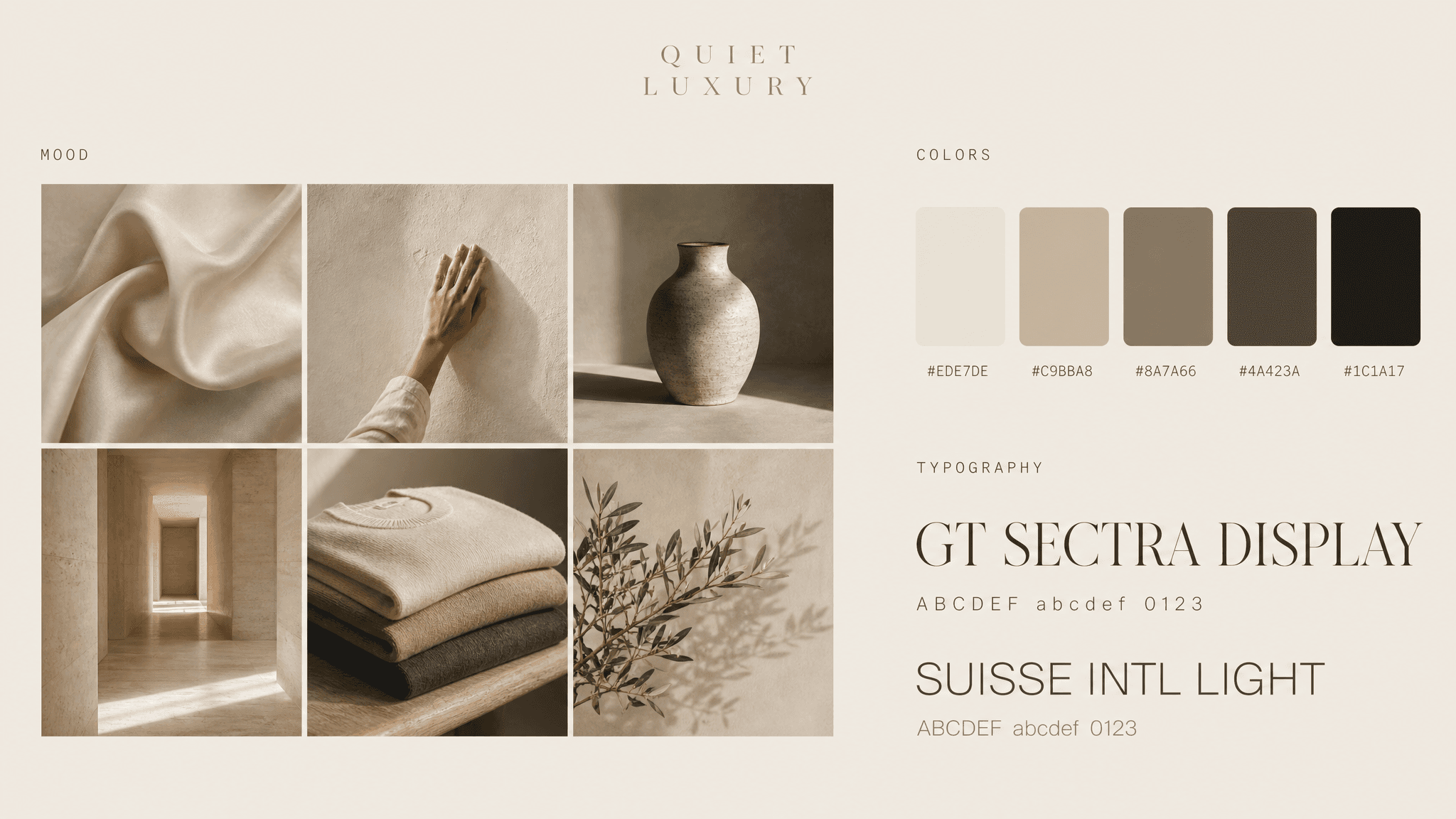
"Brand moodboard on a warm oat canvas (#EDE7DE). Header reads "QUIET LUXURY" in a wide-tracked light serif, small and centered. MOOD zone: a loose 3x2 grid of six photographs with thin white gutters, showing draped raw silk in oyster tone, a hand resting on a limewashed plaster wall, a single ceramic vessel lit from one side, an empty travertine hallway, folded cashmere on a bench, and olive branches against a bare wall. Grade is soft, warm, low contrast, highlights gently rolled off. COLORS zone: five filled squares with rounded corners in a row, labeled beneath in small mono: #EDE7DE, #C9BBA8, #8A7A66, #4A423A, #1C1A17. TYPOGRAPHY zone: two specimens stacked, reading "GT SECTRA DISPLAY" in an elegant serif at large size and "SUISSE INTL LIGHT" in a refined sans beneath, each with ABCDEF abcdef 0123 in small grey type."
2. Dramatic and nostalgic
The burgundy and blush palette against pure black carries weight without shouting, and the mixed portrait and still life collage tells a photographer exactly how much shadow you're willing to live with.
.png&w=3840&q=75)
"Brand moodboard on a warm bone canvas (#F4F1EC). Header reads "DRAMATIC & NOSTALGIC" in a bold black condensed sans, with "nostalgic" set in a flowing burgundy script that overlaps the sans. MOOD zone: an asymmetric collage of seven photographs at varying sizes, edges overlapping slightly. Content includes a black and white portrait of a woman in a white blouse, palm frond shadows cast on a plaster wall, a linen bedsheet still life with dried stems, an espresso cup on marble shot from above, split figs on a ceramic plate, and a wristwatch on a folded cuff. All images share a desaturated warm grade with lifted blacks and soft film grain. COLORS zone: four large filled circles in a row, each labeled beneath in small monospace type: #000000, #751A15, #C3907F, #C38F99. TYPOGRAPHY zone: three specimens stacked left aligned, reading "CANELA DISPLAY" in a high-contrast serif at large size, "NEUE HAAS GROTESK" in a clean sans below it, and "Vidaloka Italic" in a script, each followed by the string ABCDEF abcdef 0123."
3. Material and texture mood board
I created this mood board with an image-to-image workflow. You'll see the result is solid, but only because the input image had strong material language.
.png&w=3840&q=75)
"Use the attached image as the visual reference. Build a full brand moodboard on a warm cream canvas (#F5F0E8), 16:9, arranged as a tight grid of labeled panels with thin cream gutters between them. Upper left, occupying roughly 40% of the canvas: the hero image, a wide embroidered countryside scene in the exact style of the reference, showing a teal cottage with an orange tiled roof and a red door, a pink blossom tree in the foreground, rolling green fields, a block of golden orange wheat, a wooden post-and-rail fence, and a pale winding path scattered with small pearls. Rendered entirely as raised thread work: satin stitch, French knots, and couched wool on linen, with visible fibre texture and soft shadow between stitches. Directly right of the hero, a vertical COLOR PALETTE column on cream with the label in small letter-spaced uppercase serif at the top, holding seven filled circles stacked vertically, each with its hex code beside it in small grey uppercase mono: #E3A7A6, #6FAAA6, #12635D, #E48C2A, #A9B787, #E9E2D6, #8C5A2B. Upper right: a 3x2 grid of six square detail crops from the same embroidered world, showing a close crop of the pink blossom tree in French knots, the teal cottage front with potted plants, rolling hills in layered greens, a macro of the golden wheat field texture, the wooden fence against wheat, and loose pearls scattered on pale stitched ground. Lower middle band, split into two panels. Left panel labeled MOOD & FEEL in small uppercase serif, listing in a flowing green script: Whimsical, Peaceful, Nostalgic, Handcrafted, Warm & Inviting, with a small embroidered sprig beside it. Right panel labeled MATERIALS & TEXTURES, holding five circular swatches in a row with small uppercase labels beneath: EMBROIDERY in deep teal thread, KNIT / FRENCH KNOTS in pink, LINEN in natural weave, WOOD in warm grain, PEARLS in cream. Bottom left panel labeled PATTERN & MOTIFS: five small embroidered icons in a row on cream, showing a blossom tree, a cottage, a fence, a flowering stem, and a winding path. Bottom middle panel labeled INSPIRATION NOTES: a bulleted list in small serif reading Countryside charm, Storybook living, Handmade details, Nature in bloom, Comfort & simplicity, with a small embroidered floral sprig beside it. Bottom right panel labeled APPLICATION IDEAS: five circular product mockups in a row with uppercase labels beneath, showing WALL ART in an embroidery hoop, THROW PILLOW, TOTE BAG, JOURNAL COVER, and HANDMADE GIFTS, each carrying the embroidered motifs. Flat graphic design layout, no drop shadows on the panels themselves, crisp print-quality rendering, balanced grid alignment, generous breathing room, 16:9 canvas."
4. Modern tech editorial
Most dark palettes collapse into grey mud, but this one keeps five values clearly separated before the coral accent even arrives. If you're working on a SaaS, AI, or fintech brand that ships a dark-mode interface, this board helps the marketing site agree with the product from day one.
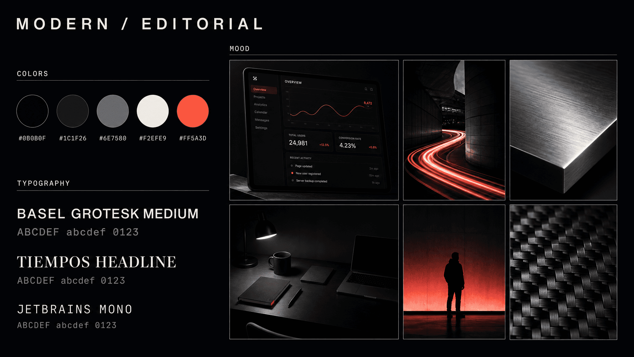
"Brand moodboard on a near-black canvas (#0B0B0F). Header reads "MODERN / EDITORIAL" in a bone-white geometric sans, wide letter spacing. MOOD zone: an asymmetric collage of six images with thin hairline borders, showing a dark-mode interface on a screen, a long-exposure light trail through architecture, a macro shot of brushed aluminum, an overhead desk scene lit by a single lamp, a figure silhouetted against a gradient wall, and a close crop of woven carbon texture. Grade is high contrast with crushed blacks, cool shadows, and one recurring electric coral accent. COLORS zone: five filled circles in a row against the dark ground, each labeled beneath in bone-white mono: #0B0B0F, #1C1F26, #6E7580, #F2EFE9, #FF5A3D. TYPOGRAPHY zone: three specimens left aligned in bone white reading "BASEL GROTESK MEDIUM", "TIEMPOS HEADLINE", and "JETBRAINS MONO", each with ABCDEF abcdef 0123 beneath in muted grey."
5. Sunbaked organic
Notice this hard directional shadow here; specifying it on the board saves a real argument later when someone wants to soften every shot into overcast neutrality. Use it when the brand has a material story worth showing in raking light.
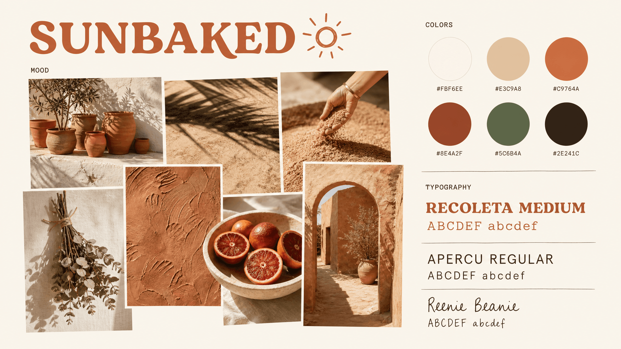
"Brand moodboard on a cream canvas (#FBF6EE). Header reads "SUNBAKED" in a warm terracotta rounded serif with a small hand-drawn sun mark beside it. MOOD zone: seven photographs collaged at mixed sizes with soft overlap, showing terracotta pots on a whitewashed ledge, hard midday shadows across sand, a hand dipping into loose grain, dried eucalyptus tied with twine, a clay wall with visible fingerprints, a bowl of blood oranges, and an adobe archway. Grade is warm and sunlit with strong directional shadow and slightly blown highlights. COLORS zone: six filled circles labeled in small mono: #FBF6EE, #E3C9A8, #C9764A, #8E4A2F, #5C6B4A, #2E241C. TYPOGRAPHY zone: three specimens reading "RECOLETA MEDIUM" in a warm rounded serif, "APERCU REGULAR" in a friendly sans, and "Reenie Beanie" in a casual handwritten face, each with ABCDEF abcdef beneath."
6. Nordic clean
I prompted this mood board especially for furniture, minimal apparel, health tech, and productivity brands. The strict 3x3 grid with wide gutters is doing real work: it demonstrates that the brand's confidence comes from spacing rather than from color, which is the hardest thing to explain in a written brief.
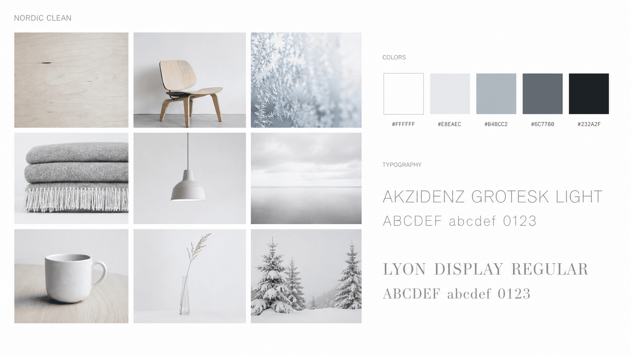
"Brand moodboard on a pure white canvas. Header reads "NORDIC CLEAN" in a light grotesque, small, top left aligned. MOOD zone: a precise 3x3 grid of nine photographs with wide even white gutters, showing pale birch grain, a bent plywood chair against a blank wall, frost on glass, a stack of grey wool blankets, a bare pendant lamp, still water under overcast sky, a white ceramic mug on a pale oak table, a single stem in a slim vase, and snow-covered pine. Grade is cool, bright, minimal contrast, soft overcast light throughout. COLORS zone: five filled squares labeled beneath in small mono: #FFFFFF, #E8EAEC, #B4BCC2, #6C7780, #232A2F. TYPOGRAPHY zone: two specimens stacked reading "AKZIDENZ GROTESK LIGHT" and "LYON DISPLAY REGULAR", each followed by ABCDEF abcdef 0123 in pale grey."
7. Gilded heirloom
Maroon and gold is the oldest luxury pairing there is and it works for premium spirits: fine jewelry, heritage hospitality, luxury events, and wedding brands. Anchor it in real materials, velvet, brass, pomegranate, and keep the richness attached to something tactile.
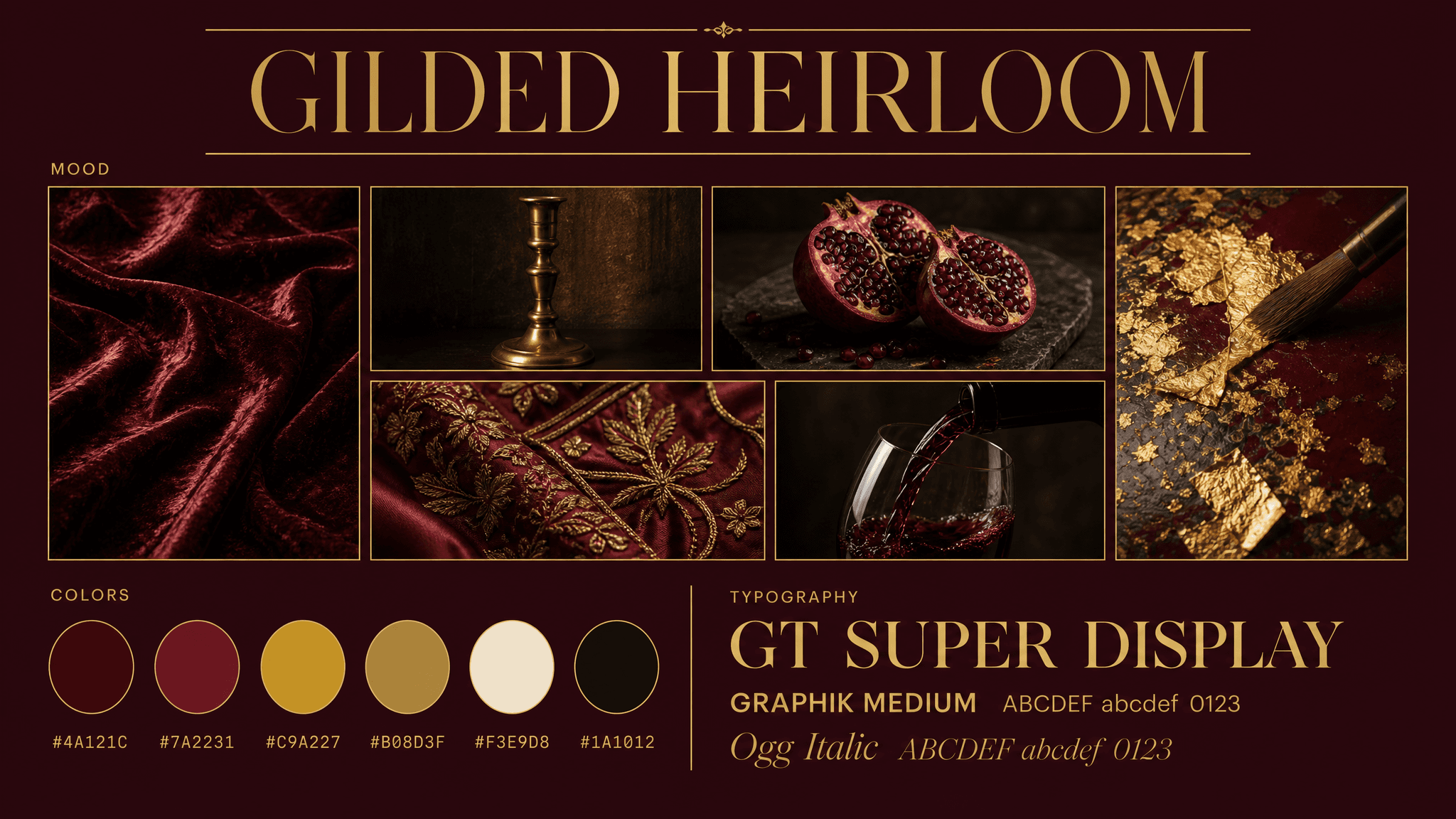
"Brand moodboard on a deep maroon canvas (#4A121C). Header reads "GILDED HEIRLOOM" in an antique gold high-contrast serif, centered, with fine gold hairline rules above and below. MOOD zone: an asymmetric collage of six photographs with thin gold borders, showing crushed burgundy velvet catching low light, a brass candlestick against a dark wall, a split pomegranate on a dark stone slab, gold leaf applied to a lacquered surface, embroidered silk with metallic thread, and a dark wine pour caught mid-motion. Grade is warm and low-key with deep shadow, gold specular highlights, and rich saturated reds. COLORS zone: six filled circles in a row, each labeled beneath in small gold monospace: #4A121C, #7A2231, #C9A227, #B08D3F, #F3E9D8, #1A1012. TYPOGRAPHY zone: three specimens stacked left aligned in gold, reading "GT SUPER DISPLAY" in a high-contrast serif at large size, "GRAPHIK MEDIUM" in a clean sans below it, and "Ogg Italic" in an elegant italic, each followed by ABCDEF abcdef 0123."
8. Coastal clay
Teal and terracotta sit opposite each other on the wheel, so the palette carries built-in tension that neutral boards lack. Creatives, take notes: cool for the environment, warm for product.
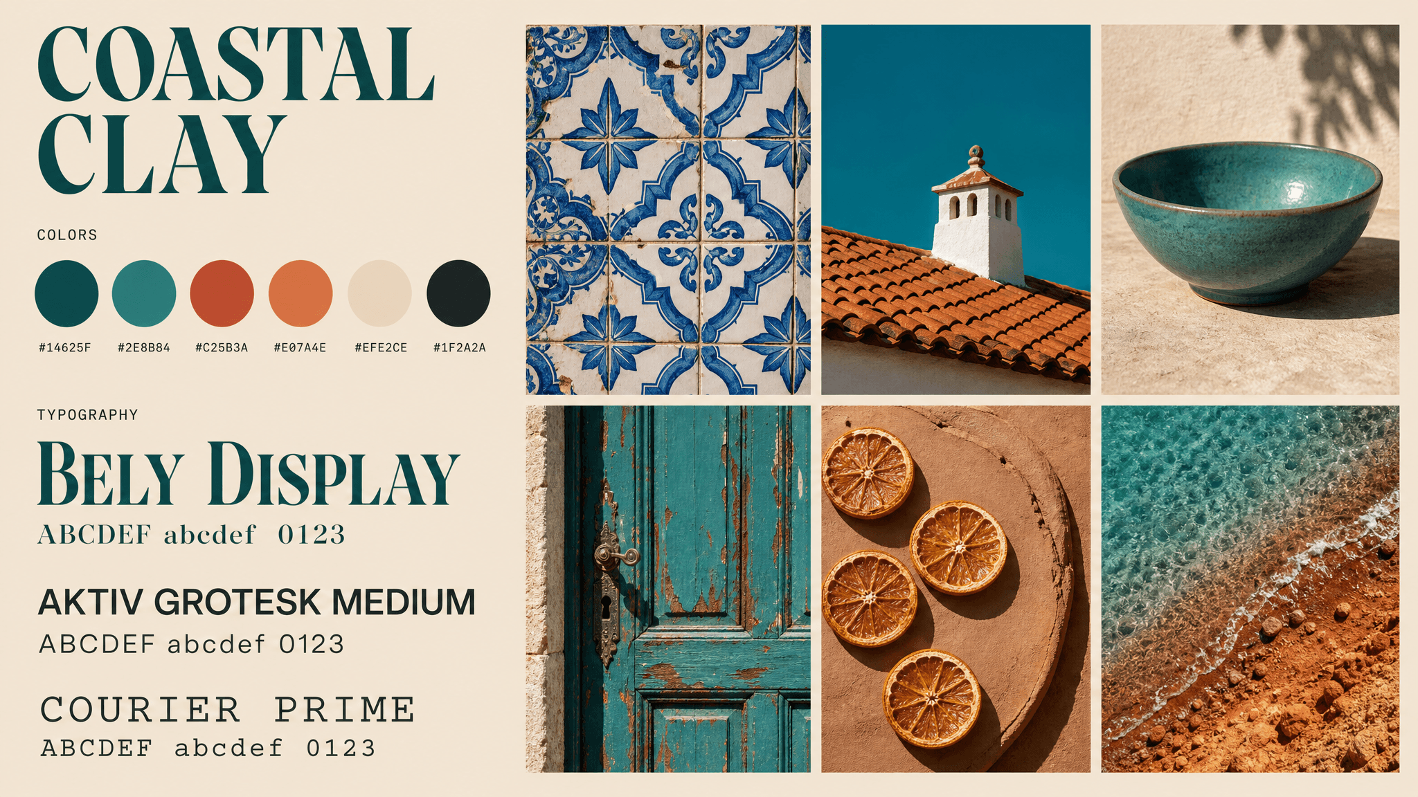
"Brand moodboard on a warm sand canvas (#EFE2CE). Header reads "COASTAL CLAY" in a deep teal display serif, top left aligned. MOOD zone: a loose 3x2 grid of six photographs with thin cream gutters, showing patterned azulejo tile in blue and white, a terracotta roof against a clear teal sky, a glazed ceramic bowl in matte teal, a weathered painted door in teal with rust bleeding through, dried orange slices on raw clay, and turquoise shallows meeting a red-earth shore. Grade is bright Mediterranean daylight, high saturation, hard shadow, slightly warm highlights. COLORS zone: six filled circles in a row, labeled beneath in small mono: #14625F, #2E8B84, #C25B3A, #E07A4E, #EFE2CE, #1F2A2A. TYPOGRAPHY zone: three specimens stacked, reading "BELY DISPLAY" in a characterful serif at large size, "AKTIV GROTESK MEDIUM" in a clean sans, and "COURIER PRIME" in a mono, each with ABCDEF abcdef 0123 beneath."
9. High voltage
Fuchsia against cobalt is the loudest pairing on this list and the hardest to keep from looking cheap. Gel lighting and reflective surfaces are what separate it from a gradient template, so the photography direction is doing most of the work here.
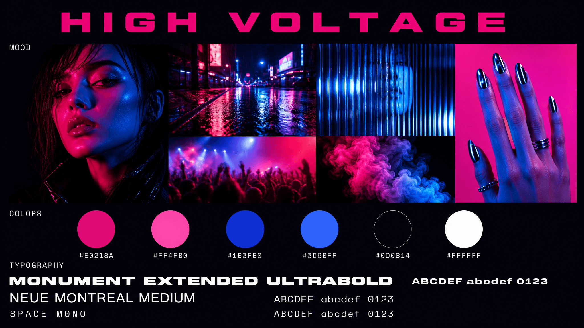
"Brand moodboard on a near-black canvas (#0D0B14). Header reads "HIGH VOLTAGE" in an extended bold sans, electric fuchsia, wide letter spacing, centered. MOOD zone: an asymmetric collage of six images with no borders, edges tight together, showing a portrait lit by hard fuchsia gel from one side and cobalt from the other, neon reflected on wet asphalt, cobalt light refracted through ridged glass, a hand with chrome nails against a hot pink ground, a blurred crowd under stage light, and colored smoke against a dark backdrop. Grade is high saturation with crushed blacks, strong color separation, and visible digital sharpness. COLORS zone: six filled circles in a row, labeled beneath in white monospace: #E0218A, #FF4FB0, #1B3FE0, #3D6BFF, #0D0B14, #FFFFFF. TYPOGRAPHY zone: three specimens left aligned in white, reading "MONUMENT EXTENDED ULTRABOLD" at large size, "NEUE MONTREAL MEDIUM" below it, and "SPACE MONO" in a mono, each followed by ABCDEF abcdef 0123."
10. Market day
Red and green defaults to Christmas the second you use pure versions of either, so this board uses tomato against olive and forest rather than scarlet against emerald. And I would use this one for food and beverage, delis and grocers, natural wine, and hospitality with a heritage angle.
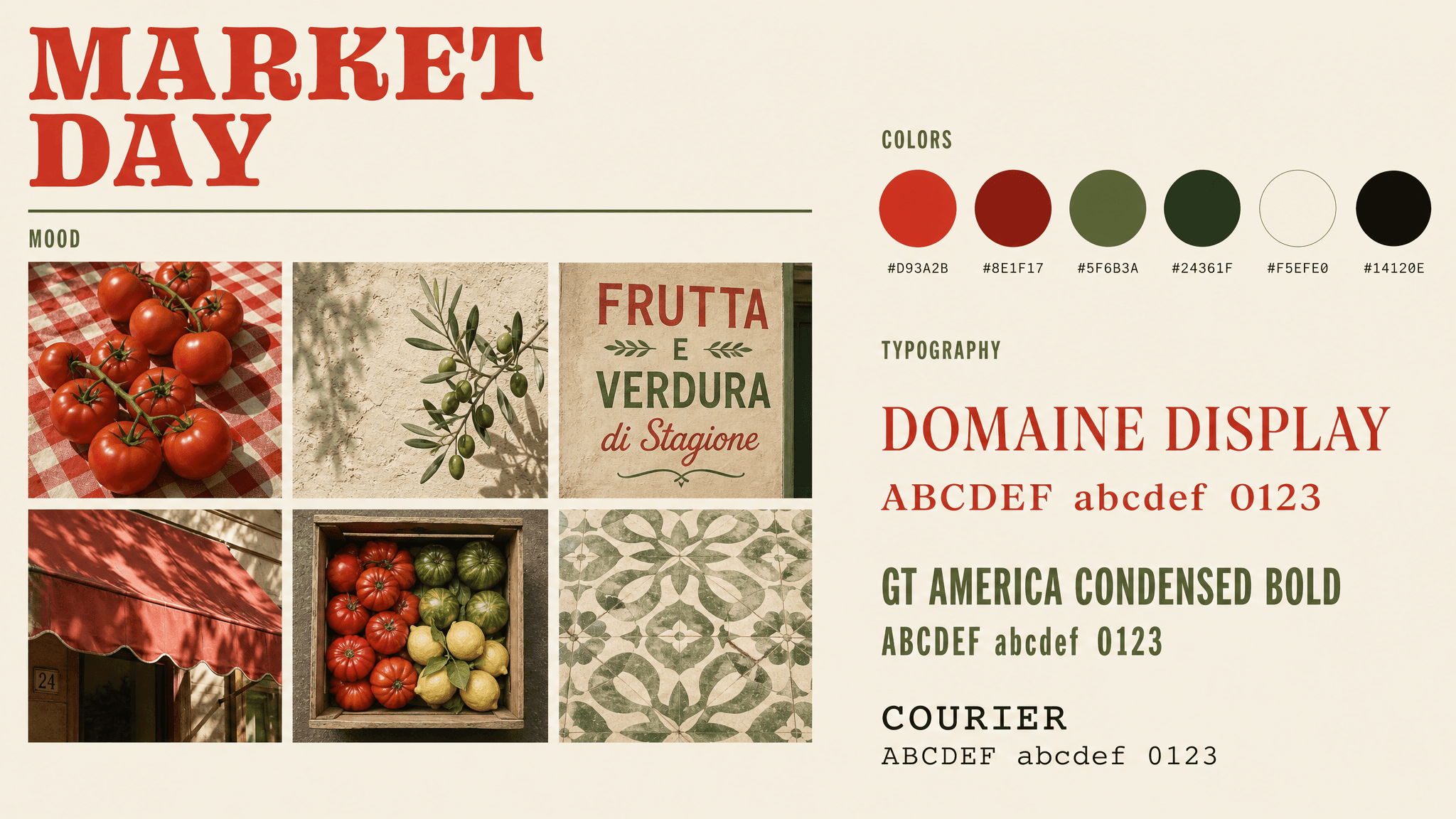
"Brand moodboard on a cream canvas (#F5EFE0). Header reads "MARKET DAY" in a chunky tomato-red display serif, top left aligned, with a thin olive rule beneath. MOOD zone: a precise 3x2 grid of six photographs with wide cream gutters, showing ripe tomatoes on a red and white checkered cloth, an olive branch against a lime-washed wall, hand-painted shop signage in red and olive lettering, a faded red awning in afternoon light, a wooden produce crate shot from above, and patterned green floor tile. Grade is warm natural daylight, moderate contrast, saturated but earthy, no gloss. COLORS zone: six filled circles in a row, labeled beneath in small mono: #D93A2B, #8E1F17, #5F6B3A, #24361F, #F5EFE0, #14120E. TYPOGRAPHY zone: three specimens stacked, reading "DOMAINE DISPLAY" in a warm serif at large size, "GT AMERICA CONDENSED BOLD" in a condensed sans, and "COURIER" in a mono, each with ABCDEF abcdef 0123 beneath."
11. Interior design mood board
Interiors live on light quality more than on color, so I let the grade instruction do the heavy lifting. The entire look utilizes afternoon light across texture.
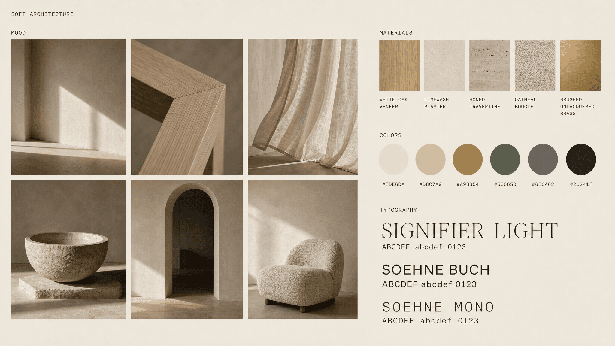
"Brand moodboard on a warm plaster canvas (#EDE6DA). Header reads "SOFT ARCHITECTURE" in a light grotesque, charcoal, small and top left aligned. MOOD zone: a precise 3x2 grid of six photographs with wide plaster gutters, showing an empty room corner with raking afternoon light across a limewashed wall, a close crop of a mitred oak joint, unlined linen curtain moving slightly, a carved stone basin lit from one side, an arched doorway opening onto a darker room, and a bouclé chair against a bare wall. Grade is warm natural daylight, low contrast, long soft shadows, no artificial fill, muted and slightly desaturated. MATERIALS zone: five finish swatch squares laid in a row, showing white oak veneer, limewash plaster, honed travertine, oatmeal bouclé, and brushed unlacquered brass, each with a small mono label beneath. COLORS zone: six filled circles in a row, labeled beneath in small mono: #EDE6DA, #D8C7A9, #A98B54, #5C6650, #6E6A62, #26241F. TYPOGRAPHY zone: three specimens stacked, reading "SIGNIFIER LIGHT" in a refined serif at large size, "SOEHNE BUCH" in a clean sans, and "SOEHNE MONO" in a mono, each with ABCDEF abcdef 0123 beneath."
12. Fashion mood board
I watched a video about chocolate and camel range and the caption went: look expensive without going grayscale. But I experimented a bit with this burnt orange accent so there is one saturated note to work against.
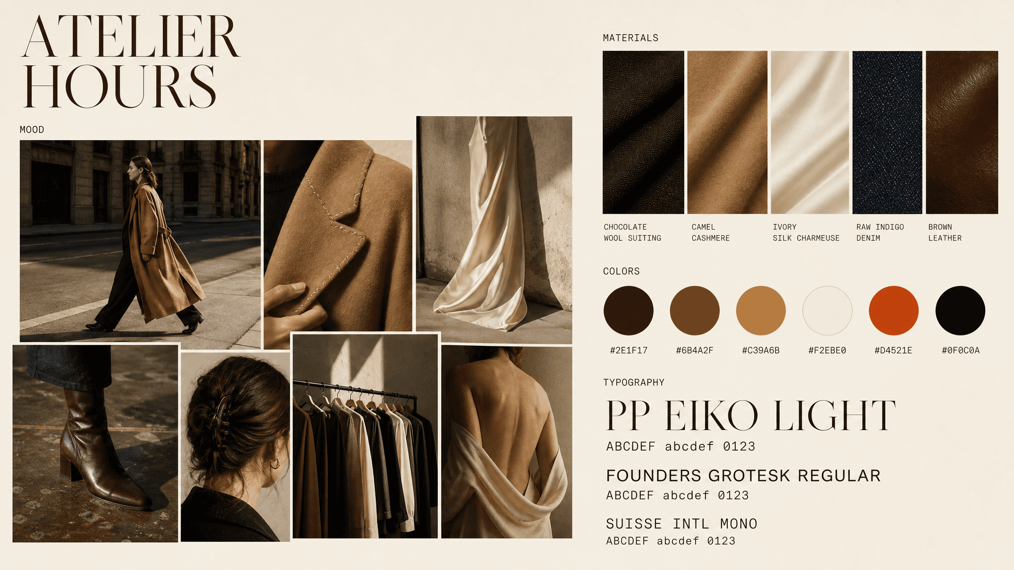
"Brand moodboard on an ivory canvas (#F2EBE0). Header reads "ATELIER HOURS" in a high-contrast light serif, chocolate brown, top left aligned. MOOD zone: an asymmetric collage of seven photographs at varying sizes with thin white borders, showing a model mid-stride on a bare city street in a long camel coat, a close crop of a shoulder seam and hand-stitched lapel, silk charmeuse falling on the bias against a studio wall, a leather boot on a scuffed studio floor, hair pinned back with visible texture, a rail of garments in raking window light, and a bare back with fabric draped loosely. Grade is warm and filmic with soft directional daylight, deep but open shadows, gentle grain. MATERIALS zone: five fabric swatch rectangles laid in a row, showing chocolate wool suiting, camel cashmere, ivory silk charmeuse, raw indigo denim, and polished brown leather, each with a small mono label beneath. COLORS zone: six filled circles in a row, labeled beneath in small mono: #2E1F17, #6B4A2F, #C39A6B, #F2EBE0, #D4521E, #0F0C0A. TYPOGRAPHY zone: three specimens stacked left aligned, reading "PP EIKO LIGHT" in a high-contrast display serif at large size, "FOUNDERS GROTESK REGULAR" in a clean sans, and "SUISSE INTL MONO" in a mono, each followed by ABCDEF abcdef 0123."
13. Bold retro optimist
This mood board will give warmth, which makes it perfect for food and beverage, travel and DTC consumer brands. I love this color-blocked band structure which doubles as a layout system.
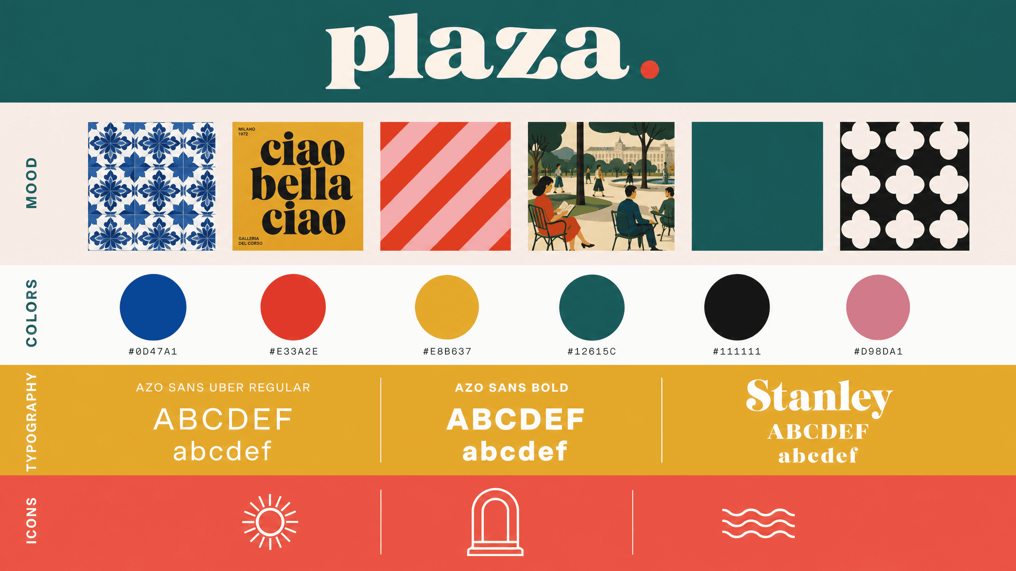
"Brand moodboard divided into five stacked color-blocked bands. Top band deep teal (#12615C) holding a wordmark in a chunky retro serif with a small dot accent. MOOD band on soft blush (#F7EDE9): a horizontal filmstrip row of six square images, evenly spaced, showing a blue tile pattern, a mustard poster with oversized black display type, a red and pink diagonal stripe pattern, a mid-century illustration of figures in a park, a solid teal field, and a black and white geometric quatrefoil pattern. COLORS band on white: six filled circles in a row in cobalt blue, tomato red, mustard yellow, deep teal, near black, and dusty rose, each labeled beneath in tiny uppercase mono. TYPOGRAPHY band on mustard (#E8B637): three specimens side by side in white type reading "AZO SANS UBER REGULAR", "AZO SANS BOLD", and "Stanley", each with ABCDEF abcdef underneath. Bottom band coral (#F0655A) holding three simple line-drawn brand icons in white. Flat vector rendering, precise alignment."
From mood boards to complete campaigns
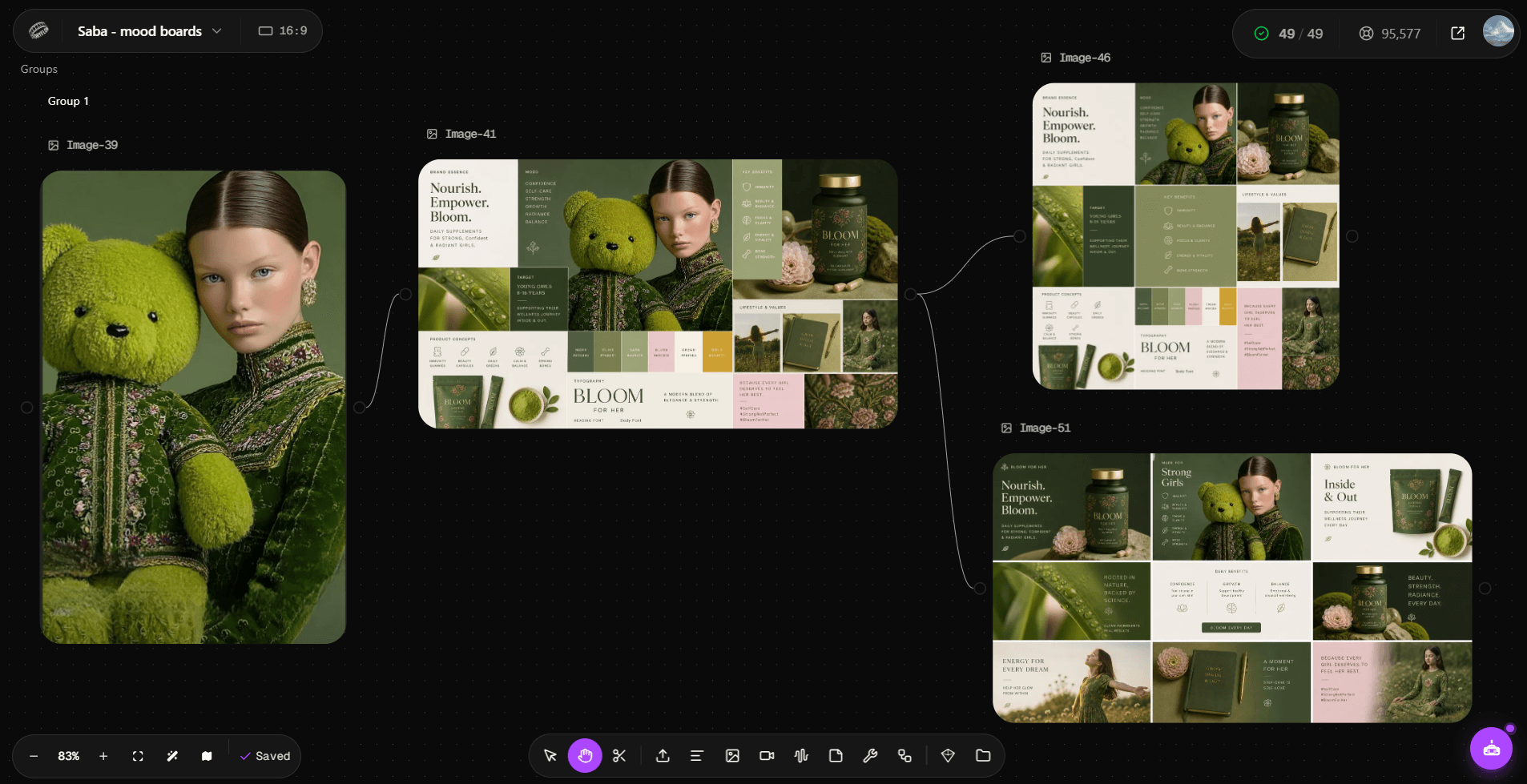
I still remember all the mood boards of 2023 and 2024 that died in my Figma. Approved with enthusiasm, never referred to again, while the actual campaign drifted in name of 'trends'. So how do you make sure your teams actually use these mood boards? Drop the approved version into a node-based canvas as your first node, then build everything off it: images, videos, social posts, ads, packaging mockups, lifestyle shots. Update the node when palette shifts or your team swaps colors. Re-run the campaigns and get new assets with the changes flowing down the canvas.
Related reading
Best AI Video Models for Product Ads in 2026
Which AI video models fit product ad workflows on Astorie.
Best AI Image Models for Brand Visuals
Brand consistency across image models on Astorie's canvas.
How to Create an AI Voiceover Video on Astorie
Audio narration plus video generation workflow on Astorie.
Ready to try it on the canvas?
Open Astorie and fan your prompt across every frontier model in one workflow.