

How to Preserve Logos and Labels in AI Product Photos
To preserve logos and labels in AI product photos, start from a clear approved product image, change one part of the scene and compare the exported package with the original. Read the words, inspect the mark and check the shape and color as separate tasks. A familiar silhouette can hide an incorrect quantity or a shifted logo.
We used two fictional packages: an amber NELA hand-wash bottle and a yellow LUMA paper-clip box. Each has a simple green mark and four readable lines. Background edits and lighting edits started from the corresponding gray-background original, so a new option did not inherit changes from another version.
What helps preserve logos and labels in AI product photos?
Use the largest clear photo you have of the current packaging. Show the complete closure, sides and base that need to appear in the result. If glare hides a word in the source, take a better reference before asking an image model to use it.
Keep the approved artwork available for real packaging. Our demo names and quantities make errors easy to spot, but real products may also include variant names, warnings or other small print. Preserve the information the image needs to show rather than asking for plausible replacement lettering.
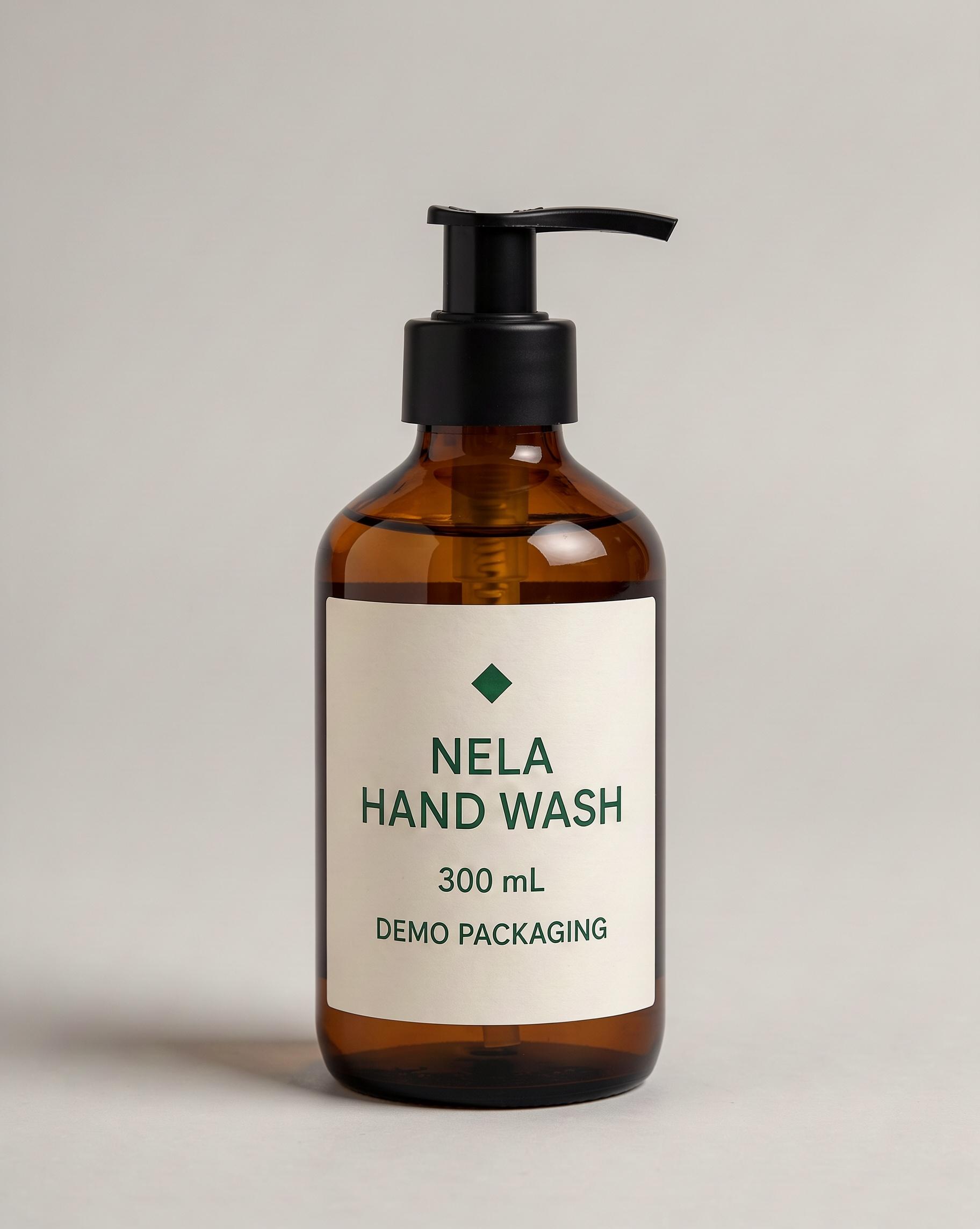
Figure 1. NELA source: the full pump, bottle, diamond mark and four label lines are visible.
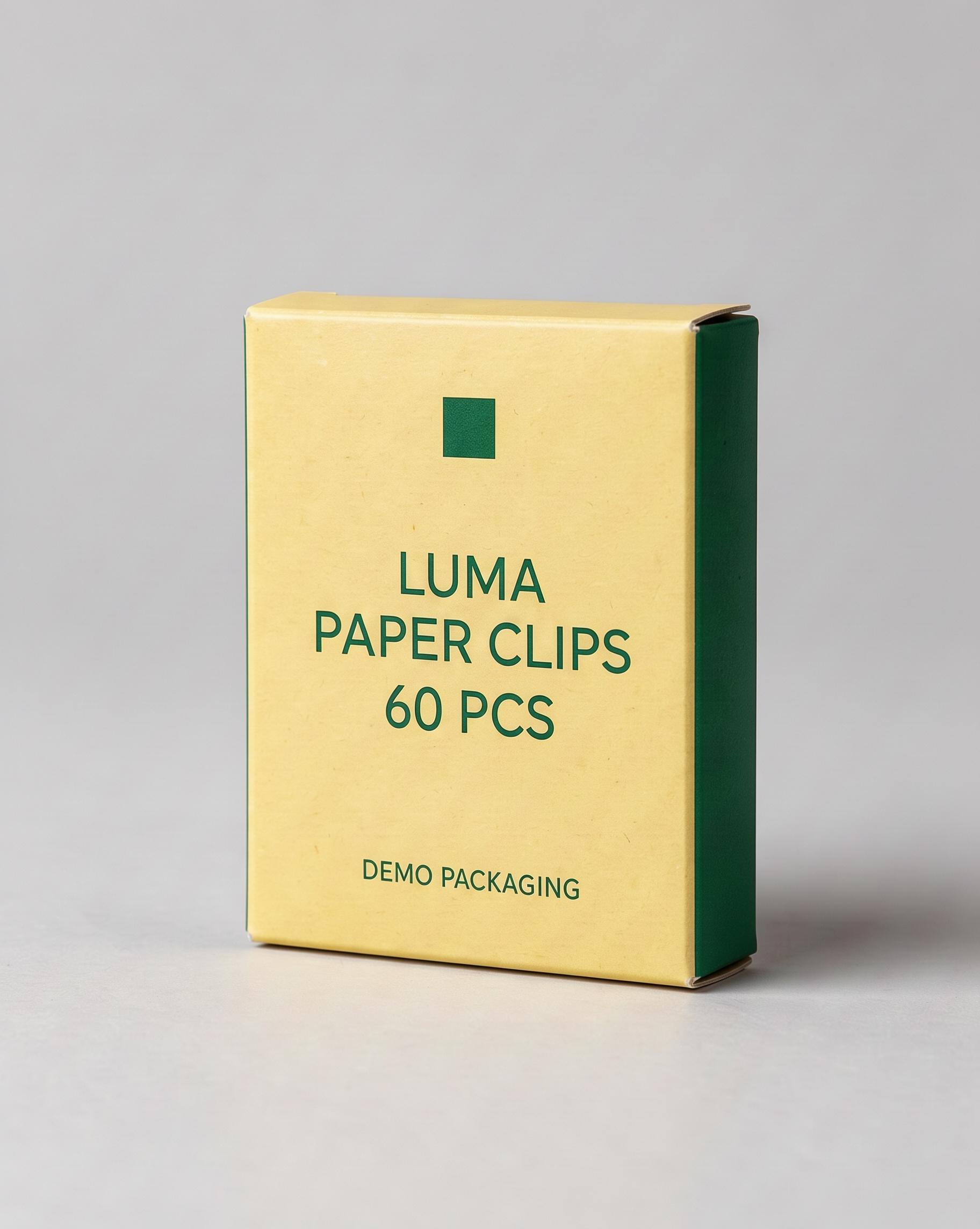
Figure 2. LUMA source: note the dark-green side panel and slightly raised top flap before editing.
Detail to carry into the edit | NELA bottle | LUMA box |
|---|---|---|
Exact wording | NELA / HAND WASH / 300 mL / DEMO PACKAGING | LUMA / PAPER CLIPS / 60 PCS / DEMO PACKAGING |
Mark | Solid dark-green diamond above the name | Solid dark-green square above the name |
Geometry | Rounded shoulders; black pump with nozzle right | Yellow front; narrow green right panel; existing folds |
Position | Front label faces camera | Near-frontal view with right side visible |
Use one reference and one requested change
Open a project and import the original. Add an Image node, select FLUX 3 Image and connect the product as the single Reference Image. For these examples, choose 4:5, 2K, JPEG, one image and Expand Prompt off. Generate an edit, open it at full size and download it before evaluating fine lettering.
Keep the original connected for each independent option, and compare the package after every edit: FLUX 3 can redraw details even when you only ask for a new setting. For broader scene ideas, see the product photo guide.
Make a background change visible enough to judge
Our first NELA instruction asked for a softly blurred pale-blue bathroom wall:
Replace only the background behind this exact bottle with a softly blurred pale-blue bathroom wall. Keep the original neutral foreground surface and soft studio lighting.
Preserve the amber-brown glass body, matte-black pump and right-facing nozzle, bottle proportions, cream-white front-label position, dark-green diamond logo, lettering style, and all label text exactly as shown: "NELA", "HAND WASH", "300 mL", and "DEMO PACKAGING".
Keep the bottle at the same size, position, and viewing angle, with the full front label readable. Add no props, hands, foam, droplets, badges, or new text.
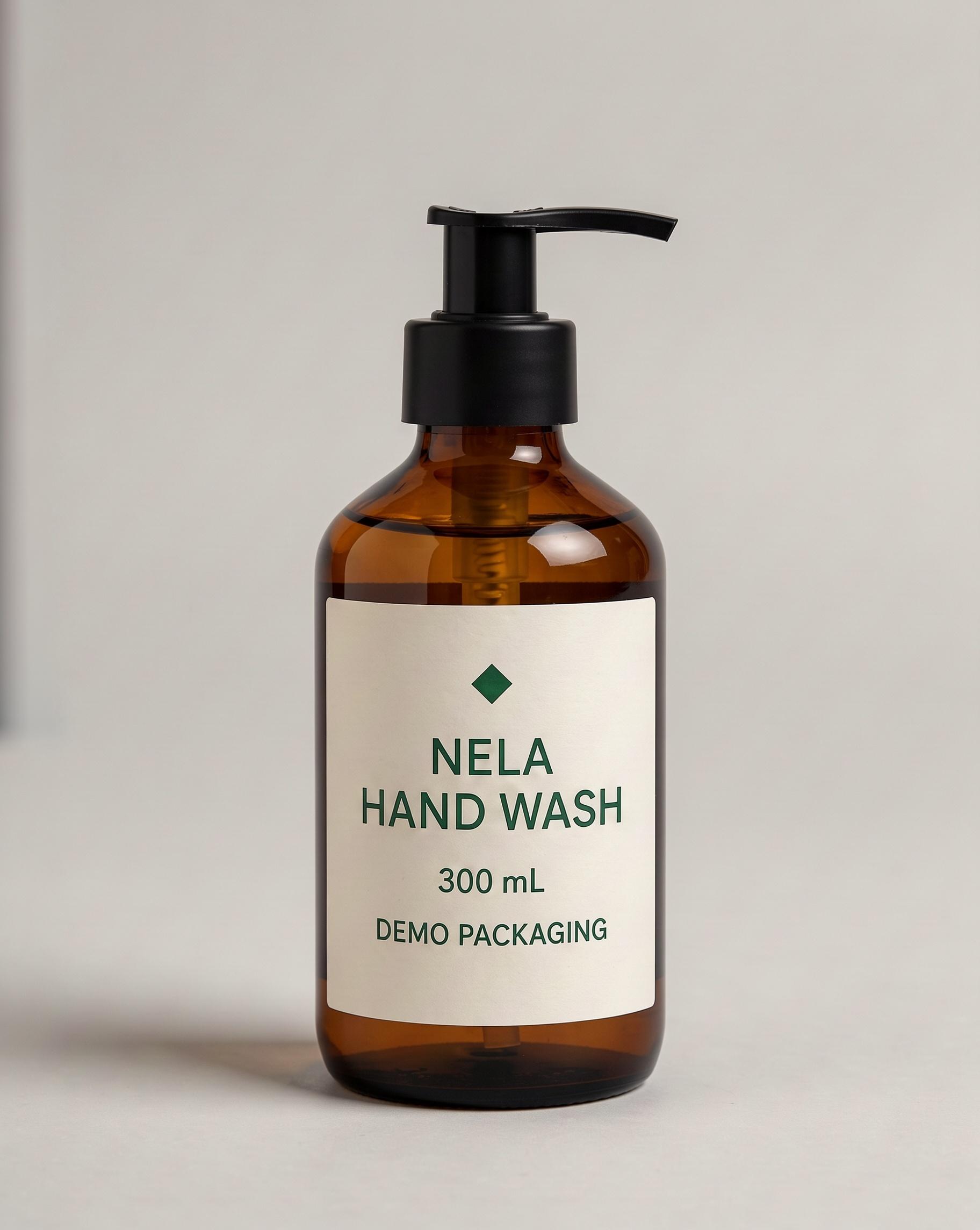
Figure 3. The first result kept the bottle recognizable but left the backdrop close to gray. The requested scene change had barely happened.
To make the blue setting clearer, we reconnected the original and asked for powder blue across the top and both sides, while keeping the foreground gray.
Change the wall behind the bottle to a clearly visible powder blue. Make this color change across the entire background around the bottle, including the top and both sides. Keep the surface under the bottle neutral light gray, and retain the original soft studio lighting.
Preserve the amber-brown glass body, matte-black pump and right-facing nozzle, bottle proportions, cream-white front-label position, dark-green diamond logo, lettering style, and all label text exactly as shown: "NELA", "HAND WASH", "300 mL", and "DEMO PACKAGING".
Keep the bottle at the same size, position, and viewing angle, with the full front label readable. Add no props, hands, foam, droplets, badges, or new text.
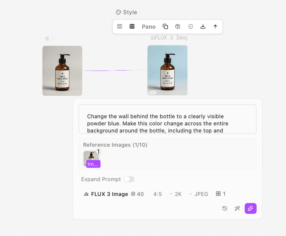
Figure 4. The revised background request still uses the original bottle as its single reference.
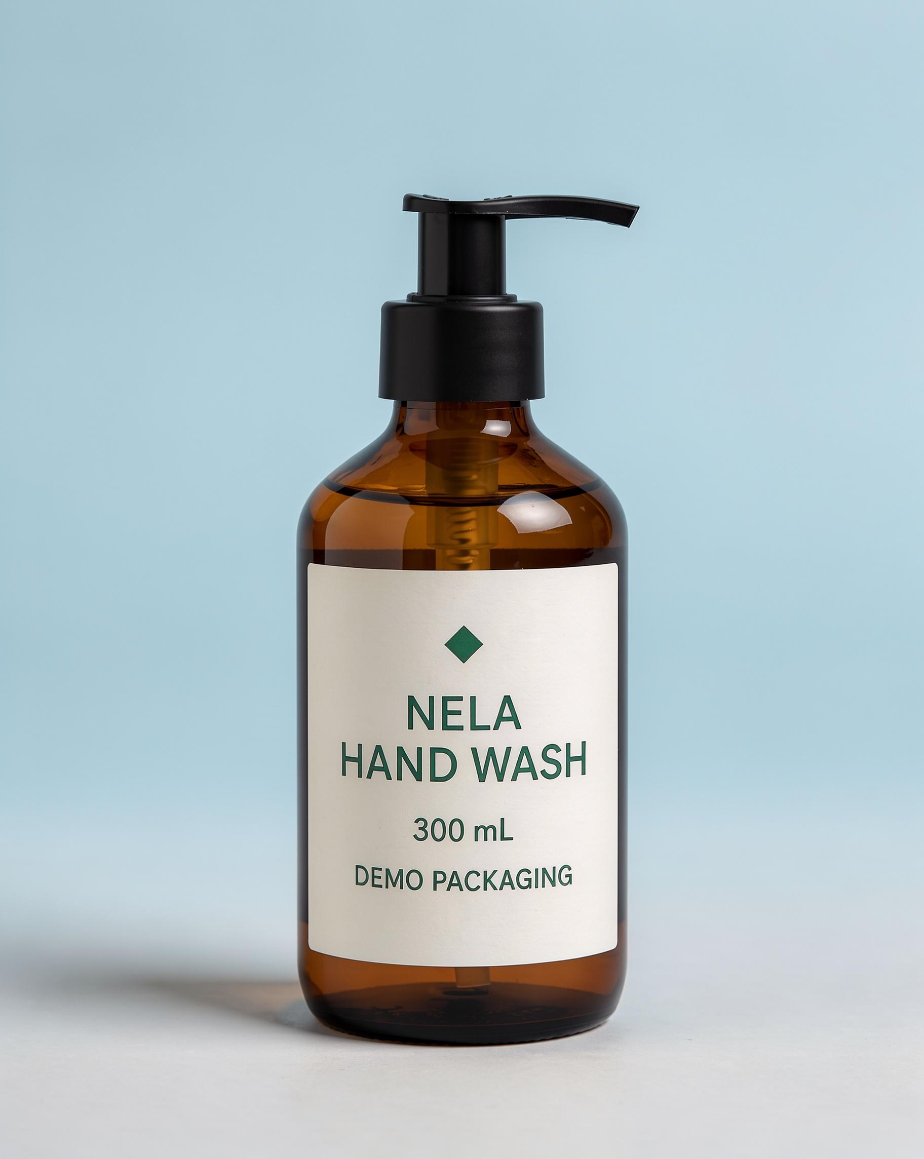
Figure 5. The revision produces a clearly blue backdrop. The label remains readable, but its paper looks whiter and cooler than the cream source.
Read NELA, HAND WASH, 300 mL and DEMO PACKAGING, then compare the cream paper and green ink. A background change can influence how the label appears even when its words stay correct. Keep the source beside the result and decide whether that paper-color difference fits the brief.
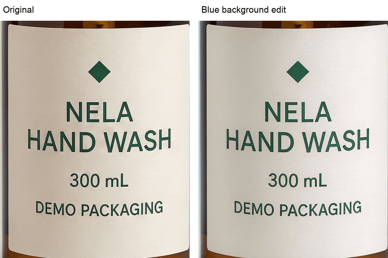
Figure 6. Enlarged NELA labels: compare all four lines and the diamond, then the cooler paper tone in the blue-background result.
For a setting-only brief, describe the visible background and preserve the product view. The background generator workflow also explains why the generated subject needs a comparison with its source.
Change lighting without confusing it with a new label design
The lighting alternative started from the original gray-background bottle, not from the blue version:
Change only the lighting on this bottle packshot to soft warm window light from the left, with a gentle shadow on the right.
Keep the original light-gray background, amber-brown glass body, matte-black pump and right-facing nozzle, bottle proportions, cream-white label layout, dark-green diamond logo, lettering style, and all text exactly as shown: "NELA", "HAND WASH", "300 mL", and "DEMO PACKAGING".
Keep the original product colors recognizable and the text evenly exposed and readable. Preserve framing and camera angle. Add no props, hands, foam, droplets, badges, or new text.
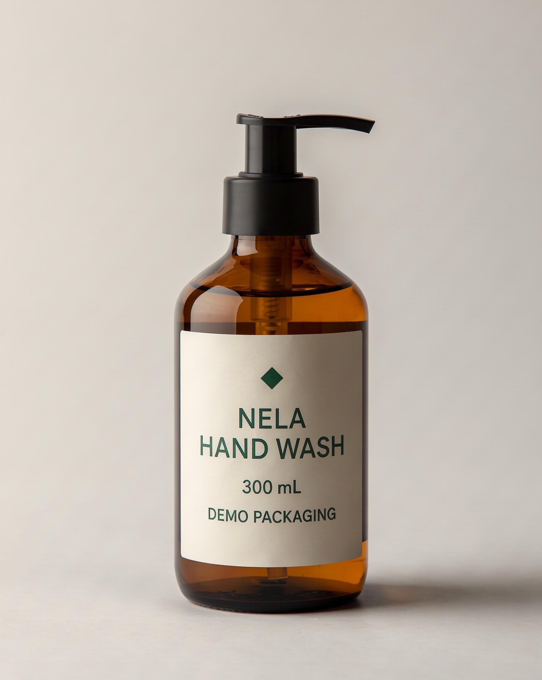
Figure 7. The lighting edit adds warmth from the left. The right side of the label is darker, while its four lines remain readable.
Check whether a highlight covers a letter or the shadow makes a required line too difficult to read. A lighting edit is meant to change brightness and reflections, so compare the design separately from illumination. If the image needs a precise packaging color, judge it against the approved reference under suitable viewing conditions.
Repeat the workflow on a box
On a box, compare the straight edges, panel widths and folded corners as well as the printing. The LUMA original already has a raised top flap and a folded lower-right corner. Note those features before editing so you can tell an existing fold from a new distortion.
For the stationery-shop setting, we used this instruction from the original box:
Replace only the gray background behind this box with a pale-green stationery shop interior. Make the new background clearly visible, with softly blurred shelving in the distance. Keep the original neutral foreground surface and soft studio lighting.
Preserve the box dimensions, pale-yellow front panel, dark-green right side panel, current folds and slightly raised top flap, square logo, lettering style, and all front-panel text exactly as shown: "LUMA", "PAPER CLIPS", "60 PCS", and "DEMO PACKAGING".
Keep the box at the same size, position, and viewing angle, with the front fully visible and readable. Add no foreground props, hands, extra packages, badges, or new text.
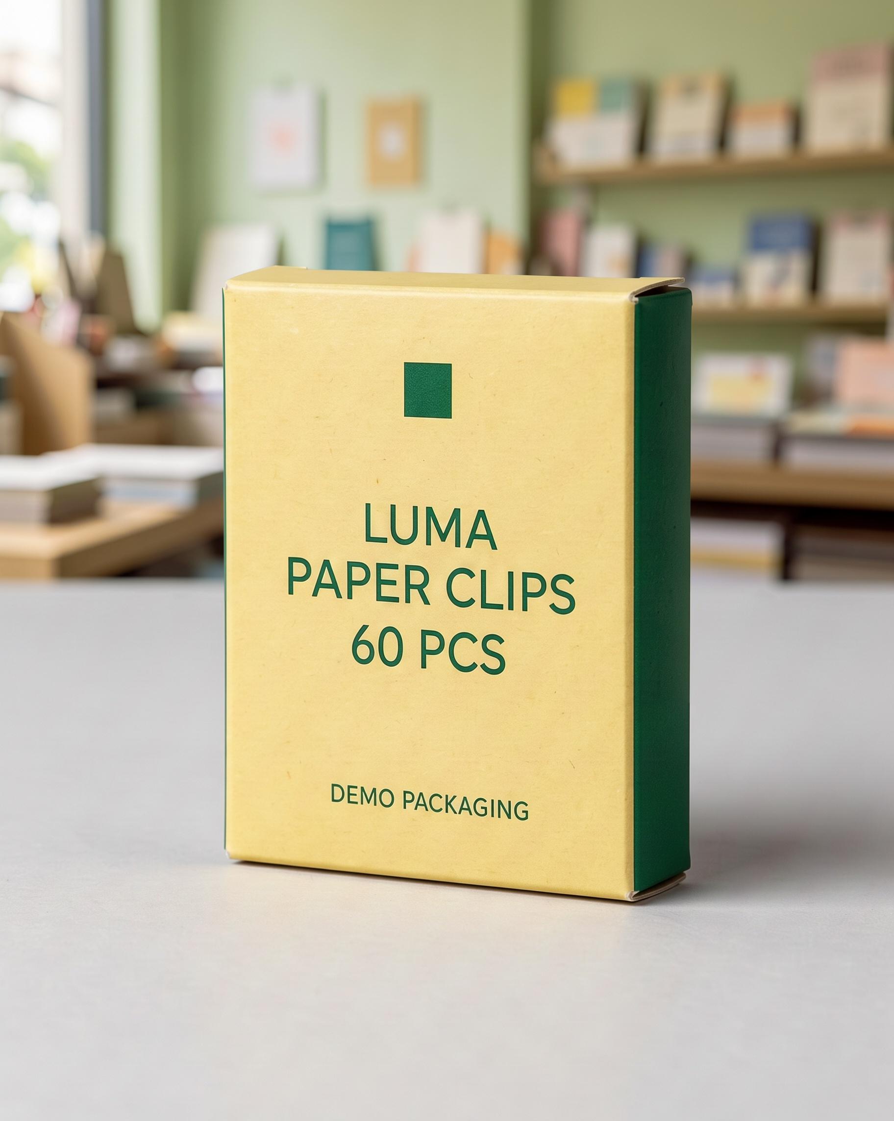
Figure 8. The box moves into a pale-green stationery-shop setting while the front text, green side panel and raised flap remain recognizable.
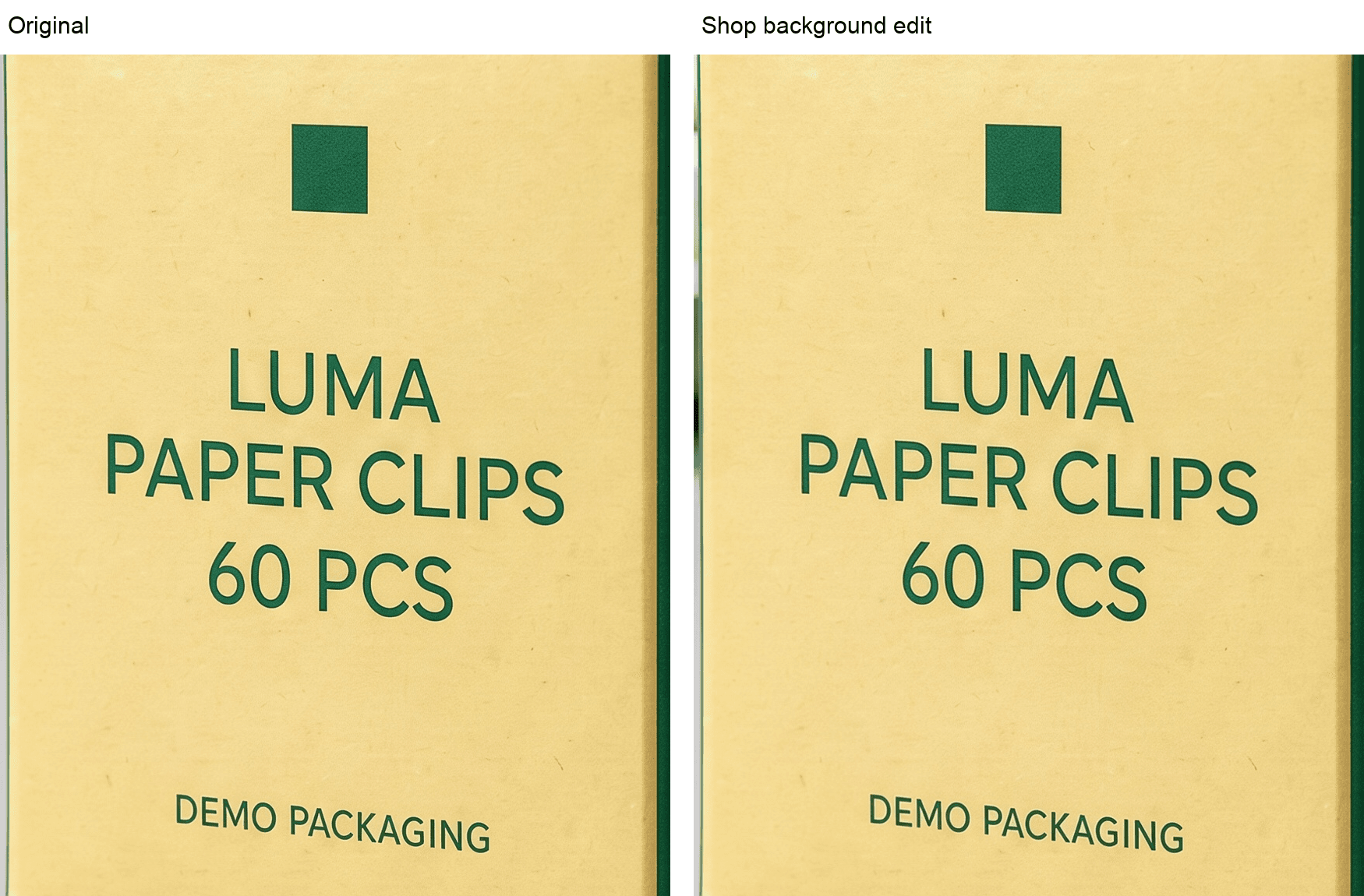
Figure 9. Enlarged LUMA fronts: compare the square mark, PAPER CLIPS line and 60 PCS quantity against the original.
The separate lighting alternative used the original box again:
Change only the lighting on this box packshot to soft warm window light from the left, with a gentle shadow on the right.
Keep the original light-gray background, box dimensions, pale-yellow front panel, dark-green right side panel, current folds and slightly raised top flap, square logo, lettering style, and all front-panel text exactly as shown: "LUMA", "PAPER CLIPS", "60 PCS", and "DEMO PACKAGING".
Keep the original package colors recognizable and the text evenly exposed and readable. Preserve framing and camera angle. Add no props, hands, extra packages, badges, or new text.
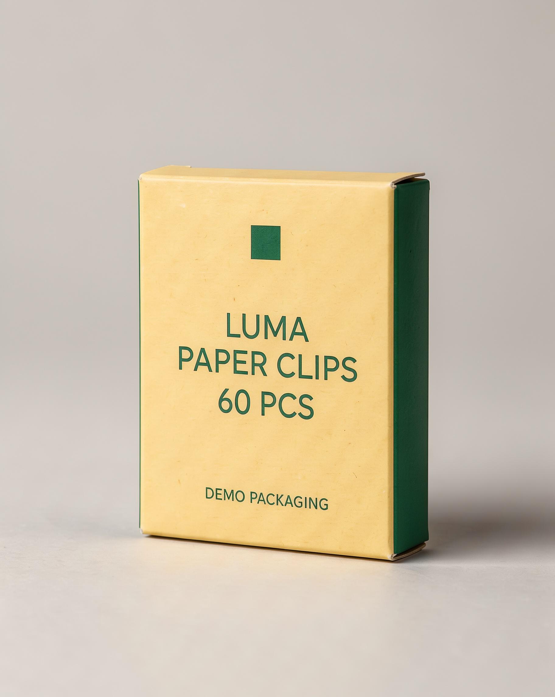
Figure 10. The warmer box version retains the gray background and main packaging details. Its paper becomes more golden; a rightward shadow was already present in the source.
Read the export at the size you will use
Start at the intended display size: does the product still read correctly on the page or ad? Then zoom into the original and edit side by side. Enlarging a crop helps you notice differences; it does not restore a letter that is missing from the exported image.
Check | Look for | What to do if it changes |
|---|---|---|
Wording and quantity | Spelling, spaces, units and invented characters | Reject or repair the affected wording before use |
Logo | Shape, placement, proportions and spacing | Compare with approved artwork, not memory |
Package construction | Pump direction, panel widths, corners and existing folds | Return to the original if the silhouette or closure changes |
Color and material | Paper tone, ink, glass and surface texture | Separate intended lighting from an unwanted design change |
Scene change | The new background or light is actually present | Clarify the change; do not approve an unchanged image as a successful edit |
When a word or mark needs to be exact and repeated prompting keeps redrawing it, stop using that generated package as the final product image. A practical finishing option is to retain the approved photographed product or restore approved artwork in a layered editor, then match the surrounding light and contact shadow. Check the combined image again at export size.
Save the chosen result together with its original. For the next setting, reconnect the original rather than a version whose paper color or geometry has already drifted. That gives each creative option the same starting package.
FAQ
Can “keep the label exact” guarantee preservation?
No. It states the requirement, but you still need to inspect the result. In these examples, readable words coexisted with changes in paper color and illumination.
Should I generate another image if the background did not change?
First make the requested change clearer. Our initial NELA background stayed close to gray; naming a clearly visible powder blue across the whole backdrop produced a more useful revision from the original.
Should a lighting edit keep every color value unchanged?
Lighting changes recorded brightness and color. Check whether the product’s design and variant remain recognizable and whether the result meets the color requirements of its intended use. A warmer box can be the requested treatment and still be unsuitable for a strict color reference.
Does a small label need less checking?
Check the exported placement as well as a close crop. Small text can become unreadable after resizing or compression. If the image must communicate that wording, use a composition and source that let the viewer read it.
Ready to try it on the canvas?
Open Astorie and fan your prompt across every frontier model in one workflow.