Social Media Post - Photography vs Impasto Oil Painting Poster
SairahGPT Image 2
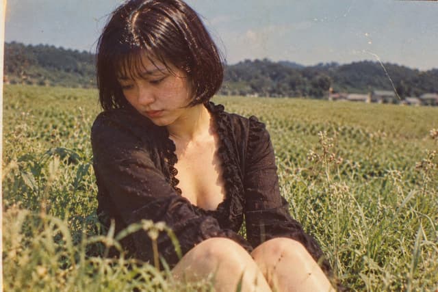
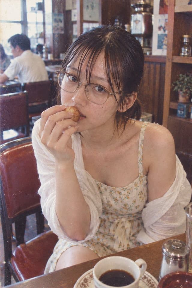
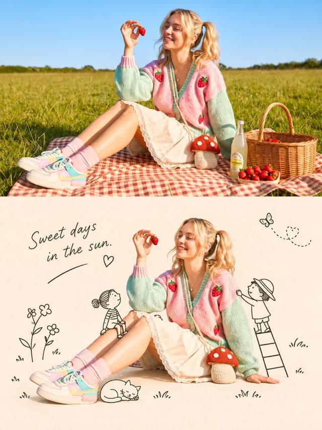
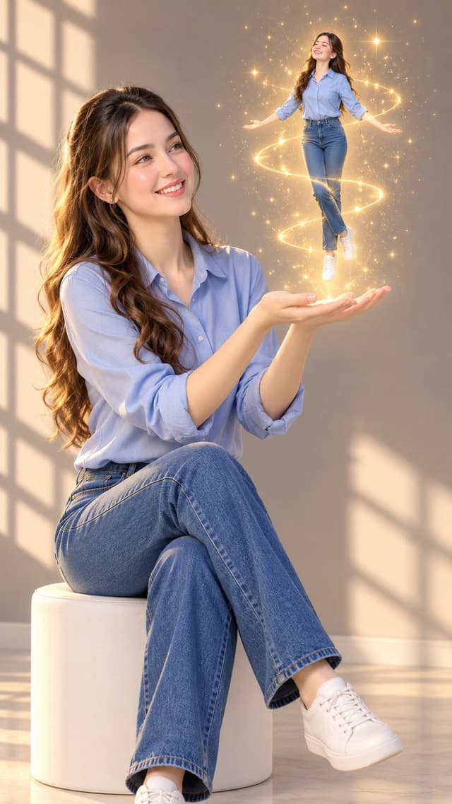
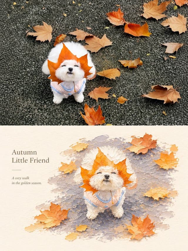
Create a premium 3:4 vertical photography and impasto oil painting comparison poster using the uploaded photograph.

### LAYOUT
Divide the canvas into two perfectly equal horizontal sections (50/50):
- Top: Original photograph.
- Bottom: Artistic impasto oil painting interpretation.

Both sections must connect directly with a clean horizontal boundary, without gaps, gradients, or overlapping.

### TOP SECTION — PHOTOGRAPHY
Preserve the original subject's identity, quantity, pose, proportions, silhouette, details, composition, perspective, lighting, and natural colors. Apply only subtle premium color grading. Do not redraw, distort, duplicate, reposition, or alter the subject. No text or decorations.

### BOTTOM SECTION — ARTISTIC INTERPRETATION
Reimagine the same subject as a sculptural impasto oil painting micro-landscape. Use thick layered paint, palette-knife textures, handcrafted forms, raised edges, and expressive brushstrokes.

Keep the subject recognizable, centrally or slightly off-center, surrounded by generous warm-white negative space. Introduce a single color band inspired by the original photograph, transformed into a ground, water, pathway, or abstract landscape element.

### COLORS & TEXTURES
Extract a harmonious, limited color palette from the original photograph. Preserve the subject's natural color character while adding subtle brightness and luminosity. Use rich paint textures selectively, with refined subject details and delicate matte paper texture.

### TYPOGRAPHY
Add a short, elegant English title and one small supporting line within the lower section's negative space. Use thin, minimal typography. Generate text based on the actual subject or mood. Avoid invented dates, locations, logos, signatures, and unnecessary annotations.

### AESTHETIC
Quiet, minimal, sophisticated, and editorial. Create a collectible fine-art publication aesthetic through negative space, sculptural depth, material textures, and balanced composition.

### AVOID
Photo collages, altered subjects, unrelated scenes, illustrated photography, extra title bars, clutter, excessive decorations, incorrect text, watermarks, cartoon styles, neon colors, oversaturation, muddy tones, plastic-looking 3D, and cheap CGI.