

Color Correction vs Color Grading: Protect Product Accuracy Before Adding a Look
Color correction vs color grading is a difference in purpose: correction balances exposure, white balance and shot consistency against an agreed reference; grading shapes the scene's mood and visual style. For product video, establish the approved product appearance first, then add a look while checking that it does not push the product outside that reference.
A warmer scene may be the right creative choice. A blue lunchbox drifting toward a different finish may not be. Separate those decisions so the brand can approve the atmosphere without accidentally approving a new product color.
Color correction vs color grading at a glance
Neither process is defined by a particular software panel. Temperature, curves and selective color can serve either purpose depending on the intended result. The useful distinction is what the adjustment is trying to achieve and how you will approve it.
Question | Color correction | Color grading |
|---|---|---|
Main objective | Establish a balanced, consistent base | Create an intentional visual treatment |
Reference | Approved product and shot appearance; neutral references when reliable | Approved look, campaign palette or mood reference |
Typical controls | White balance, exposure, contrast, channel balance, shot matching | Curves, selective color, contrast shaping, saturation and masks |
Pass condition | Required detail and color agree with the reference | Style is accepted while protected details remain acceptable |
Common mistake | Treating any gray-looking object as a calibrated card | Applying a global look that changes the product |
Place in the workflow | Build the base before the creative treatment | Add and evaluate the look over the corrected base |
Adobe's basic correction documentation identifies white-balance and tone controls. Its grading guidance recommends establishing a good base before creative color treatment. The comparison here concerns editorial purposes, not competing models or a paid-software price comparison.
Define what product accuracy means before touching the image
Use an approved product reference under a known viewing and color-management setup. For real merchandise, that may include a properly photographed sample, production color references and agreement from the brand owner. A hex code alone does not describe how a metallic, textured or reflective surface should look under every light.
If the only source is generated footage, you can preserve an approved digital appearance. You cannot establish physical SKU accuracy from that footage alone. Likewise, a generated gray card is a visible neutral reference within the image, not a certified reflectance target.
Record the source and delivery color spaces, transfer functions and any input transforms before grading. In an NLE, make sure the source is interpreted correctly and that you are not applying the same conversion twice. Compare on the same display with automatic brightness and viewing effects controlled where practical. A transformed export viewed through a different pipeline can look wrong even when the timeline looked acceptable.
Keep that selected reference with the other approved materials in a brand consistency workflow. Name which parts of the product matter: blue finish, silver latch, label wording, cap or material. Color correction cannot restore lettering or geometry that a generator has changed.
One source, five clearly identified versions
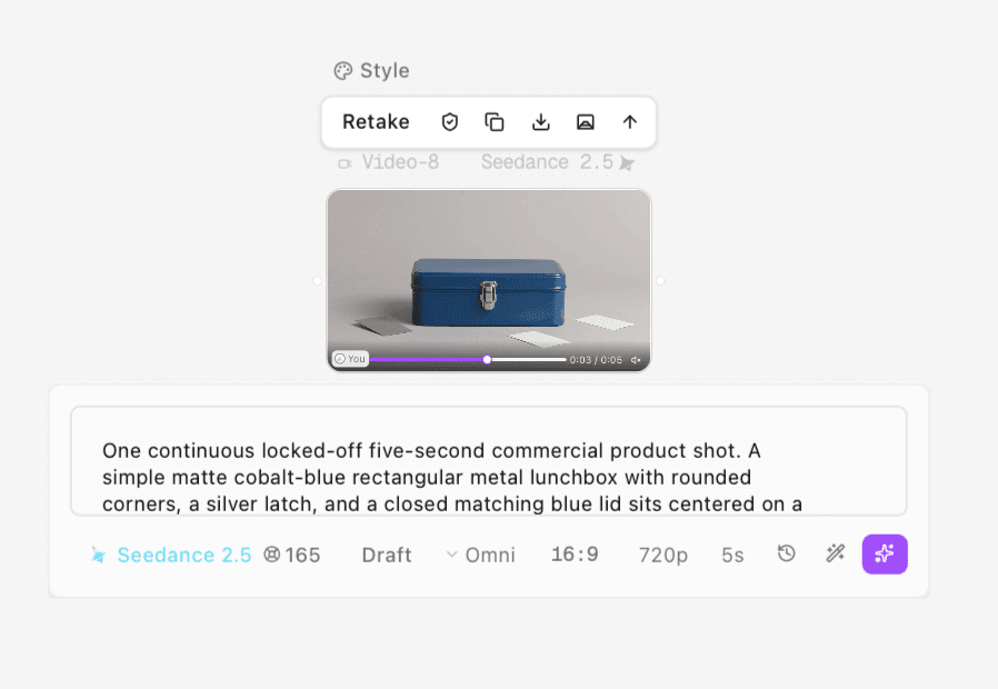
Clara supplied a locked-off lunchbox shot generated with Seedance 2.5, Draft, Omni, 16:9, 720p, 5s. The blue box, silver latch and surrounding cards form a useful reference scene. The actual export contains one gray card and two white cards, although the prompt requested one of each. We kept the supplied output rather than relabeling it to match the instruction.
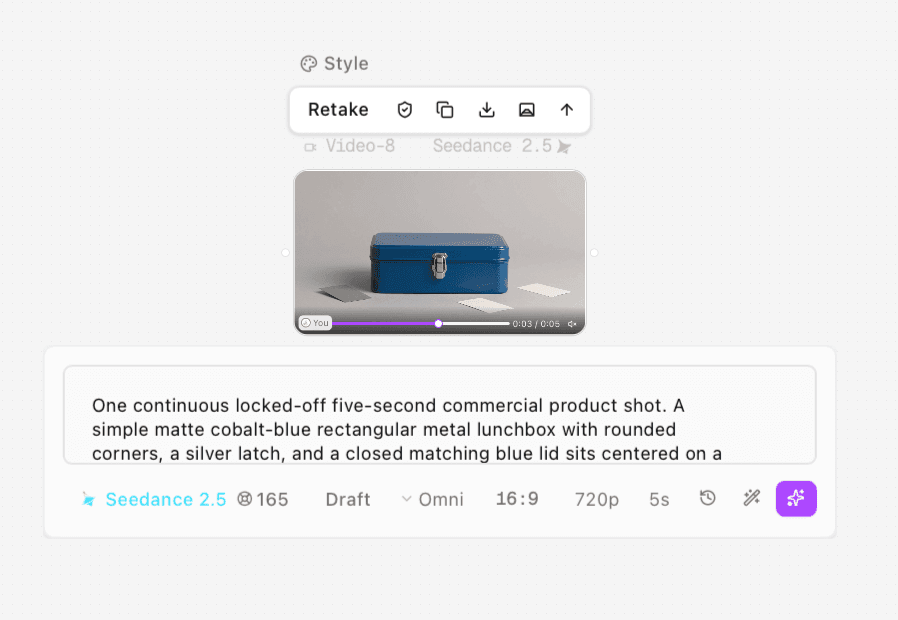
Figure 1. Clara’s Seedance 2.5 Draft, Omni source setup. The actual output contains one gray card and two white cards; it serves as a digital reference, not a calibrated physical chart.
Original blue lunchbox source used as the selected digital appearance reference. Original AAC retained.
The source serves as the selected digital reference. To demonstrate correction, we deliberately added a warm channel imbalance and a 0.35-stop exposure reduction to copies of its frames. We then estimated a correction from the gray patch. From that corrected base, we made a global warm look and a second version that protects the blue product region.
Version | What changed | What it demonstrates |
|---|---|---|
Selected source | Original supplied frames | Agreed digital appearance for this comparison |
Constructed cast | Warm channel imbalance and lower exposure | A known input problem introduced for teaching |
Corrected base | Fixed per-channel gains estimated from the gray patch | Matching back toward the selected reference |
Global creative grade | Warm channel treatment across the image | A look can change product color too |
Product-protected grade | Same look outside a blue-product mask | Separating scene atmosphere from protected finish |
All versions use the same 121 source frames. They are numerical post-processing derivatives, not AI redraws or additional generation attempts.
Correct the base before adding the look
1 Set the color interpretation and inspect the reference
Start with the original file, a duplicate for correction and the approved reference alongside it. Check whether highlights contain detail and whether shadows are crushed. Use a waveform to inspect tonal distribution, RGB parade to compare channels and a vectorscope to observe chroma. A scope shows signal relationships; it does not know the brand's correct blue by itself.
For the local numerical example, we used an sRGB transfer assumption to decode and re-encode RGB. That defines the computation; it does not establish the generator's camera pipeline or calibrate the image to a physical color standard. Use the correct documented transforms for your actual footage.
2 Adjust white balance and exposure against reliable areas
In an editor, balance temperature and tint using a suitable neutral area, then adjust exposure and contrast while protecting relevant highlight and shadow detail. Verify the product as well as the background. An eyedropper on a colored reflection can produce a technically neat but visually incorrect correction.
In this example, the gray-patch rectangle spans x=200–259, y=535–549 in the 1280 × 720 frame. The target is that patch's median linear RGB in the selected source. The correction uses the ratio of reference to affected patch values, producing fixed gains of approximately 1.080 R, 1.278 G and 1.594 B. It matches the selected source patch; it does not force a generated card to physical 18% gray.
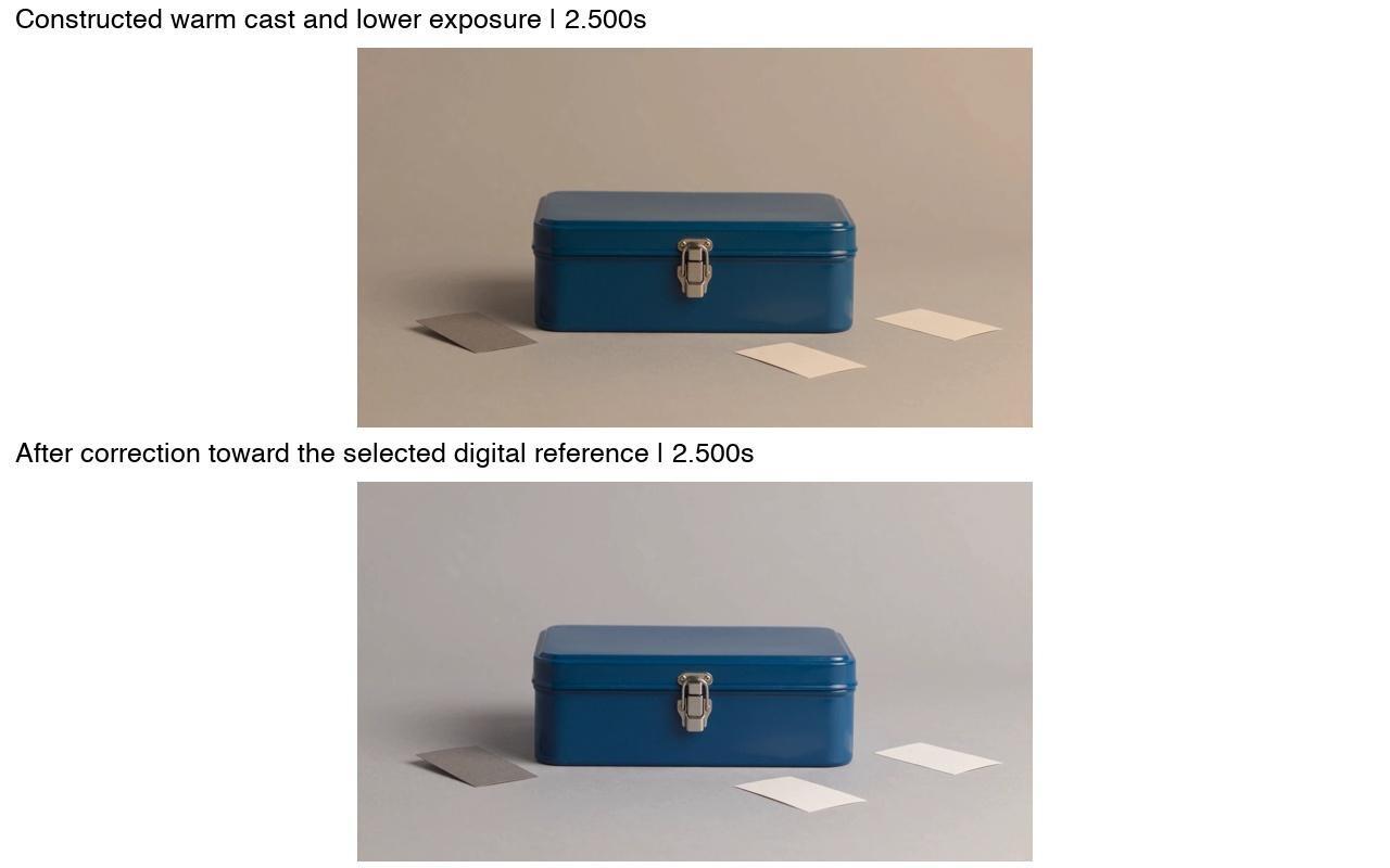
Figure 2. The same frame at 2.500s before and after correction of the explicitly constructed cast. The correction targets the selected source gray patch, not a physical 18% gray value.
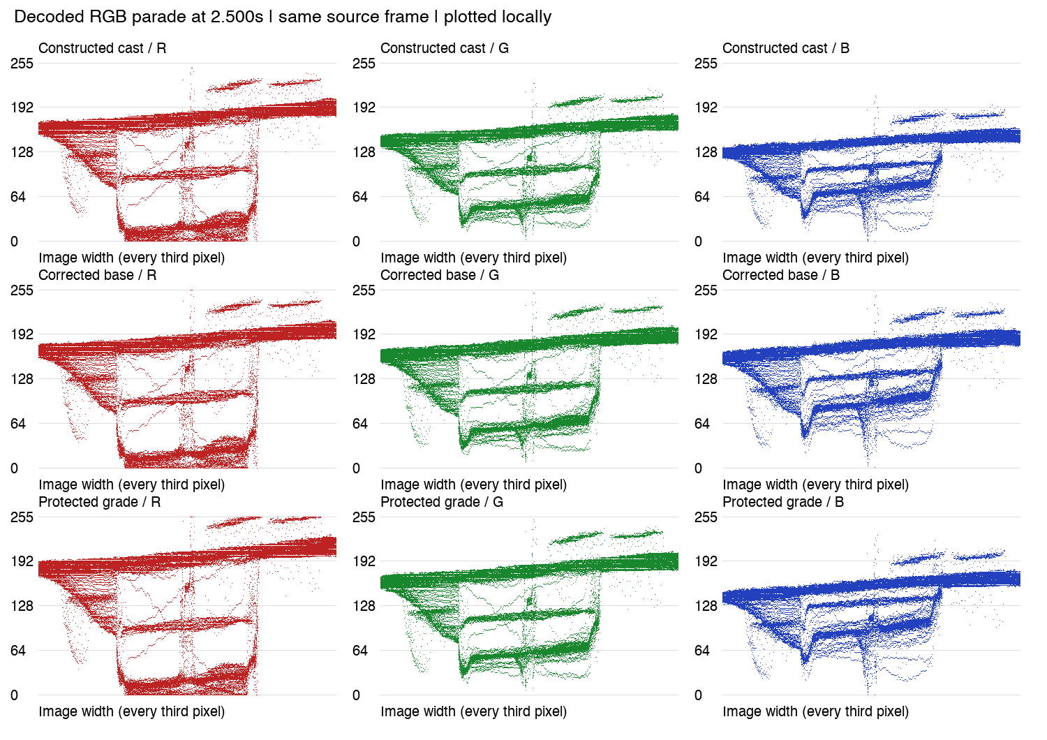
Figure 3. Locally plotted decoded RGB parade at 2.500s for the constructed cast, corrected base and protected grade. It is a signal visualization, not a screenshot of an NLE or a physical color-accuracy score.
Constructed warm cast and exposure reduction on the same source frames; audio intentionally omitted.
Reference-patch correction of the constructed cast; audio intentionally omitted.
3 Match adjacent shots before approving the base
For a sequence, compare the product across the shots that will actually cut together. A shot can look balanced alone while jumping blue hue or brightness at the edit. Match the base first so the creative treatment is applied to compatible images.
This test has one source shot, so it demonstrates reference matching within that shot, not a completed multi-shot campaign match. Save the accepted base separately; it is the version to return to if the proposed look changes the product too far.
Add a look and protect the product deliberately
Apply the creative treatment after the base correction in a separate node, effect or adjustment layer. Toggle it on and off against the corrected image. Ask whether its warmth, contrast and saturation support the scene, then inspect the product independently of that overall preference.
Our global look multiplies linear RGB by approximately 1.18, 1.02 and 0.78. It warms the setting, but also reduces blue-channel intensity on the box. That is a creative difference, not a new white-balance error to “correct” indiscriminately across the frame.
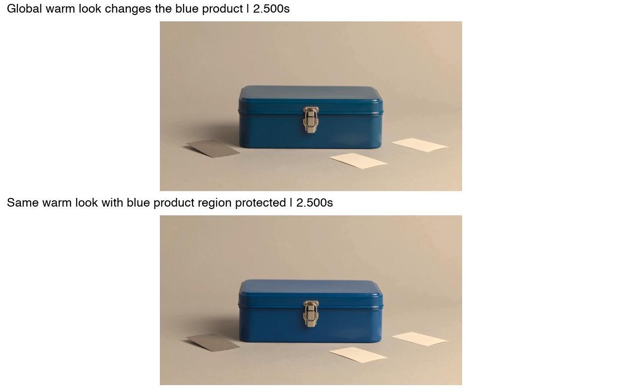
Figure 4. Global warm treatment and product-protected treatment on the same corrected source frame. The latter protects the selected blue finish while allowing the surrounding scene to warm.
Global warm creative grade applied after correction; audio intentionally omitted.
For the protected version, we selected blue-dominant pixels within the fixed lunchbox area and feathered the selection by two pixels. Inside that mask, the corrected base is retained; outside it, the same warm look is applied. The mask suits this locked-off example. A moving product requires tracking and checking the mask through the full range.
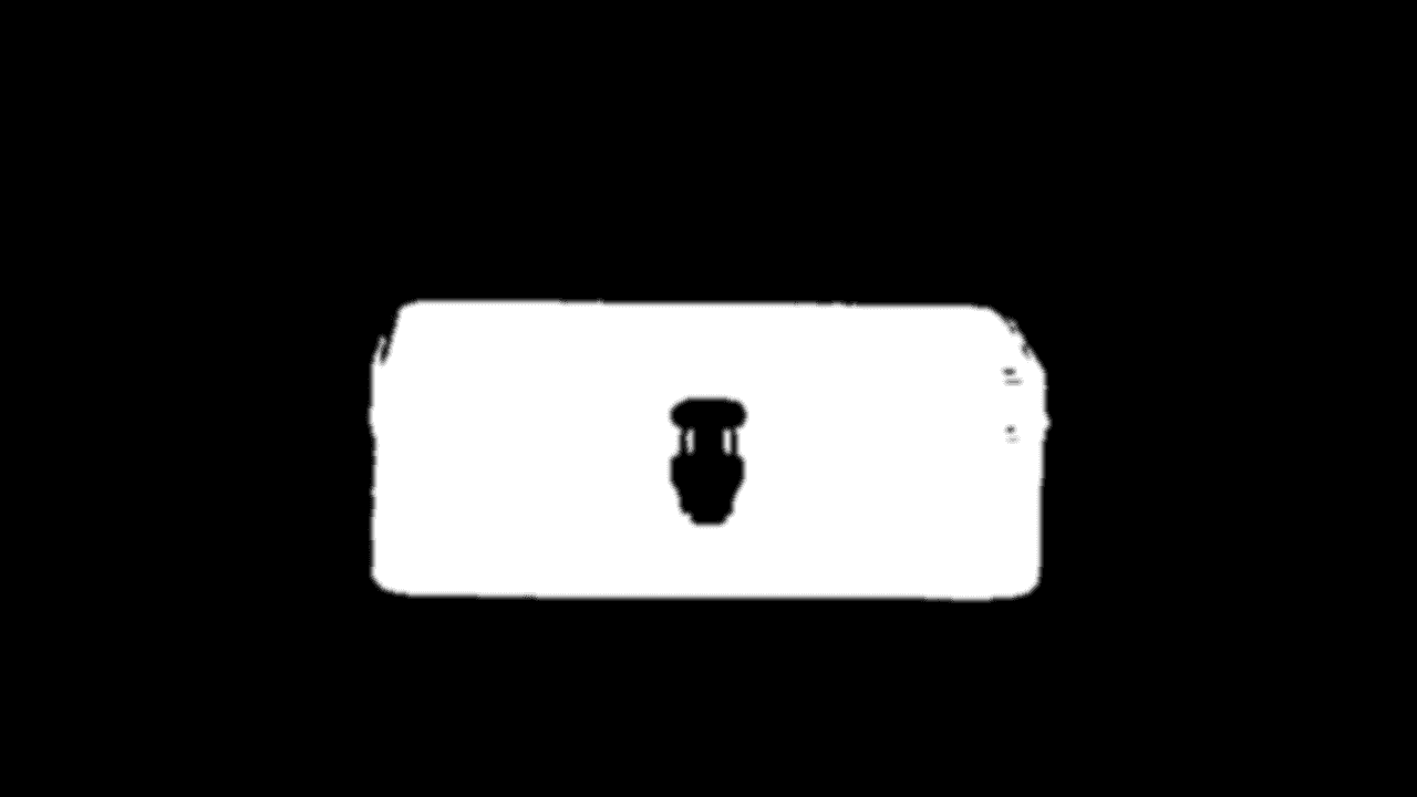
Figure 5. Actual fixed selection used for the blue-product protection, with a two-pixel feather. It does not include the whole silver latch and must not be assumed to track a moving product.
Same warm treatment with a fixed blue-product protection mask; audio intentionally omitted.
This protects the blue finish, not every part of the object. The silver latch and surrounding reflections still need a separate decision. A broad protection mask that ignores contact, edges or reflected environment can make the product look pasted into the scene. Adobe's isolated-adjustment guidance documents mask-based local color adjustment and tracking for moving subjects.
Measure the change without turning it into a false accuracy score
At 2.500 seconds, the same blue-panel patch has the following mean decoded RGB values. The rectangle is x=500–574, y=400–479, avoiding the latch and outer silhouette. Values are rounded 8-bit code values after lossy export.
Version | R | G | B |
|---|---|---|---|
Corrected base | 16.37 | 55.07 | 86.60 |
Global warm look | 18.46 | 55.23 | 76.43 |
Product-protected look | 16.37 | 55.16 | 86.46 |
The protected version stays closer to the corrected patch in this measurement. These RGB means are not Delta E, a calibrated brand-color tolerance or proof of full-object equality. Compression also changes pixels, so “protected” does not mean pixel-identical.
Use numbers to locate changes, then inspect the actual product, including highlights, corners and reflections. For a real brand job, agree a meaningful tolerance and viewing condition with the approver instead of deriving a pass threshold after seeing the grade.
Approve color and delivery as separate checks
Approve the corrected product appearance, the proposed look and any permitted exceptions. Then export using the agreed color space and delivery settings. Reopen the exported file in the intended viewing path and compare it with the reference. Check for clipping, banding, mask edges and changes over time; listen to the actual soundtrack when required.
Use the video quality control checklist for the final master. Astorie can organize the generated source and candidate references on a canvas; the numerical correction and grading in this example were performed locally, not by a demonstrated Astorie professional grading panel.
Frequently asked questions
Should I color correct before color grading
Usually, establish the balanced base and shot consistency first. Separate stages make it easier to adjust or reject a look without losing the approved product appearance.
Does a generated gray card prove the product color is accurate
No. It can help compare versions of that digital image, but it is not a measured physical chart or evidence of the real product's color.
Can I use a warm grade in an accurate product video
Yes, if the brand accepts the result and the protected product remains within its agreed reference. Local masks can help, but their edges, reflections and behavior over time need review.
Test method and sources
Clara supplied the original Astorie export and screenshot and confirmed the provided prompt unchanged on November 13, 2026. The UI quote is 165 credits, not a verified deduction. Generation date, total attempts and generation time were not separately confirmed. The source is 1280 × 720, 24 fps, 121 video frames, approximately 5.042 seconds; it contains AAC audio with nonzero samples. No listening or sound-quality conclusion is claimed.
Agent processing on November 13 created four H.264 derivatives using PyAV 19.0.2 and numerical RGB operations. Each has the same video dimensions, frame rate and frame count; derivative audio was deliberately omitted. All derivative frames decoded without corrupt-frame flags; matched full-size frames were inspected. This is a controlled digital-reference example, not a calibrated physical-product test or a full-speed delivery approval. Sources were checked November 13, 2026.
Ready to try it on the canvas?
Open Astorie and fan your prompt across every frontier model in one workflow.