Infographic / Edu Visual - Bilingual Prompt Comparison Gallery

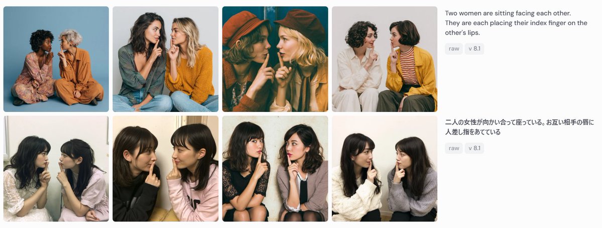
Creates a screenshot-like gallery comparing eight generated images from English and Japanese versions of the same prompt.

Prompt

2,920 charactersOpen Astorie studio ↗
Goal: Create a wide screenshot-style comparison panel showing image-generation results for the same prompt in two languages.

Canvas: Use a horizontal 1199×461 px composition on a very light gray/off-white background, like a social media screenshot or web gallery capture.

Layout: Arrange the left 75% as a 2-row by 4-column gallery of exactly 8 rounded-corner photo cards, with narrow white gutters between cards. Each card is a square-ish portrait photograph of two women sitting close together, facing each other or angled inward, each placing one index finger on the other person's lips in a mutual “shh” gesture. On the right 25%, place two stacked prompt description blocks aligned with the two gallery rows.

Gallery details: Include exactly 8 distinct generated-photo cards:
1. Top-left: two women seated on the floor against a blue studio backdrop, one in a floral dress, one in an orange outfit.
2. Top-second: two women in casual sweaters, one dark-haired and one blonde, seated close together against a pale gray background.
3. Top-third: warm cinematic dark teal/orange image, both women wearing hats, faces partially obscured by large soft blur rectangles.
4. Top-fourth: two women on a white background, one in white clothing and one in a mustard cardigan with striped shirt.
5. Bottom-left: two young women seated indoors near a window, soft casual snapshot lighting.
6. Bottom-second: two young women in black and pale pink tops, close-up casual indoor portrait.
7. Bottom-third: two young women seated on chairs, one in a dark dress and one in a light cardigan, against a plain wall.
8. Bottom-fourth: two young women in white and gray sweaters, seated indoors against a light wall.

Face treatment: All visible faces in the 8 cards should be anonymized with soft rectangular mosaic/blur blocks over the face area, matching the screenshot-like privacy masking.

Right-side text content: At the top right, show the English prompt text: “{argument name="English prompt text" default="Two women are sitting facing each other. They are each placing their index finger on the other's lips."}” Under it, place two small rounded gray tags reading “raw” and “v 8.1”. Below, aligned with the second row, show the Japanese prompt text: “{argument name="Japanese prompt text" default="二人の女性が向かい合って座っている。お互い相手の唇に人差し指をあてている"}” Under it, place two matching gray tags reading “raw” and “v 8.1”.

Visual style: Photorealistic generated-image thumbnails, varied lighting and wardrobes, clean UI spacing, rounded image corners, sans-serif interface text in dark gray, small pale-gray pill tags. The overall image should look like a captured comparison grid demonstrating prompt-following consistency, not a polished poster.

Constraints: Use exactly 8 photo cards, exactly 2 text blocks, and exactly 4 pill tags total. Do not add logos, watermarks, browser chrome, captions inside the photo cards, or extra UI elements.
From sourceView source ↗

More to explore

Product Marketing - Classic Cafe Date Outfit Prompt

Product Marketing - Classic Cafe Date Outfit Prompt

のぞむ*AIイラストGPT Image 2
OUTFIT:
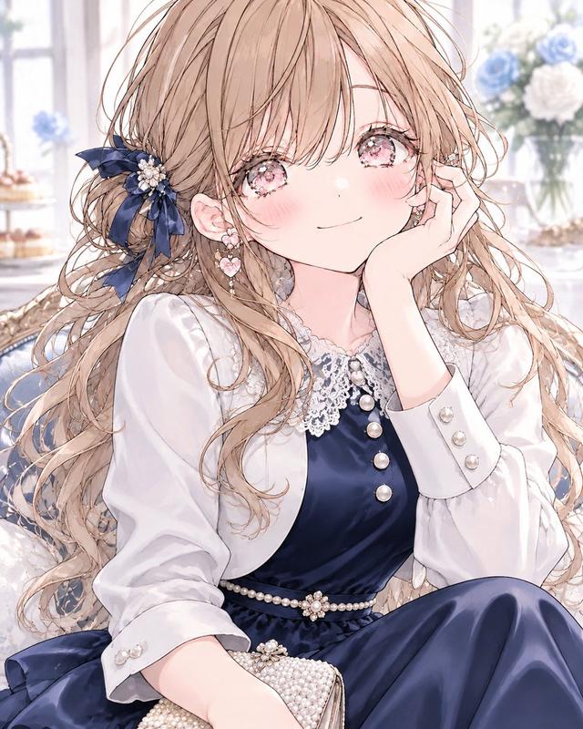
A {argument name="dress color" default="navy blue"} satin midi dress with elegant long sleeves and a delicate white lace collar, creating a refined, classic silhouette.

Accented with a thin pearl belt at the waist and layered with a small white bolero jacket for a graceful feminine touch.

Styled with black Mary Jane heels decorated with small ribbon details and a compact pearl clutch bag.

Elegant, romantic, classic café-date fashion aesthetic.
Navy blue, crisp white, black, and pearl ivory color palette.
Smooth satin, delicate lace, luminous pearls, and polished fabric textures.
Sophisticated, feminine, timeless seasonal styling.
Social Media Post - Watercolor Illustration Comparison Poster

Social Media Post - Watercolor Illustration Comparison Poster

SairahGPT Image 2
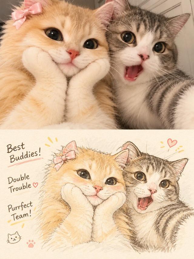
Transform the uploaded photograph into a beautiful, hand-drawn watercolor illustration comparison poster.

LAYOUT & COMPOSITION:
Create a vertical 3:4 poster divided into two equal horizontal sections.

TOP HALF — ORIGINAL PHOTO:
Display the original uploaded photograph exactly as it is. Preserve the original subject, pose, clothing, background, lighting, colors, and composition without alterations.

BOTTOM HALF — WATERCOLOR ILLUSTRATION:
Recreate the exact same photograph as a delicate, hand-painted watercolor and colored-pencil illustration. Preserve the subject's identity, facial features, hairstyle, expression, clothing, pose, proportions, and surroundings.

Use soft watercolor washes, delicate ink outlines, visible pencil strokes, subtle paper texture, warm pastel tones, gentle shading, and beautifully imperfect hand-drawn details. Give the illustration a charming Korean/Japanese lifestyle sketchbook aesthetic.

DECORATIVE DETAILS:
Add handwritten playful typography that complements the subject and scene. Include small hand-drawn doodles such as hearts, stars, arrows, crowns, underlines, or sparkles. Generate a short, creative phrase that matches the subject's personality or mood.

BACKGROUND:
Maintain the original environment but reinterpret it with loose watercolor brushstrokes, simplified scenery, and soft artistic details.

OVERALL STYLE:
Dreamy, cozy, youthful, elegant, artistic, and slightly whimsical. Use warm off-white textured watercolor paper as the illustration background.

IMPORTANT:
- Keep the original photograph completely unchanged in the top section.
- The bottom illustration must clearly depict the exact same moment.
- Do not invent additional people or objects.
- Maintain strong visual similarity to the original photograph.
- Make the typography look naturally handwritten, not digitally typeset.
- Ensure a clean 50/50 split with balanced composition.

High-quality editorial art poster, 3:4 vertical aspect ratio.
Social Media Post - Outfit of the Day Fashion Collage

Social Media Post - Outfit of the Day Fashion Collage

SairahGPT Image 2
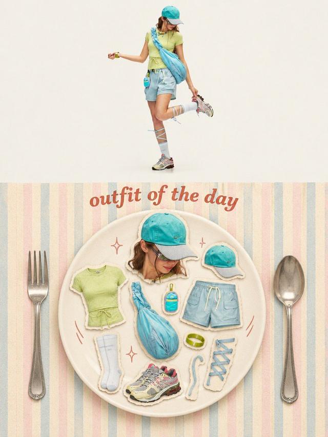
Transform the uploaded photo into a stylish OUTFIT OF THE DAY editorial fashion collage in a vertical 3:4 composition.

TOP SECTION (50%):
Create a full-body, high-end fashion editorial photograph of the person wearing the exact outfit from the reference image. Preserve their facial identity, hairstyle, clothing, colors, accessories, shoes, and natural proportions. Use a clean, warm ivory studio background, soft natural lighting, and a relaxed fashion-model pose.

BOTTOM SECTION (50%):
Create a creative flat-lay fashion moodboard arranged on a large elegant ceramic plate. Display individual outfit components as realistic paper-cutout stickers with subtle white borders and soft shadows, including:
- A cutout portrait of the person.
- Top, trousers or skirt.
- Shoes and socks.
- Hat, bag, jewelry and accessories.
- Any additional objects visible or relevant to the outfit.

Arrange everything aesthetically inside the plate, as if presenting a complete outfit recipe.

DESIGN & DETAILS:
Add elegant vintage-inspired typography reading "OUTFIT OF THE DAY" above the plate. Use a pastel striped background, oversized silver fork and spoon on either side, tiny hand-drawn sparkles and playful doodles.

VISUAL STYLE:
Premium Korean fashion magazine aesthetic, Pinterest-inspired editorial design, warm cream tones, pastel colors, realistic product photography, scrapbook collage, paper-cutout sticker effect, soft shadows, playful composition and refined vintage styling.

IMPORTANT: Automatically identify the clothing and accessories in the uploaded photo. Do not invent a different outfit or change the person's identity. Every item in the flat lay must correspond to the actual outfit or its visible accessories.

Ultra-detailed, polished graphic design, balanced composition, 3:4 vertical poster.
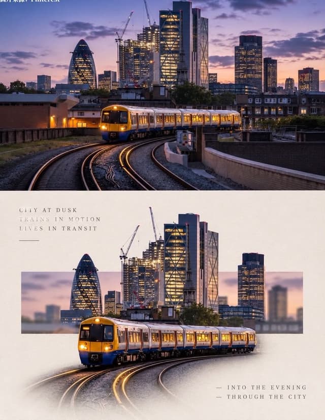
Social Media Post - Minimal Gallery Poster with Pop-Out Effect

Social Media Post - Minimal Gallery Poster with Pop-Out Effect

KGPT Image 2
Using the uploaded photo, create a 3:4 vertical poster split into top and bottom halves that touch seamlessly, with no white line, gap, or border between them.

Top: the original photo, full-bleed.

Bottom: a warm off-white textured paper background. The main subject is cut out, enlarged, and centered. Behind it, a thin horizontal rectangle shows a blurred crop of the original scene, and the subject breaks out of the frame (3D pop-out). The subject's base fades softly into the paper with natural particles, shadow, or reflection. Add small uppercase serif text in light grey with wide spacing: 3 short poetic lines at top-left and 2 lines with a "—" at bottom-right. Minimal gallery-poster style, photorealistic.
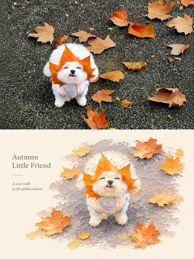
Social Media Post - Photography vs Impasto Oil Painting Poster

Social Media Post - Photography vs Impasto Oil Painting Poster

SairahGPT Image 2
Create a premium 3:4 vertical photography and impasto oil painting comparison poster using the uploaded photograph.

### LAYOUT
Divide the canvas into two perfectly equal horizontal sections (50/50):
- Top: Original photograph.
- Bottom: Artistic impasto oil painting interpretation.

Both sections must connect directly with a clean horizontal boundary, without gaps, gradients, or overlapping.

### TOP SECTION — PHOTOGRAPHY
Preserve the original subject's identity, quantity, pose, proportions, silhouette, details, composition, perspective, lighting, and natural colors. Apply only subtle premium color grading. Do not redraw, distort, duplicate, reposition, or alter the subject. No text or decorations.

### BOTTOM SECTION — ARTISTIC INTERPRETATION
Reimagine the same subject as a sculptural impasto oil painting micro-landscape. Use thick layered paint, palette-knife textures, handcrafted forms, raised edges, and expressive brushstrokes.

Keep the subject recognizable, centrally or slightly off-center, surrounded by generous warm-white negative space. Introduce a single color band inspired by the original photograph, transformed into a ground, water, pathway, or abstract landscape element.

### COLORS & TEXTURES
Extract a harmonious, limited color palette from the original photograph. Preserve the subject's natural color character while adding subtle brightness and luminosity. Use rich paint textures selectively, with refined subject details and delicate matte paper texture.

### TYPOGRAPHY
Add a short, elegant English title and one small supporting line within the lower section's negative space. Use thin, minimal typography. Generate text based on the actual subject or mood. Avoid invented dates, locations, logos, signatures, and unnecessary annotations.

### AESTHETIC
Quiet, minimal, sophisticated, and editorial. Create a collectible fine-art publication aesthetic through negative space, sculptural depth, material textures, and balanced composition.

### AVOID
Photo collages, altered subjects, unrelated scenes, illustrated photography, extra title bars, clutter, excessive decorations, incorrect text, watermarks, cartoon styles, neon colors, oversaturation, muddy tones, plastic-looking 3D, and cheap CGI.

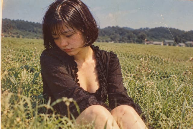
Social Media Post - Vintage Photo of Woman in Field

Social Media Post - Vintage Photo of Woman in Field

いがぐりメタボGPT Image 2
A nostalgic, vintage-style photograph of a young woman sitting in a lush green field. She has short, dark bobbed hair with bangs and is looking down with a pensive, melancholic expression. She wears a black, long-sleeved top with a deep V-neckline featuring ruffled edges. The background shows a vast expanse of tall grass or crops stretching toward distant hills under a clear sky. The image has a distinct retro aesthetic, characterized by film grain, warm color tones, scratches, and dust spots typical of old analog photography from the Showa era.

Find your next direction

ASTORIE CANVAS

Take the idea further.

Bring your prompts, references and results together in one creative space.

Open your canvas ↗