Infographic / Edu Visual - AI Infrastructure Infographic Poster

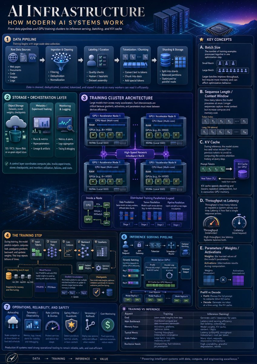
A dense futuristic educational poster explaining modern AI systems, useful for technical presentations, learning materials, and social media informationals.

Prompt

7,108 charactersOpen Astorie studio ↗
Goal: Create a highly polished vertical educational infographic titled {argument name="headline text" default="AI INFRASTRUCTURE"} with the subtitle {argument name="subtitle text" default="HOW MODERN AI SYSTEMS WORK"}, explaining modern AI infrastructure from data pipelines and GPU training clusters to inference serving, batching, and KV cache.

Canvas: Vertical poster, 4:5 aspect ratio, dark navy futuristic data-center aesthetic. Use a glowing blue/purple cyber grid background with mountains, server racks, a GPU chip illustration, neon circuit traces, thin rounded panels, white and cyan typography, and small orange numbered badges. The overall look should resemble a premium technical explainer poster, dense but readable.

Layout: Large title across the top left, small subtitle and tagline below it, decorative server racks and GPU chip on the top right. Arrange the content into exactly 8 numbered main sections plus a right-side “Key Concepts” column and a bottom flow footer. Use precise panel borders, small icons, arrows, diagrams, tables, and micro-labels.

Sections and required content:
1. Data Pipeline: Show exactly 5 pipeline stages connected by arrows: Raw Data Sources, Ingestion & Cleaning, Labeling / Curation, Tokenization / Chunking, and Sharding & Storage. Raw Data Sources contains exactly 5 bullets: Web pages, Documents, Code, Images, Logs. Ingestion & Cleaning contains exactly 3 bullets: Filtering, Deduplication, Normalization. Labeling / Curation contains exactly 3 bullets: Quality checks, Human / heuristic, Dataset assembly. Tokenization / Chunking contains exactly 3 bullets: Convert text to tokens, Chunk into docs, Add special tokens. Sharding & Storage contains exactly 3 bullets: Split into shards, Balanced partitions, Optimized for parallel reads. Add a caption stating that data is cleaned, deduplicated, curated, tokenized, and stored in shards so many workers can read it efficiently.

2. Storage + Orchestration Layer: Include exactly 3 vertical cards: Object Storage with a cloud-to-database icon and note “S3 / GCS / Azure Blob or on-prem object store”; Metadata / Experiment Tracking with a dashboard icon and bullets “Runs & metrics,” “Hyperparameters,” “Lineage & artifacts”; Monitoring & Logging with a chart/magnifier icon and bullets “Metrics & alerts,” “Logs aggregation,” “Tracing & debugging.” Add a footer note that the control layer coordinates compute jobs, tracks experiments, stores checkpoints, and monitors utilization, failures, and costs.

3. Training Cluster Architecture: Large central architecture diagram titled Training Cluster Architecture. Show exactly 4 GPU / Accelerator Node boxes in a 2x2 grid connected by glowing high-speed network links labeled “High-Speed Network InfiniBand / RoCE.” Each node contains CPU Host (Multi-core), RAM, GPUs such as 8x H100, and NVMe local SSD. Add dotted links between nodes. Below, include exactly 3 mini-panels: Inside a Node, Data Parallelism, and Distributed Training Parallelism (Legend). Inside a Node should show CPU connected by PCIe/NVLink/NVSwitch lines to multiple GPUs. Distributed Training Parallelism legend should show exactly 4 stages labeled Stage 1, Stage 2, Stage 3, Stage 4.

4. The Training Step: Create a left-to-right training flow with exactly 6 stages: Input Tokens, Forward Pass, Loss Compute, Backward Pass, Gradients, Optimizer Update. Include a checkpointing icon stack, a “Model Precision” box mentioning FP32, FP16/BF16, FP8, and an “Optimizer State” box. Show gradient accumulation arrows and a caption explaining that during training, the model predicts outputs, computes loss, propagates gradients backward, and updates weights, repeated billions of times.

5. Inference Serving Pipeline: Create a compact serving diagram with exactly 6 stages across the top: User Request, API Gateway, Tokenizer, Scheduler / Router, Model Server (GPU), Streamed Output. Inside the panel include Dynamic Batching with exactly 3 request rows, a Model Server box showing Prefill and Decode Loop, KV Cache on GPU Memory, optional adapters, and a load balancer connecting exactly 3 model replicas labeled Model Replica 1, Model Replica 2, Model Replica N.

6. Operations, Reliability, and Safety: Include exactly 6 operational cards with icons: Autoscaling, Telemetry / Observability, Rate Limiting & Quotas, Safety Filters / Guardrails, Versioning / Rollback, Cost Monitoring. Add a note that production AI systems need strong operational tooling to remain reliable, safe, and cost-efficient.

7. Training vs Inference: Add a comparison table with exactly 6 rows: Goal, Main Bottleneck, Memory Focus, Typical Metric, Scale Pattern, Resilience Needs. Use two columns labeled Training and Inference (Serving). Training should describe learning model weights from data, distributed compute and data movement bandwidth, activations/gradients/optimizer states, tokens per second or convergence, large batch long jobs, and checkpointing/fault tolerance. Inference should describe generating useful responses for users, latency and throughput, model weights plus KV cache, latency and tokens per second, many short requests, and high availability/graceful degradation.

8. Key Concepts right column: Create a tall right sidebar titled Key Concepts containing exactly 5 lettered cards: A. Batch Size, B. Sequence Length / Context Window, C. KV Cache, D. Throughput vs Latency, E. Parameters / Weights / Activations. Card A should define batch size and show small batch versus large batch with token/person icons. Card B should show prompt tokens and long context as token blocks labeled T1, T2, T3, T4, …, Tn. Card C should show prompt tokens feeding a purple cylindrical KV Cache, then a new token reading from cache. Card D should show exactly 2 gauges: Throughput and Latency. Card E should show weights and activations as blue and purple grids connected by multiplication. At the bottom of the sidebar add a small “Prefill vs Decode” note explaining prefill processes the full prompt and decode generates one token at a time using the KV cache.

Footer: Add a bottom navigation strip with the sequence “DATA → TRAINING → INFERENCE → VALUE,” a small circular rocket/compass-style icon at left, and a closing quote: {argument name="footer quote" default="Powering intelligent systems with data, compute, and engineering excellence."}

Visual style: Dense corporate technical infographic, crisp vector and semi-3D icons, glowing cyan outlines, subtle gradients, volumetric light, small schematics, miniature charts, and clean serif title typography with modern sans-serif labels. The color palette should be {argument name="color palette" default="deep navy, electric blue, cyan, violet, white, and small amber accents"}.

Constraints: Use exactly 8 numbered main sections, exactly 5 key concept cards, exactly 4 GPU nodes, exactly 6 training-step stages, exactly 6 inference stages, exactly 6 operations cards, and exactly 6 training-vs-inference table rows. Keep all visible text in English, avoid watermarks, avoid brand logos, and maintain high readability despite the dense layout.

From sourceView source ↗

More to explore

Product Marketing - Classic Cafe Date Outfit Prompt

Product Marketing - Classic Cafe Date Outfit Prompt

のぞむ*AIイラストGPT Image 2
OUTFIT:
A {argument name="dress color" default="navy blue"} satin midi dress with elegant long sleeves and a delicate white lace collar, creating a refined, classic silhouette.

Accented with a thin pearl belt at the waist and layered with a small white bolero jacket for a graceful feminine touch.

Styled with black Mary Jane heels decorated with small ribbon details and a compact pearl clutch bag.

Elegant, romantic, classic café-date fashion aesthetic.
Navy blue, crisp white, black, and pearl ivory color palette.
Smooth satin, delicate lace, luminous pearls, and polished fabric textures.
Sophisticated, feminine, timeless seasonal styling.
Social Media Post - Watercolor Illustration Comparison Poster

Social Media Post - Watercolor Illustration Comparison Poster

SairahGPT Image 2
Transform the uploaded photograph into a beautiful, hand-drawn watercolor illustration comparison poster.

LAYOUT & COMPOSITION:
Create a vertical 3:4 poster divided into two equal horizontal sections.

TOP HALF — ORIGINAL PHOTO:
Display the original uploaded photograph exactly as it is. Preserve the original subject, pose, clothing, background, lighting, colors, and composition without alterations.

BOTTOM HALF — WATERCOLOR ILLUSTRATION:
Recreate the exact same photograph as a delicate, hand-painted watercolor and colored-pencil illustration. Preserve the subject's identity, facial features, hairstyle, expression, clothing, pose, proportions, and surroundings.

Use soft watercolor washes, delicate ink outlines, visible pencil strokes, subtle paper texture, warm pastel tones, gentle shading, and beautifully imperfect hand-drawn details. Give the illustration a charming Korean/Japanese lifestyle sketchbook aesthetic.

DECORATIVE DETAILS:
Add handwritten playful typography that complements the subject and scene. Include small hand-drawn doodles such as hearts, stars, arrows, crowns, underlines, or sparkles. Generate a short, creative phrase that matches the subject's personality or mood.

BACKGROUND:
Maintain the original environment but reinterpret it with loose watercolor brushstrokes, simplified scenery, and soft artistic details.

OVERALL STYLE:
Dreamy, cozy, youthful, elegant, artistic, and slightly whimsical. Use warm off-white textured watercolor paper as the illustration background.

IMPORTANT:
- Keep the original photograph completely unchanged in the top section.
- The bottom illustration must clearly depict the exact same moment.
- Do not invent additional people or objects.
- Maintain strong visual similarity to the original photograph.
- Make the typography look naturally handwritten, not digitally typeset.
- Ensure a clean 50/50 split with balanced composition.

High-quality editorial art poster, 3:4 vertical aspect ratio.
Social Media Post - Outfit of the Day Fashion Collage

Social Media Post - Outfit of the Day Fashion Collage

SairahGPT Image 2
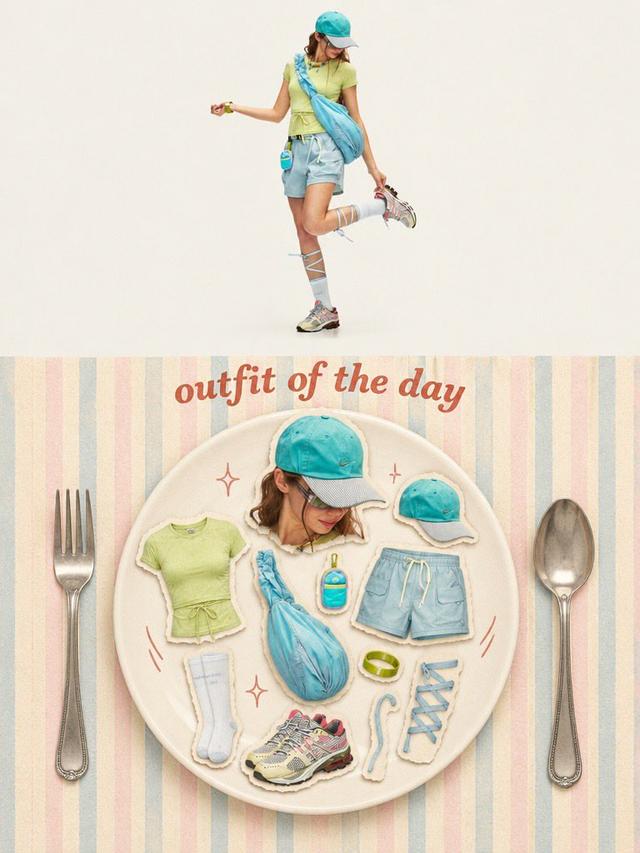
Transform the uploaded photo into a stylish OUTFIT OF THE DAY editorial fashion collage in a vertical 3:4 composition.

TOP SECTION (50%):
Create a full-body, high-end fashion editorial photograph of the person wearing the exact outfit from the reference image. Preserve their facial identity, hairstyle, clothing, colors, accessories, shoes, and natural proportions. Use a clean, warm ivory studio background, soft natural lighting, and a relaxed fashion-model pose.

BOTTOM SECTION (50%):
Create a creative flat-lay fashion moodboard arranged on a large elegant ceramic plate. Display individual outfit components as realistic paper-cutout stickers with subtle white borders and soft shadows, including:
- A cutout portrait of the person.
- Top, trousers or skirt.
- Shoes and socks.
- Hat, bag, jewelry and accessories.
- Any additional objects visible or relevant to the outfit.

Arrange everything aesthetically inside the plate, as if presenting a complete outfit recipe.

DESIGN & DETAILS:
Add elegant vintage-inspired typography reading "OUTFIT OF THE DAY" above the plate. Use a pastel striped background, oversized silver fork and spoon on either side, tiny hand-drawn sparkles and playful doodles.

VISUAL STYLE:
Premium Korean fashion magazine aesthetic, Pinterest-inspired editorial design, warm cream tones, pastel colors, realistic product photography, scrapbook collage, paper-cutout sticker effect, soft shadows, playful composition and refined vintage styling.

IMPORTANT: Automatically identify the clothing and accessories in the uploaded photo. Do not invent a different outfit or change the person's identity. Every item in the flat lay must correspond to the actual outfit or its visible accessories.

Ultra-detailed, polished graphic design, balanced composition, 3:4 vertical poster.
Social Media Post - Minimal Gallery Poster with Pop-Out Effect

Social Media Post - Minimal Gallery Poster with Pop-Out Effect

KGPT Image 2
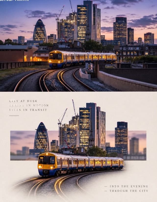
Using the uploaded photo, create a 3:4 vertical poster split into top and bottom halves that touch seamlessly, with no white line, gap, or border between them.

Top: the original photo, full-bleed.

Bottom: a warm off-white textured paper background. The main subject is cut out, enlarged, and centered. Behind it, a thin horizontal rectangle shows a blurred crop of the original scene, and the subject breaks out of the frame (3D pop-out). The subject's base fades softly into the paper with natural particles, shadow, or reflection. Add small uppercase serif text in light grey with wide spacing: 3 short poetic lines at top-left and 2 lines with a "—" at bottom-right. Minimal gallery-poster style, photorealistic.
Social Media Post - Photography vs Impasto Oil Painting Poster

Social Media Post - Photography vs Impasto Oil Painting Poster

SairahGPT Image 2
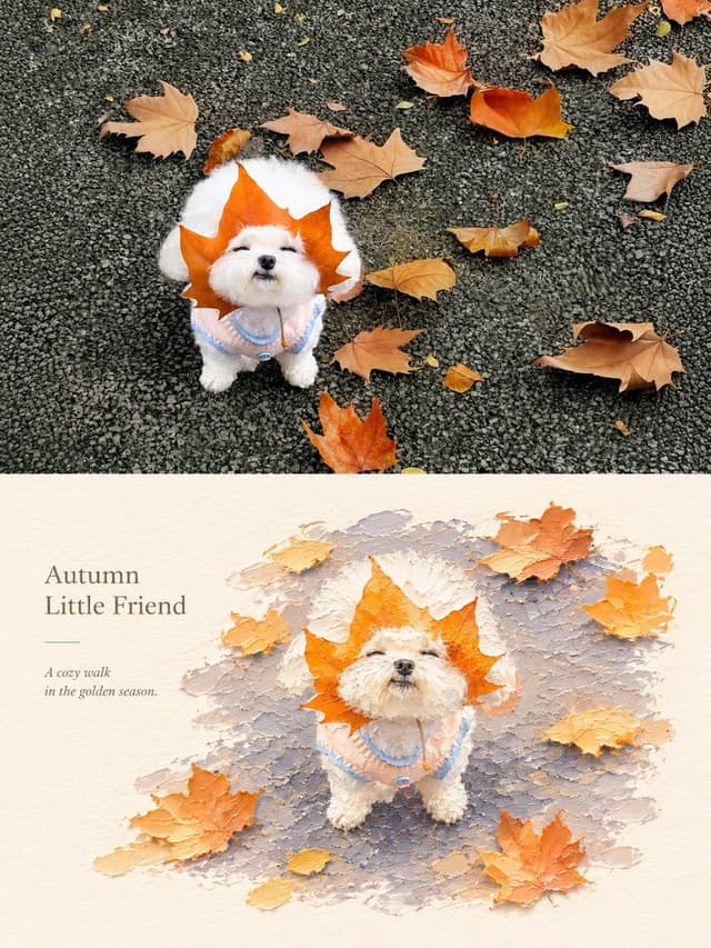
Create a premium 3:4 vertical photography and impasto oil painting comparison poster using the uploaded photograph.

### LAYOUT
Divide the canvas into two perfectly equal horizontal sections (50/50):
- Top: Original photograph.
- Bottom: Artistic impasto oil painting interpretation.

Both sections must connect directly with a clean horizontal boundary, without gaps, gradients, or overlapping.

### TOP SECTION — PHOTOGRAPHY
Preserve the original subject's identity, quantity, pose, proportions, silhouette, details, composition, perspective, lighting, and natural colors. Apply only subtle premium color grading. Do not redraw, distort, duplicate, reposition, or alter the subject. No text or decorations.

### BOTTOM SECTION — ARTISTIC INTERPRETATION
Reimagine the same subject as a sculptural impasto oil painting micro-landscape. Use thick layered paint, palette-knife textures, handcrafted forms, raised edges, and expressive brushstrokes.

Keep the subject recognizable, centrally or slightly off-center, surrounded by generous warm-white negative space. Introduce a single color band inspired by the original photograph, transformed into a ground, water, pathway, or abstract landscape element.

### COLORS & TEXTURES
Extract a harmonious, limited color palette from the original photograph. Preserve the subject's natural color character while adding subtle brightness and luminosity. Use rich paint textures selectively, with refined subject details and delicate matte paper texture.

### TYPOGRAPHY
Add a short, elegant English title and one small supporting line within the lower section's negative space. Use thin, minimal typography. Generate text based on the actual subject or mood. Avoid invented dates, locations, logos, signatures, and unnecessary annotations.

### AESTHETIC
Quiet, minimal, sophisticated, and editorial. Create a collectible fine-art publication aesthetic through negative space, sculptural depth, material textures, and balanced composition.

### AVOID
Photo collages, altered subjects, unrelated scenes, illustrated photography, extra title bars, clutter, excessive decorations, incorrect text, watermarks, cartoon styles, neon colors, oversaturation, muddy tones, plastic-looking 3D, and cheap CGI.
Social Media Post - Vintage Photo of Woman in Field

Social Media Post - Vintage Photo of Woman in Field

いがぐりメタボGPT Image 2
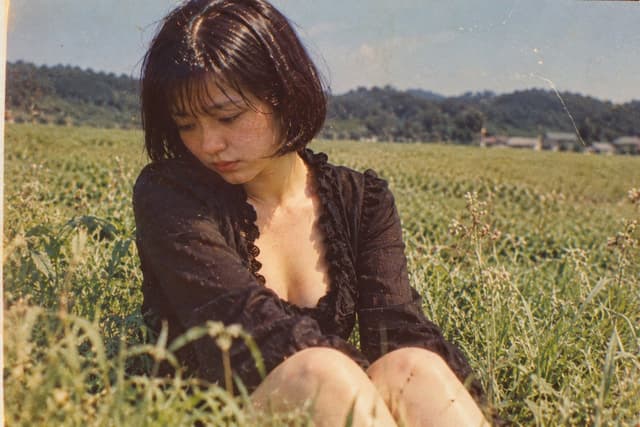
A nostalgic, vintage-style photograph of a young woman sitting in a lush green field. She has short, dark bobbed hair with bangs and is looking down with a pensive, melancholic expression. She wears a black, long-sleeved top with a deep V-neckline featuring ruffled edges. The background shows a vast expanse of tall grass or crops stretching toward distant hills under a clear sky. The image has a distinct retro aesthetic, characterized by film grain, warm color tones, scratches, and dust spots typical of old analog photography from the Showa era.

Find your next direction

ASTORIE CANVAS

Take the idea further.

Bring your prompts, references and results together in one creative space.

Open your canvas ↗