Infographic / Edu Visual - Claude Opus 4.8 Market Infographic

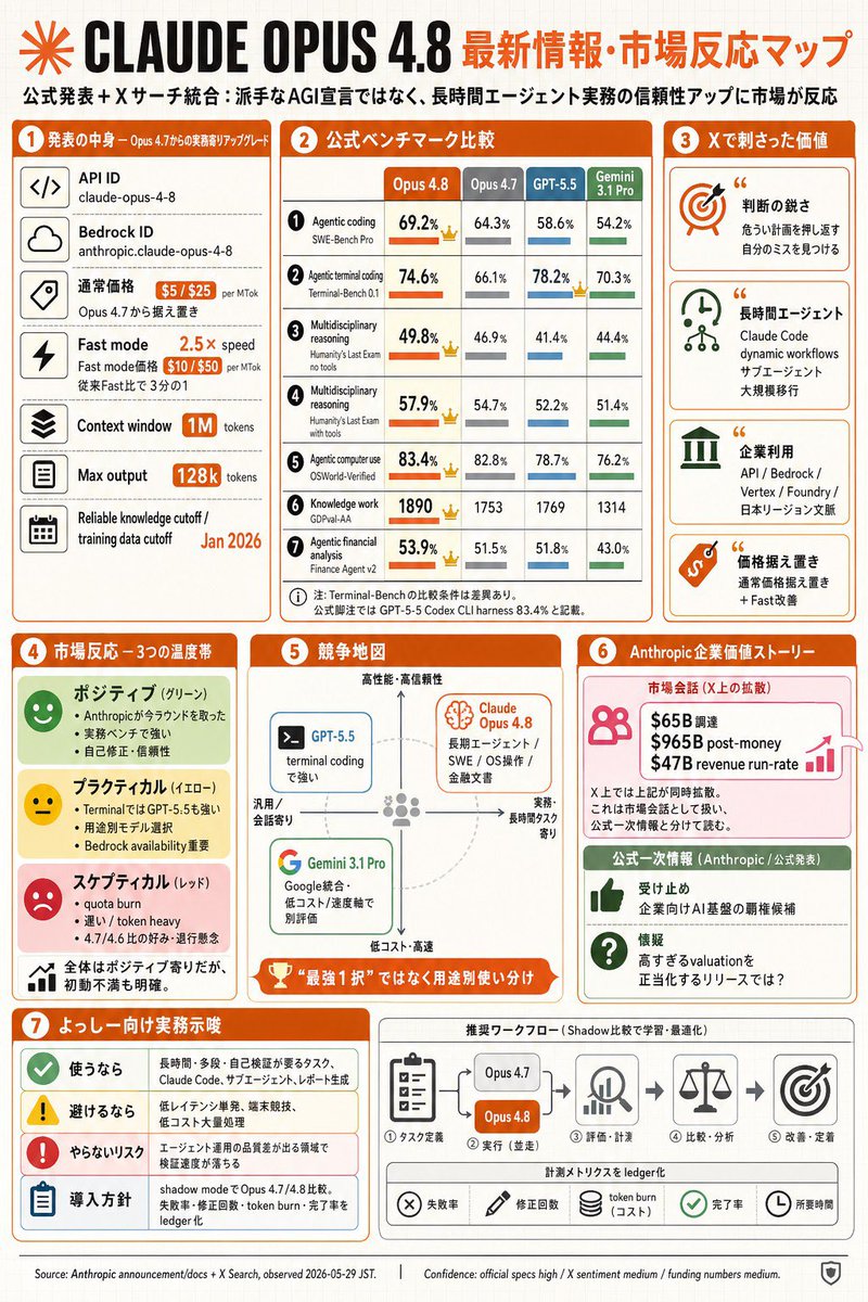
A dense Japanese editorial infographic summarizing Claude Opus 4.8 specs, benchmarks, market reactions, and practical adoption guidance.

Prompt

6,520 charactersOpen Astorie studio ↗
Goal: Create a dense Japanese tech infographic about {argument name="main topic" default="CLAUDE OPUS 4.8"} and market reaction, styled as a GPT-image-2 generated editorial slide.

Canvas: Portrait 2:3 infographic, off-white graph-paper background with faint grid lines, orange and black headline branding, rounded rectangular cards, thin gray dividers, orange section headers, small flat icons, and compact Japanese typography. Use a clean business-tech layout with a slightly hand-assembled newsletter feel.

Top header: Large black title “CLAUDE OPUS 4.8” with an orange radial starburst logo at far left. To the right, an orange Japanese headline: {argument name="headline text" default="最新情報・市場反応マップ"}. Under it, a smaller Japanese subtitle: “公式発表+Xサーチ統合:派手なAGI宣言ではなく、長時間エージェント実務の信頼性アップに市場が反応”.

Overall layout: Use exactly 7 numbered main sections, each with an orange circular number badge and orange title bar. Arrange sections 1–3 across the upper half, sections 4–6 in the middle, and section 7 plus a workflow strip across the bottom. Keep all content packed but readable.

Section 1, left column, “発表の中身 — Opus 4.7からの実務寄りアップグレード”: Show exactly 6 stacked spec rows with square black line icons on the left and labels/values on the right: 1) API ID, value “claude-opus-4-8”; 2) Bedrock ID, value “anthropic.claude-opus-4-8”; 3) 通常価格, orange price pills “$5 / $25 per MTok” and note “Opus 4.7から据え置き”; 4) Fast mode, orange “2.5× speed” and price pills “$10 / $50 per MTok”, note “従来Fast比で3分の1”; 5) Context window, orange pill “1M tokens”; 6) Max output, orange pill “128k tokens”; add a bottom small row “Reliable knowledge cutoff / training data cutoff” with orange date {argument name="training cutoff date" default="Jan 2026"}.

Section 2, top center, “公式ベンチマーク比較”: Create a comparison table with exactly 4 model columns labeled “Opus 4.8”, “Opus 4.7”, “GPT-5.5”, and “Gemini 3.1 Pro”. Use orange for Opus 4.8, gray for Opus 4.7, blue for GPT-5.5, green for Gemini. Include exactly 7 benchmark rows with small numbered circles, metric names, percentages/scores, horizontal mini bars, and small crown icons where Opus 4.8 leads: 1) Agentic coding / SWE-Bench Pro: 69.2%, 64.3%, 58.6%, 54.2%; 2) Agentic terminal coding / Terminal-Bench 0.1: 74.6%, 66.1%, 78.2%, 70.3%; 3) Multidisciplinary reasoning / Humanity’s Last Exam no tools: 49.8%, 46.9%, 41.4%, 44.4%; 4) Multidisciplinary reasoning / Humanity’s Last Exam with tools: 57.9%, 54.7%, 52.2%, 51.4%; 5) Agentic computer use / OSWorld-Verified: 83.4%, 82.8%, 78.7%, 76.2%; 6) Knowledge work / GDPval-AA: 1890, 1753, 1769, 1314; 7) Agentic financial analysis / Finance Agent v2: 53.9%, 51.5%, 51.8%, 43.0%. Add a small Japanese footnote beneath the table.

Section 3, top right, “Xで刺さった価値”: Show exactly 4 stacked insight cards with large icons and quotation marks: 1) orange target icon, title “判断の鋭さ”, note about catching dangerous blind spots and noticing your own mistakes; 2) green clock/network icon, title “長時間エージェント”, note “Claude Code dynamic workflows / サブエージェント / 大規模移行”; 3) green enterprise-building icon, title “企業利用”, note listing “API / Bedrock / Vertex / Foundry / 日本リージョン文脈”; 4) orange price-tag icon, title “価格据え置き”, note “通常価格据え置き + Fast改善”.

Section 4, middle left, “市場反応 — 3つの温度帯”: Create exactly 3 sentiment bands plus one summary band: 1) green “ポジティブ(グリーン)” with smiling face icon and three bullets about winning back trust in Anthropic, strong real benchmarks, and self-correction/reliability; 2) yellow “プラクティカル(イエロー)” with neutral face icon and three bullets about Terminal being strong for GPT-5.5, usage model selection, and Bedrock availability; 3) red “スケプティカル(レッド)” with sad face icon and three bullets about quota burn, heavy token burn, and suspicion of 4.7/4.6 comparison; 4) white summary row with tiny bar-chart icon: “全体はポジティブ寄りだが、初動不満も明確。”

Section 5, middle center, “競争地図”: Draw a quadrant map with vertical axis “高性能・高信頼性” at top to “低コスト・高速” at bottom, horizontal axis “汎用/会話寄り” left to “実務・長時間タスク寄り” right. Include exactly 3 model cards: a blue “GPT-5.5” card on the upper-left/center labeled “terminal codingで強い”; an orange “Claude Opus 4.8” card in the upper-right with a brain icon and text “長期エージェント / SWE / OS操作 / 金融文書”; a green “Gemini 3.1 Pro” card in the lower-left with Google-style G icon and text “Google統合・低コスト / 速度軸で別評価”. Add a dashed circular guide and a bottom orange trophy ribbon reading “最強1択ではなく用途別使い分け”.

Section 6, middle right, “Anthropic 企業価値ストーリー”: Split into exactly 2 cards. Top pink card titled “市場会話(X上の拡散)” with people icon, growth arrow, and three bold funding lines: “$65B 調達”, “$965B post-money”, “$47B revenue run-rate”; add small caveat text that X treats these as market conversation and they are not official announcement figures. Bottom green card titled “公式一次情報(Anthropic / 公式発表)” with exactly 2 rows: thumbs-up icon “受け止め 企業向けAI基盤の覇権候補”; question icon “懐疑 高すぎるvaluationを正当化するリリースでは?”.

Section 7, bottom left, “よっしー向け実務示唆”: Make exactly 4 rows with colored icons: 1) green check “使うなら” followed by tasks such as long-duration, many-step, self-verification, Claude Code, migration, and refactoring; 2) yellow warning “避けるなら” followed by low-latency single-shot, simple searches, and high-cost large-volume processing; 3) red exclamation “やらないリスク” followed by missing early signals in engineering and product domains; 4) blue clipboard “導入方針” followed by comparing shadow mode with Opus 4.7/4.8 and logging failures, correction count, token burn, and completion rate.

Bottom workflow strip, to the right of section 7: Title it “推奨ワークフロー(Shadow比較で学習・最適化)”. Show exactly 5 process steps connected by arrows: 1) task-definition clipboard icon “タスク定義”; 2) comparison block with two pills “Opus 4.7” and orange “Opus 4.8”, label “実行(並走)”; 3) magnifier/chart icon “評価・計測”; 4) scales icon “比較・分析”; 5) target icon “改善・定着”. Beneath, add a metrics ledger row with exactly 5 chips/icons: “失敗率”, “修正回数”, “token burn(コスト)”, “完了率”, “所要時間”.

Footer: Add tiny source and confidence text along the bottom: “Source: Anthropic announcement/docs + X Search, observed 2026-05-29 JST.” and “Confidence: official specs high / X sentiment medium / funding numbers medium.” Include a small shield icon at bottom right.

Visual constraints: Use mostly orange, black, gray, green, blue, yellow, and red accents; include many small icons but no photorealism; keep the page crisp, flat, legible, and information-dense; no watermark; no extra sections beyond the 7 numbered sections and the workflow strip.

From sourceView source ↗

More to explore

Product Marketing - Classic Cafe Date Outfit Prompt

Product Marketing - Classic Cafe Date Outfit Prompt

のぞむ*AIイラストGPT Image 2
OUTFIT:
A {argument name="dress color" default="navy blue"} satin midi dress with elegant long sleeves and a delicate white lace collar, creating a refined, classic silhouette.

Accented with a thin pearl belt at the waist and layered with a small white bolero jacket for a graceful feminine touch.

Styled with black Mary Jane heels decorated with small ribbon details and a compact pearl clutch bag.

Elegant, romantic, classic café-date fashion aesthetic.
Navy blue, crisp white, black, and pearl ivory color palette.
Smooth satin, delicate lace, luminous pearls, and polished fabric textures.
Sophisticated, feminine, timeless seasonal styling.
Social Media Post - Watercolor Illustration Comparison Poster

Social Media Post - Watercolor Illustration Comparison Poster

SairahGPT Image 2
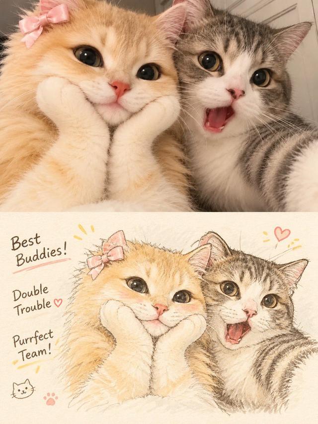
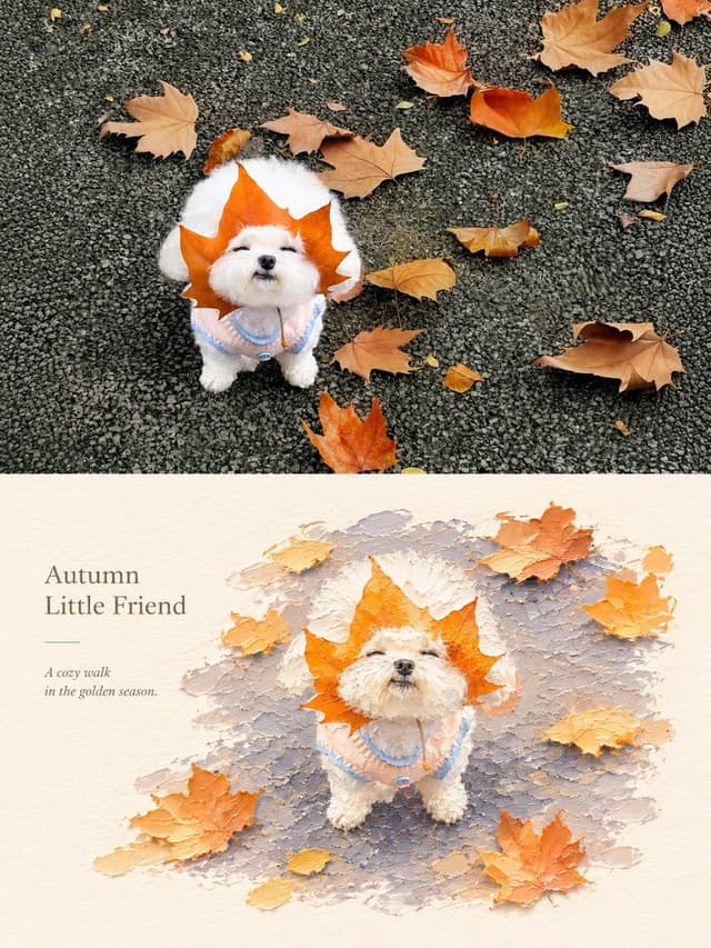
Transform the uploaded photograph into a beautiful, hand-drawn watercolor illustration comparison poster.

LAYOUT & COMPOSITION:
Create a vertical 3:4 poster divided into two equal horizontal sections.

TOP HALF — ORIGINAL PHOTO:
Display the original uploaded photograph exactly as it is. Preserve the original subject, pose, clothing, background, lighting, colors, and composition without alterations.

BOTTOM HALF — WATERCOLOR ILLUSTRATION:
Recreate the exact same photograph as a delicate, hand-painted watercolor and colored-pencil illustration. Preserve the subject's identity, facial features, hairstyle, expression, clothing, pose, proportions, and surroundings.

Use soft watercolor washes, delicate ink outlines, visible pencil strokes, subtle paper texture, warm pastel tones, gentle shading, and beautifully imperfect hand-drawn details. Give the illustration a charming Korean/Japanese lifestyle sketchbook aesthetic.

DECORATIVE DETAILS:
Add handwritten playful typography that complements the subject and scene. Include small hand-drawn doodles such as hearts, stars, arrows, crowns, underlines, or sparkles. Generate a short, creative phrase that matches the subject's personality or mood.

BACKGROUND:
Maintain the original environment but reinterpret it with loose watercolor brushstrokes, simplified scenery, and soft artistic details.

OVERALL STYLE:
Dreamy, cozy, youthful, elegant, artistic, and slightly whimsical. Use warm off-white textured watercolor paper as the illustration background.

IMPORTANT:
- Keep the original photograph completely unchanged in the top section.
- The bottom illustration must clearly depict the exact same moment.
- Do not invent additional people or objects.
- Maintain strong visual similarity to the original photograph.
- Make the typography look naturally handwritten, not digitally typeset.
- Ensure a clean 50/50 split with balanced composition.

High-quality editorial art poster, 3:4 vertical aspect ratio.
Social Media Post - Outfit of the Day Fashion Collage

Social Media Post - Outfit of the Day Fashion Collage

SairahGPT Image 2
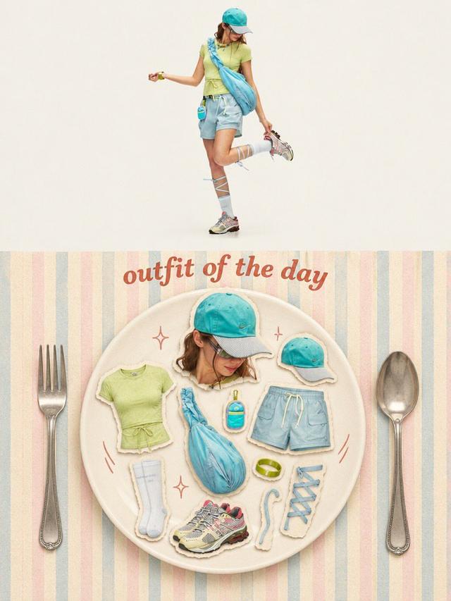
Transform the uploaded photo into a stylish OUTFIT OF THE DAY editorial fashion collage in a vertical 3:4 composition.

TOP SECTION (50%):
Create a full-body, high-end fashion editorial photograph of the person wearing the exact outfit from the reference image. Preserve their facial identity, hairstyle, clothing, colors, accessories, shoes, and natural proportions. Use a clean, warm ivory studio background, soft natural lighting, and a relaxed fashion-model pose.

BOTTOM SECTION (50%):
Create a creative flat-lay fashion moodboard arranged on a large elegant ceramic plate. Display individual outfit components as realistic paper-cutout stickers with subtle white borders and soft shadows, including:
- A cutout portrait of the person.
- Top, trousers or skirt.
- Shoes and socks.
- Hat, bag, jewelry and accessories.
- Any additional objects visible or relevant to the outfit.

Arrange everything aesthetically inside the plate, as if presenting a complete outfit recipe.

DESIGN & DETAILS:
Add elegant vintage-inspired typography reading "OUTFIT OF THE DAY" above the plate. Use a pastel striped background, oversized silver fork and spoon on either side, tiny hand-drawn sparkles and playful doodles.

VISUAL STYLE:
Premium Korean fashion magazine aesthetic, Pinterest-inspired editorial design, warm cream tones, pastel colors, realistic product photography, scrapbook collage, paper-cutout sticker effect, soft shadows, playful composition and refined vintage styling.

IMPORTANT: Automatically identify the clothing and accessories in the uploaded photo. Do not invent a different outfit or change the person's identity. Every item in the flat lay must correspond to the actual outfit or its visible accessories.

Ultra-detailed, polished graphic design, balanced composition, 3:4 vertical poster.
Social Media Post - Minimal Gallery Poster with Pop-Out Effect

Social Media Post - Minimal Gallery Poster with Pop-Out Effect

KGPT Image 2
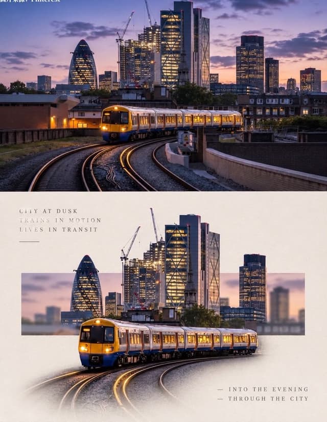
Using the uploaded photo, create a 3:4 vertical poster split into top and bottom halves that touch seamlessly, with no white line, gap, or border between them.

Top: the original photo, full-bleed.

Bottom: a warm off-white textured paper background. The main subject is cut out, enlarged, and centered. Behind it, a thin horizontal rectangle shows a blurred crop of the original scene, and the subject breaks out of the frame (3D pop-out). The subject's base fades softly into the paper with natural particles, shadow, or reflection. Add small uppercase serif text in light grey with wide spacing: 3 short poetic lines at top-left and 2 lines with a "—" at bottom-right. Minimal gallery-poster style, photorealistic.
Social Media Post - Photography vs Impasto Oil Painting Poster

Social Media Post - Photography vs Impasto Oil Painting Poster

SairahGPT Image 2
Create a premium 3:4 vertical photography and impasto oil painting comparison poster using the uploaded photograph.

### LAYOUT
Divide the canvas into two perfectly equal horizontal sections (50/50):
- Top: Original photograph.
- Bottom: Artistic impasto oil painting interpretation.

Both sections must connect directly with a clean horizontal boundary, without gaps, gradients, or overlapping.

### TOP SECTION — PHOTOGRAPHY
Preserve the original subject's identity, quantity, pose, proportions, silhouette, details, composition, perspective, lighting, and natural colors. Apply only subtle premium color grading. Do not redraw, distort, duplicate, reposition, or alter the subject. No text or decorations.

### BOTTOM SECTION — ARTISTIC INTERPRETATION
Reimagine the same subject as a sculptural impasto oil painting micro-landscape. Use thick layered paint, palette-knife textures, handcrafted forms, raised edges, and expressive brushstrokes.

Keep the subject recognizable, centrally or slightly off-center, surrounded by generous warm-white negative space. Introduce a single color band inspired by the original photograph, transformed into a ground, water, pathway, or abstract landscape element.

### COLORS & TEXTURES
Extract a harmonious, limited color palette from the original photograph. Preserve the subject's natural color character while adding subtle brightness and luminosity. Use rich paint textures selectively, with refined subject details and delicate matte paper texture.

### TYPOGRAPHY
Add a short, elegant English title and one small supporting line within the lower section's negative space. Use thin, minimal typography. Generate text based on the actual subject or mood. Avoid invented dates, locations, logos, signatures, and unnecessary annotations.

### AESTHETIC
Quiet, minimal, sophisticated, and editorial. Create a collectible fine-art publication aesthetic through negative space, sculptural depth, material textures, and balanced composition.

### AVOID
Photo collages, altered subjects, unrelated scenes, illustrated photography, extra title bars, clutter, excessive decorations, incorrect text, watermarks, cartoon styles, neon colors, oversaturation, muddy tones, plastic-looking 3D, and cheap CGI.
Social Media Post - Vintage Photo of Woman in Field

Social Media Post - Vintage Photo of Woman in Field

いがぐりメタボGPT Image 2
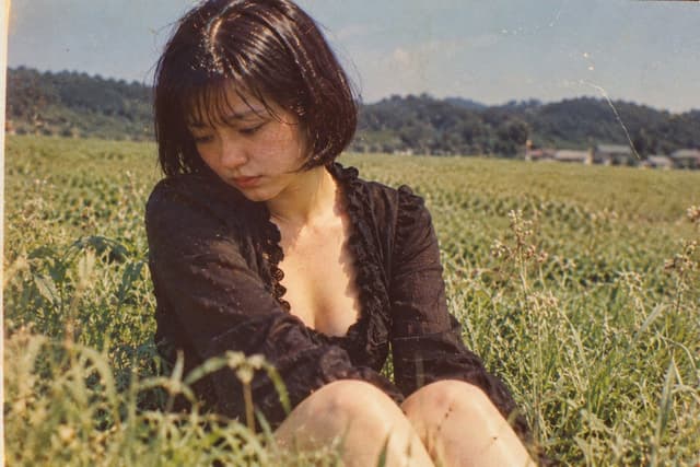
A nostalgic, vintage-style photograph of a young woman sitting in a lush green field. She has short, dark bobbed hair with bangs and is looking down with a pensive, melancholic expression. She wears a black, long-sleeved top with a deep V-neckline featuring ruffled edges. The background shows a vast expanse of tall grass or crops stretching toward distant hills under a clear sky. The image has a distinct retro aesthetic, characterized by film grain, warm color tones, scratches, and dust spots typical of old analog photography from the Showa era.

Find your next direction

ASTORIE CANVAS

Take the idea further.

Bring your prompts, references and results together in one creative space.

Open your canvas ↗